5 Ways Website Design Can Skyrocket Your Conversion Rates
Dominic Tarn
Head of Content - ReVerb
18.09.2024
Website optimization is the holy grail of digital marketing and online conversion in general.
But did you know that website design is at the tip of this optimization and is a critical factor that decides whether people will engage with your website? Research shows that 38% of customers stop interacting with your website if it has a poor layout.
If you are new to web design, you can consult with a product design company to help analyze whether your company’s website is up to scratch and optimize it if necessary. Even better, you can also try out these five ways to unlock your website’s potential for conversion.
5 Web Design Principles To Boost Your Website’s Conversion Rates
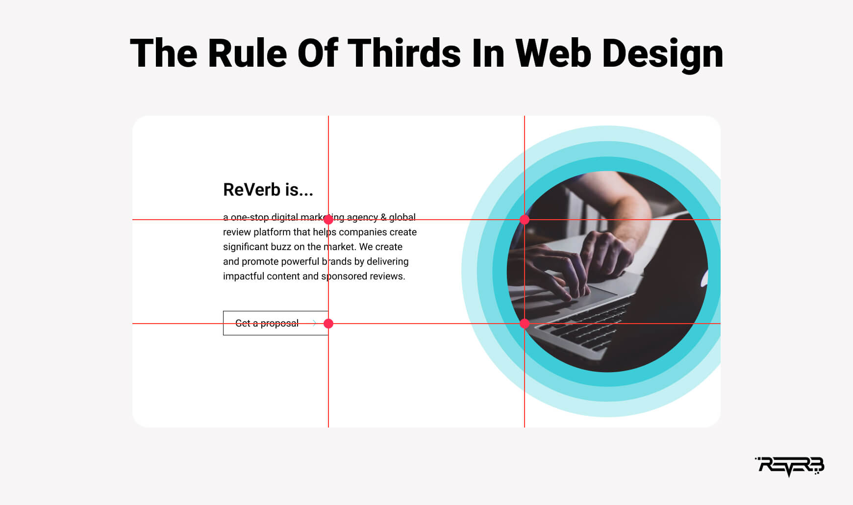
1. Using the rule of thirds to create balanced visuals
The rule of thirds is a key photography principle developed in the early 1800s to help photographers center images relative to the edges of the frame. In web design, the concept allows designers to place critical elements where page visitors’ eyes are naturally drawn. It brings symmetry and balance to website visuals.
To use this compositional principle, UI designers divide a design area into a 3 x 3 grid and position elements along the four gridlines. The top left intersection, the primary focal point, is the first point that captures a user’s attention when visiting your website. Therefore, it must contain your webpage’s most important element. This could be a punchy headline or a landing page image. The CTA button could be moved to the bottom-right grid intersection, allowing for a visual hierarchy.
While the key elements go to the top left, you can place secondary elements, like the navigation menu, along the vertical gridlines. This helps you avoid clutter while creating a harmonious balance between multiple components.
The rule of thirds comes in handy when adapting web layouts for different screen sizes and orientations in today’s multi-device era. All critical elements remain positioned optimally irrespective of the user’s device.
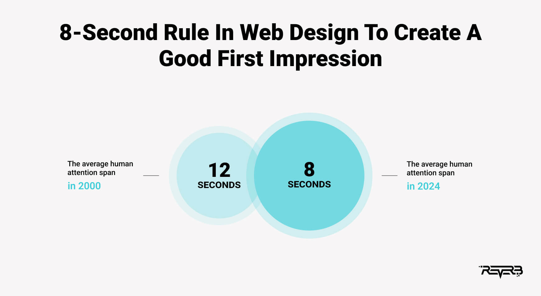
2. Utilising the 8-second rule
New users visiting your website have about 8 seconds to decide whether to keep scrolling on your page or bounce. With this in mind, your website must make the best first impression to convince new visitors to stay beyond those first 8 seconds.
Luckily, there are multiple free tools, such as Google’s PageSpeed Insights, where you can test your loading time by simply entering your website address and analyzing it. The tool gives a detailed performance report and advises you on what needs fixing to make your website faster.
On the other hand, your website’s navigation and layout must be simply and intuitively designed. You may consider applying the rule of thirds to position key elements as discussed above. This could include having a compelling headline with keywords or using captivating images on your landing page. An intuitive web design ensures users visiting your website can find the content they are looking for at a glance.
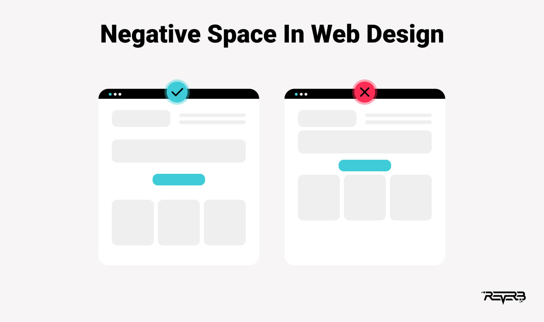
3. Maximising impact with negative space
Negative space is the white space separating content lines and graphics on your webpage layout. This white space makes it easier for users to interact with site information. While it doesn’t contain anything, negative space accentuates your key website design elements, enabling you to create a visual hierarchy.
These key elements occupy what is referred to as the positive space. The web designer uses this space to convey a message about your brand. Graphics and images in the positive space draw the visitor’s attention first. That said, you can’t make your web page a completely positive space.
Balancing it out with negative space provides breathing room to design elements, ensuring your page doesn’t look chaotic. This way, you can naturally draw user attention to key components, such as CTAs. For blog websites, it’s worth noting that having text with margins and spaces between paragraphs will make the content more digestible.
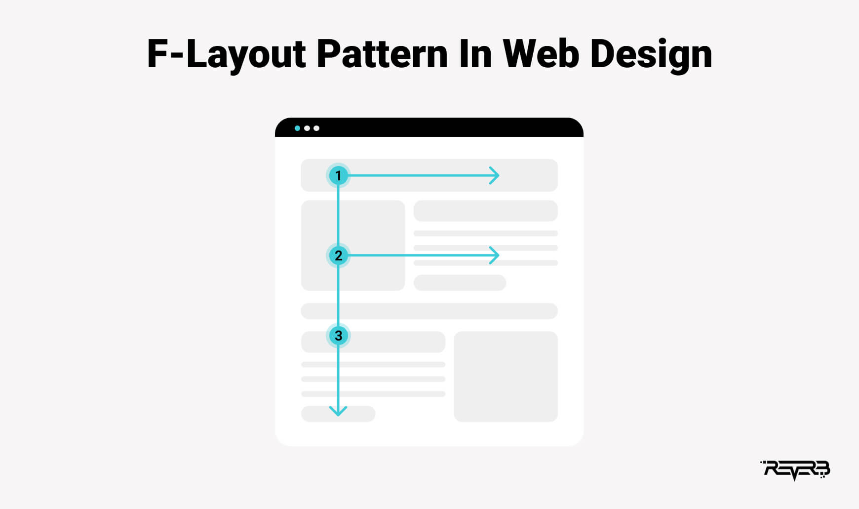
4. Incorporating the F-layout
Deciding what elements users see when visiting your website is critical to increasing your retention rate. The F-layout pattern enables designers to direct attention intentionally. The layout derives from the notion that users visiting your website will read horizontally across the top of the page.
The user will then scan the line below and read across but not to the end of the line. This pattern of reading less and less continues until they start scanning only the first words or images on each line. When mapped out, this scanning behavior makes an F pattern.
Understanding the F-pattern allows you to place content along specific hotspots to ensure maximum interaction with the reader. A web page designed with the F-pattern in mind has an intentional rhythm that ensures the user doesn’t lose attention as they scan through. Unsurprisingly, the navigation bar is best placed across the top of the page — the only place users scan horizontally to the end.
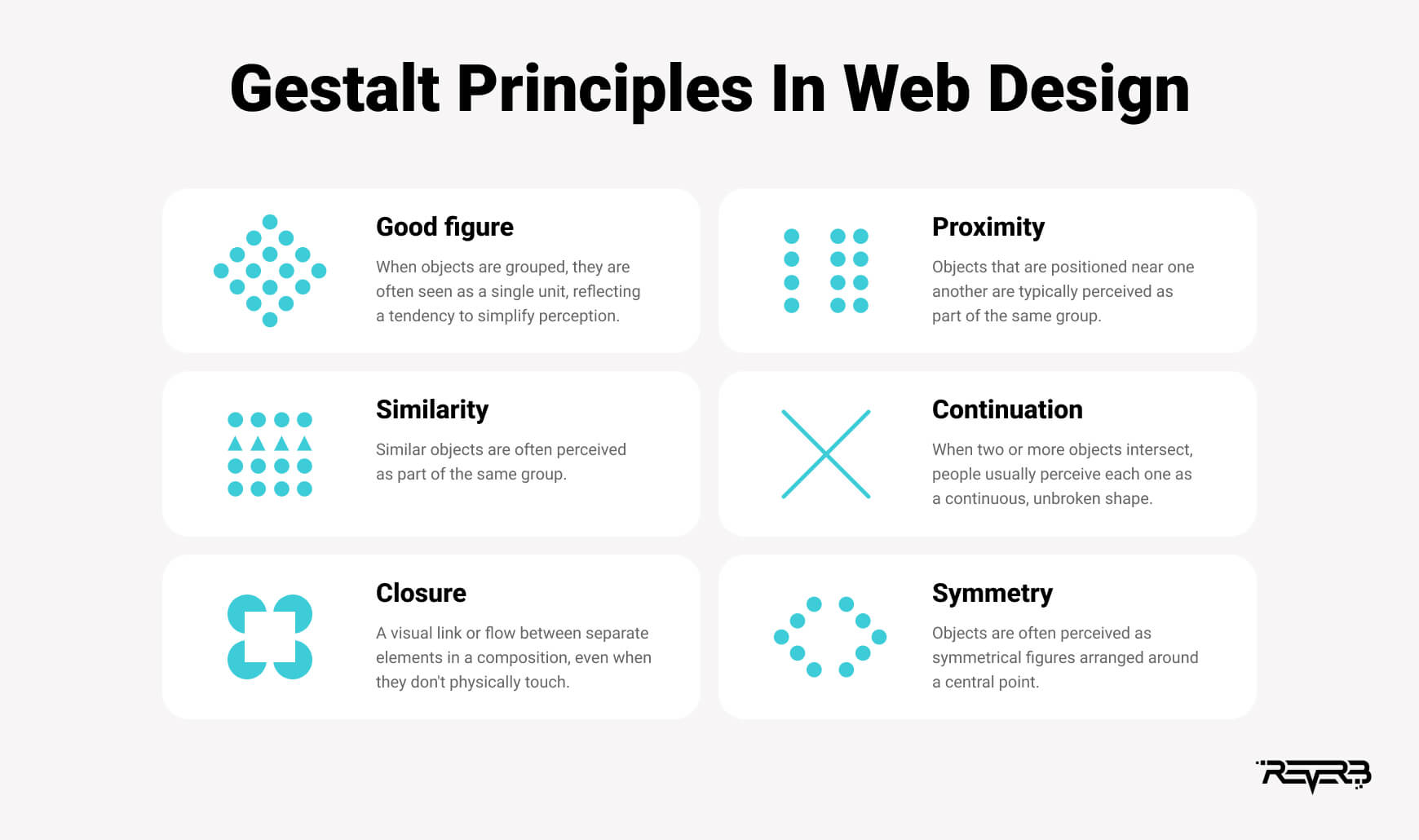
Over the years, graphic designers have adopted the Gestalt Principles to create well-placed elements. The Gestalt Similarity Principle — one of over 10 Gestalt Principles — has been especially useful for designers who combine multiple visuals to achieve a specific goal. It claims that a user’s mind will group certain elements together if they share the same characteristics.
Applying the Similarity Principle may entail grouping visual elements by color or shape. For instance, designers may prefer to use blue for all hyperlinks, making them appear similar despite having different text. The same principle can be applied to designing CTAs, where you use price sections with the same size and color.You can also place a dissimilar object next to a unit of similar shapes to draw user attention and create design focal points.
Conclusion
Modern web users want information and want it quickly. To improve conversion rates, this is a convenience you have to consider. You may put lots of effort into SEO and social media without enhanced conversion rates, all because your website design is unsatisfactory. Implementing the above-listed tips should help your site appear better to first-time visitors, reduce bounce rates, and improve conversions.