Small and medium business (SMB) owners know they must stand out from the competition to grow their customer bases.
Your logo serves as the first impression your brand makes. Consider all the places you use the emblem–social media, website, letterhead, and storefront signage.
A logo is a small design but has to do duty in many areas. It must embrace the brand’s personality, explain what the company offers, and be unique from others in the same industry. Ensuring you incorporate the correct elements to hit all the notes is complex.
Fortunately, there are some common elements almost all logos have that you can apply to your design to make it captivating and memorable.
The Anatomy Of A Logotype: 6 Essential Elements
1. Images
Sometimes, you’ll work with a wordmark logo without additional images, but you should still know how to incorporate symbols into excellent logo design.
In the 2024 Guide to the State of Design, researchers point to the 473% increase in concept art from 2022 to 2023, making it the fastest-growing asset type. Complex vector art is more precise for projects that must scale, such as logos.
Keep the overall design simple, even when utilizing images with layered visuals. People should know the company and industry when they glance at the symbol. Avoid making the user think too hard about what the logo means.
The brand uses the image of a key to show the industry they’re in. Real estate brands may specialize in commercial or residential properties. By embracing a skeleton key symbol, they cater to their users, who access listings via their website. They might have an older home in an up and coming neighborhood available. Consider what images match your industry when choosing graphics. People associate keys, houses, and for sale signs with real estate professionals.
2. Font
Fonts have personalities. If there is any text in your design, consider the font’s tone. The typeface must also be readable at large and small scales. If you want a more formal look, go with a serif font. A modern option is a sans serif.
You can use scripts and decorative fonts, but make sure they are readable in different mediums. If your brand is fun and hip, use a modern font with accents. Businesses such as financial services should adopt a serious tone and choose a font with serifs and little decorative detail.
See how Lee & Birch, a small women’s clothing boutique in downtown St. Joseph, Michigan, skillfully applied fonts in its logotype.
The brand offers a modern, personalized shopping experience with six locations in western Michigan. The fashions are trendy, so the logo designer chose a modern sans serif font and no images for this emblem. The letters sit up close to the ampersand and have a stretched-out X-height to make the symbol stand out from other brands.
3. Color palette
Brands usually have a style guide and list their company color palette. Using the same shades makes it recognizable as part of their brand. There is an entire psychology behind color choices and the typical emotions they evoke.
Some research shows that around 90% of the first impression a brand makes on consumers ties into color choices. For example, red can make people feel excited. People often see black as formal.
That’s how The Paper Tigers created their logo, embracing a beautiful gold double tiger image.
The gold has a regal look and pops against the neutral background. Although they place a wordmark next to the emblem, the two images are separated, giving them more flexibility on when and how to use the logo design. What’s more, as the logo was created as an SVG, it scales up or down regardless of your device’s screen size.
4. Hidden meanings
The logo’s design can be subtle, too. Many logo designers go with a hidden meaning to send a subliminal message. Consider the company’s unique value proposition. If they’re known for speedy service, slant the letters slightly and make lines shooting off to the side to signify movement.
The company offers first aid products. The red aid symbol makes sense for the industry they’re in. However, if you look closely, you’ll see that the right side bottom is a bit thinner and stretches longer than on the left. This makes the letter L part of the symbol.
The design repeats the L in blue and spells out the rest of the company name in the white space between the two red L’s. The design is genius, telling what the company does while also reinforcing the first letter in the brand’s name.
5. Uniqueness
The best logos stand out because they differ from others in the industry. While Coca-Cola and Pepsi both embrace the color red, they combine different shades alongside it. They use varying fonts, placement and spacing. The Pepsi logo uses a sans serif typeface. Coke uses a script.
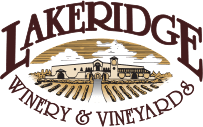
Similarly, Lakeridge Winery & Vineyards has a logo that stands out from other wineries surrounding them in Florida.
Note the image in the center sketching their operation. The bold, serif font is still readable but incorporates a larger L and E to add some visual interest. The ampersand and some of the letters on the bottom are intricate enough to grab attention.
6. Evergreen
The best logos are timeless. They don’t need a redesign every year. Instead, the logo design incorporates the overall mission of the company. Logo designers should avoid trending topics or fashions to avoid an outdated logo in a few years. Just because everyone else adds motion to a graphic doesn’t mean you must do the same.
A good example here is Maxwell Groves Country Store with a timeless logo that will work for them for decades to come.
The orange color is a nod to the orange grove farm the family runs. You approach the little country store with rockers on the front porch and an occasional family dog wiggling up to greet you, encouraging you to feel at home and stay a while.
Inside the store are free samples of orange juice and orange-flavored soft serve as imagined in their logo. Although the ring in the logo is a bit more modern, it is a simple enough design to stand the test of time. Avoiding trendy elements keeps a design evergreen.
Making Your SMB’s Logo Design Stellar
With more designers turning to AI logo design tools and many companies coming online, standing out can be more challenging. Stick to essential elements of good logo design and stay true to your company’s personality, and you will wind up with a symbol that leaves a memorable first impression.
The more you use your logo, the more people associate it with your brand and all the positive experiences they’ve had there.