CTA Buttons: The Secret Ingredient To Effective Online Sales
Dominic Tarn
Head of Content - ReVerb
03.10.2023
Have you encountered some of those irresistible CTA buttons that seem to know just how to get you to make a purchase or sign up? They’re extremely effective, but not by pure luck or coincidence.
Behind each successful CTA button is a blend of precision, carefully chosen text, and a dash of psychology. And while many of us are familiar with the basics, the world of CTAs is ever-evolving, offering endless opportunities to learn and adapt.
For instance, did you know that personalized CTAs aren’t just slightly more effective? They’re a game-changer, performing a staggering 202% better than generic ones. Figures that testify to their strengths, like this one, continue to surprise even the pros who use them daily.
To give you a better sense of how persuasive they can get, we’ll embark on a journey to dissect the anatomy of the perfect CTA button and help you supercharge your online sales strategy.
8 Expert Tips To Create High-Converting CTA Buttons
1. Add icons
Icons, those tiny visuals accompanying your CTAs, can pack a punch when used right. They aren’t merely aesthetic additions – they’re functional elements that can reinforce your message and guide user behavior.
These visual elements speed up user comprehension and elevate CTAs by making them more visually appealing and reducing friction.
Whether bridging language gaps or aiding those who quickly skim through content, a well-chosen icon can be the difference between a clicked and a missed CTA.
Here are some tips on crafting your icon-infused CTAs:
Choose easily recognizable icons. If users have to think too hard about an icon’s meaning, it defeats the purpose.
Ensure your icons follow a consistent style and size. This ensures your CTAs aren’t competing with each other.
Like any other CTA strategy, it’s vital to A/B test different icons to see which resonates most with your audience.
Example:
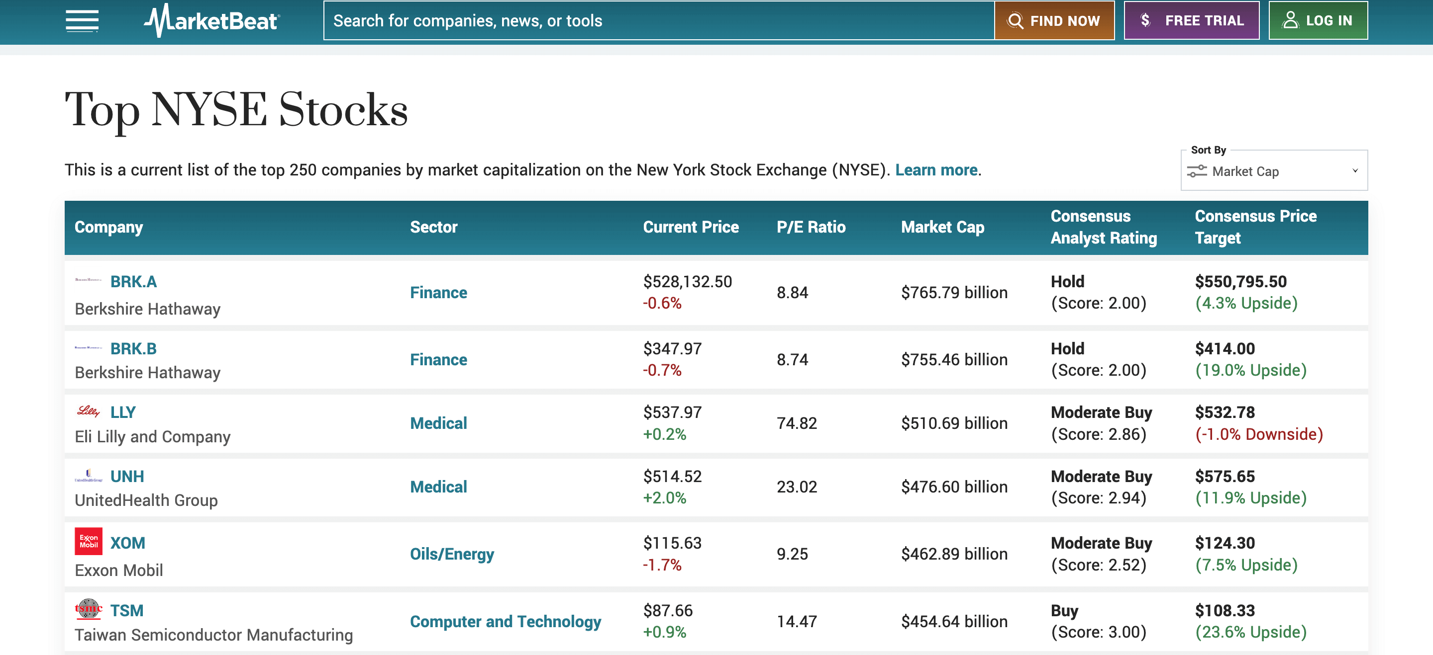
MarketBeat, a leading player in stock market news and research tools, nails this approach, as evident on their “Top NYSE Stocks” page.
Instead of relying purely on text, each CTA in their header pairs with a self-explanatory icon:
Searching for something? You’ll find a CTA adorned with a magnifying glass.
Tempted by their free trial offer? The “$” sign makes its value proposition clear.
Need to access your account? The “Log In” CTA with a person icon welcomes you in.
These aren’t just random selections. Each icon serves to clarify the CTA’s function, reducing any guesswork for users.
2. Harness subtle urgency
Creating a sense of urgency can be a powerful motivator in decision-making. Yet, it’s crucial to strike the right balance – not too aggressive that it scares potential customers away, but just enough to nudge them into taking prompt action.
Subtle urgency doesn’t scream “BUY NOW OR MISS OUT!” Instead, it whispers, “This is an opportunity you might not want to wait on.” It’s a softer sell, relying more on the fear of missing out than on high-pressure tactics.
Perfect the art of subtle urgency by:
Crafting smart text. Use phrases like “Claim Deal,” “Secure Offer,” or “Limited Time” to suggest there’s a window of opportunity, but it might not last forever.
Use visual indicators. Employ icons like ticking clocks or hourglasses to reinforce the temporal aspect without being too on-the-nose.
Follow through on your promises. If you’re indicating a limited-time deal, ensure the deal does have an end date. Trust is essentialfor boosting sales.
Example:
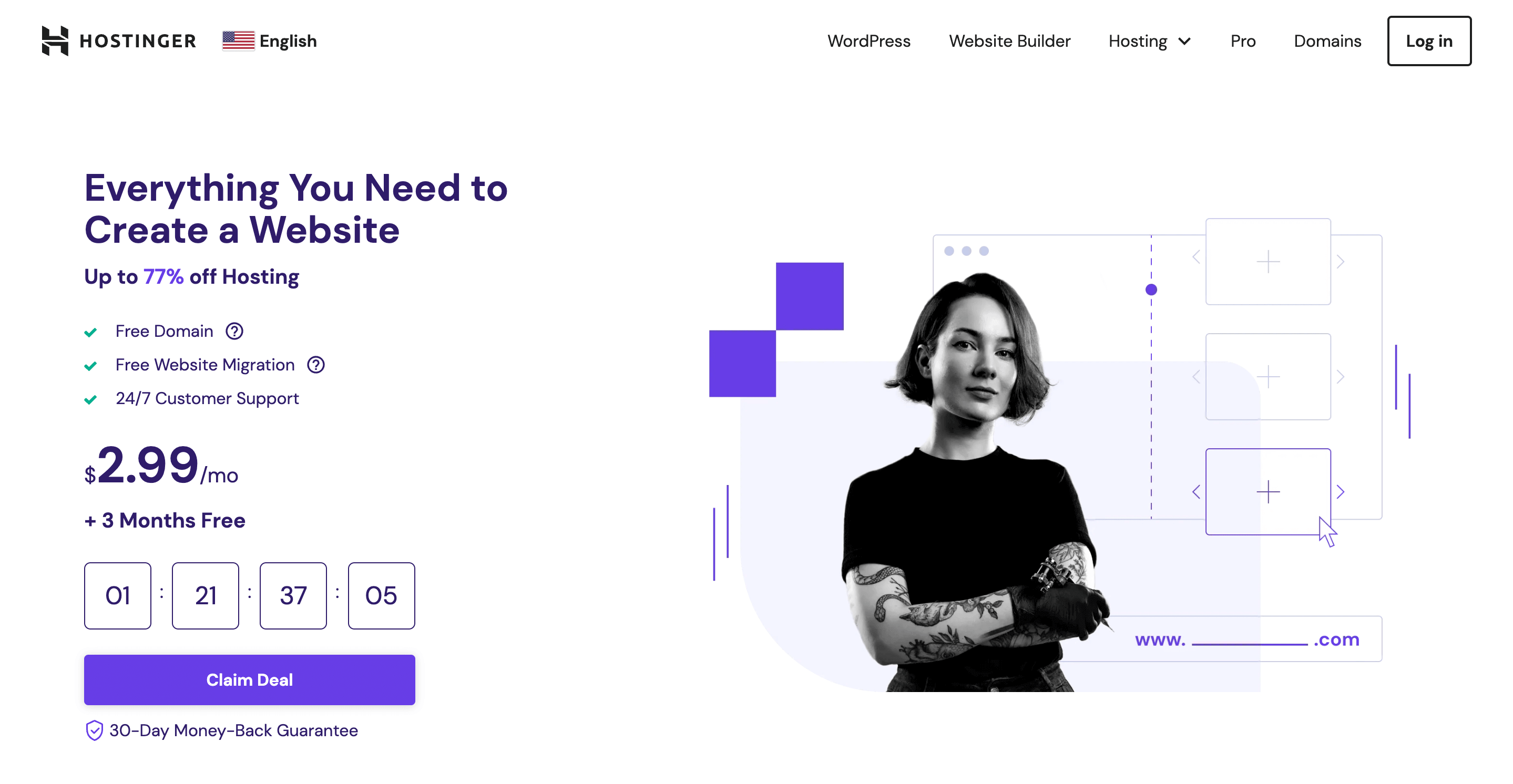
Take Hostinger, a leading web hosting service provider, as an illustrative example. Upon landing on their homepage, visitors are met with a compelling CTA titled “Claim Deal.” Customers can easily be overwhelmed with web hosting options, but Hostinger uses this CTA to immediately steer them toward a decision.
What amplifies the urgency is the timer placed just above it, counting down the seconds and minutes the deal remains available. It’s neither loud nor pushy but rather a subtle reminder that time is of the essence. And when users sense the window of opportunity is closing, they’re more inclined to jump in and claim that deal.
This clever tactic generates a nudge, enticing readers to act promptly, believing they’re getting a special deal that might not be around forever.
3. Inject personality
In the vast digital sea of “Click Here” and “Learn More” buttons, there’s an opportunity to be unique and memorable. Adding a dash of personality to your CTAs can make them stand out and foster a stronger connection with your audience.
So, what’s the magic behind personality-driven CTAs?
Memorability. Unconventional, quirky CTAs are more likely to be remembered than mundane ones.
Branding reinforcement. Personalized CTAs can echo your brand’s voice and values, strengthening brand recognition.
Emotionally engaging. A fun or witty CTA can evoke emotions, and emotional engagement often drives action.
Crafting these charismatic CTAs involves a bit of strategy. Here are some pro-tips:
Stay authentic. It’s essential to ensure your quirky CTAs align with your brand’s voice. They should feel organic, not forced.
Gauge and adjust. A/B tests different CTAs to see how your audience vibes to various tonal shifts.
Use them sparingly. Personality-packed CTAs are impactful, but overuse can dilute their sparkle. It’s all about finding the sweet spot.
Example:
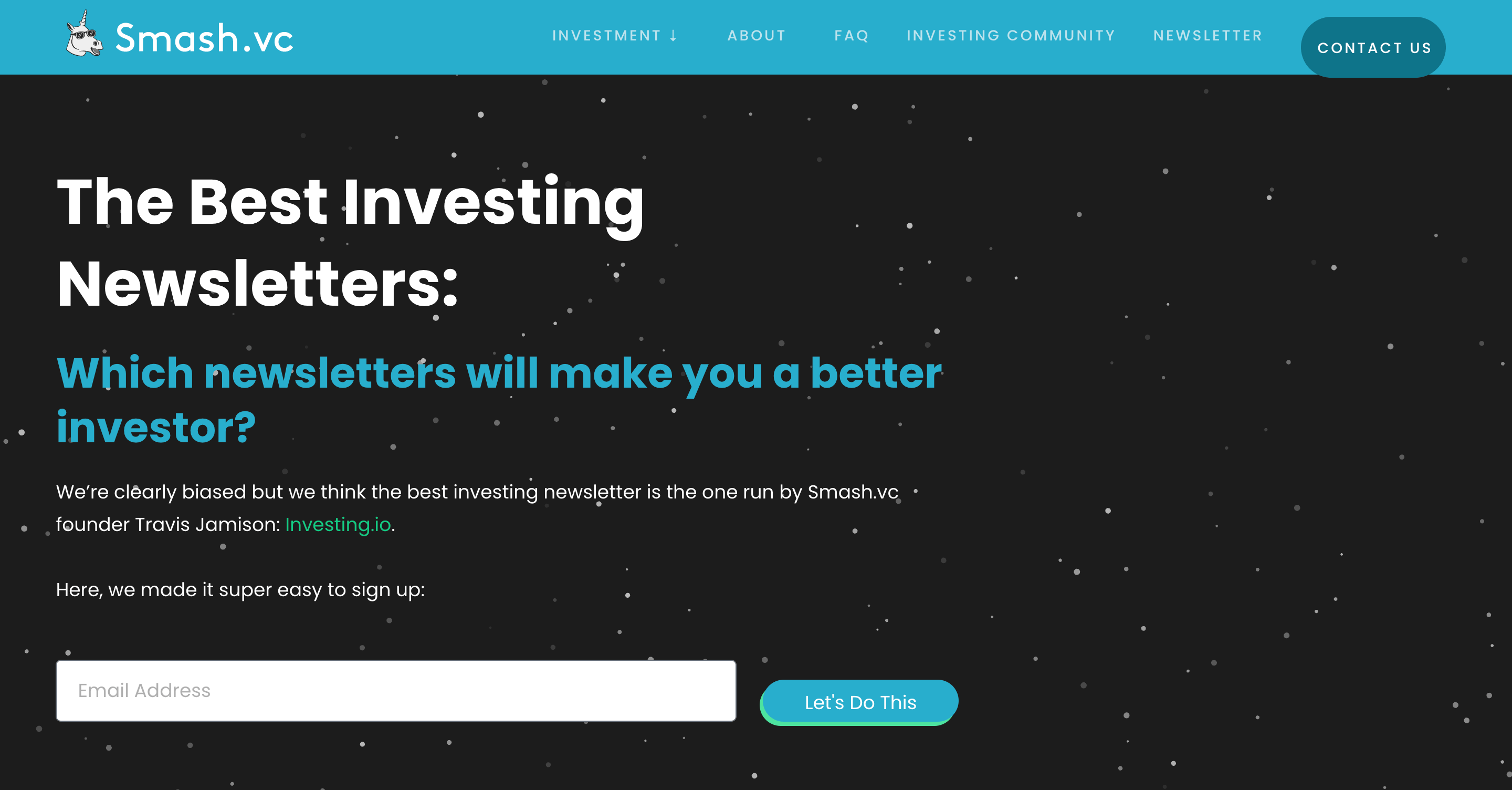
Enter Smash.vc, a renowned investment firm for small businesses. Their partnership with Investing.io for an investment newsletter is a great case in point.
At the beginning of their best investing newsletters post, they encourage readers to sign up for their newsletter with a CTA that confidently says, “Let’s Do This.”
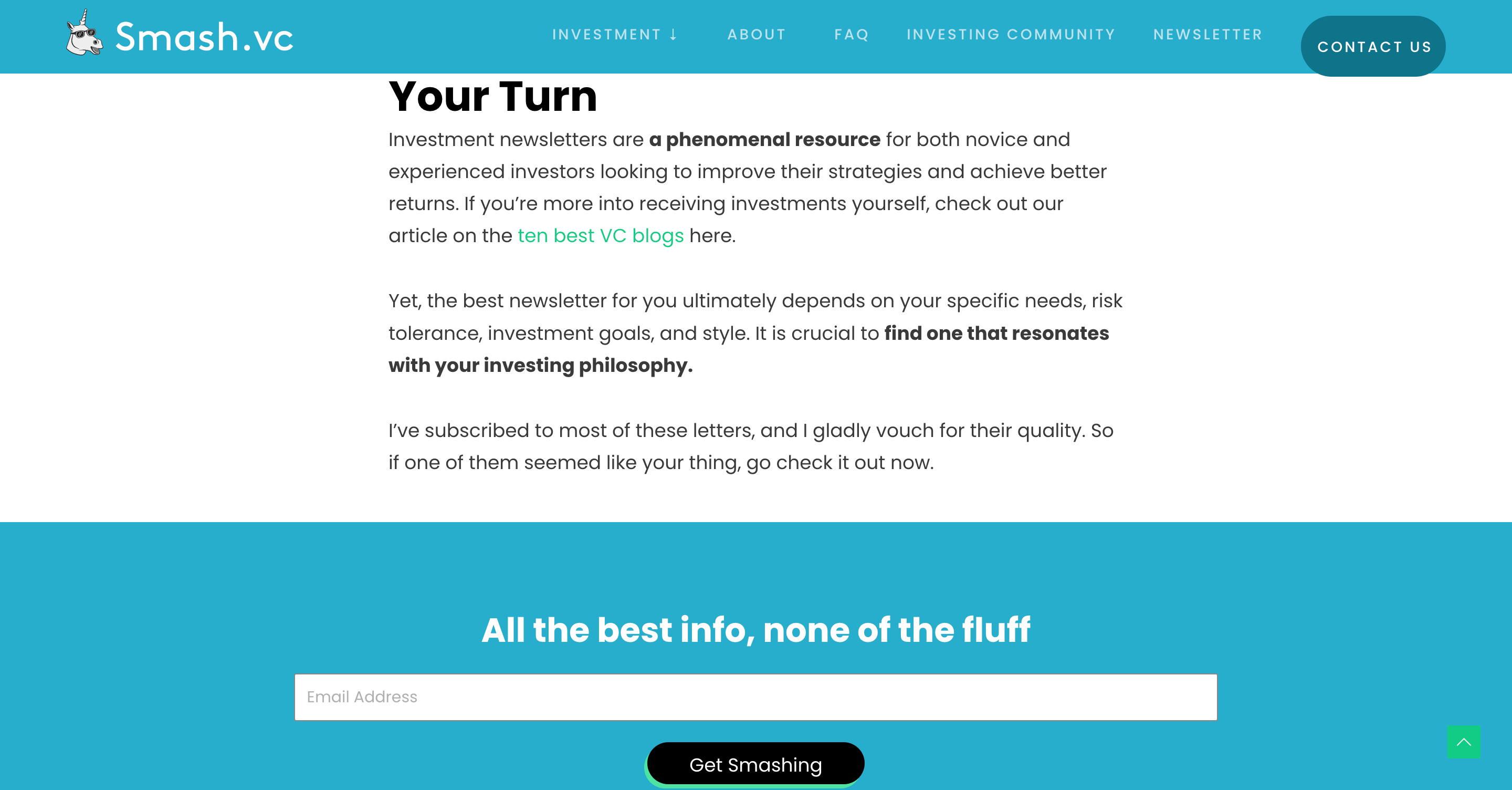
And by the end, they send them off with a cheeky “Get Smashing.”
Neither of these CTAs fall into the typical, often overused phrasing we see online. They’re fun, they’re distinctive, and most importantly, they’re true to Smash.vc’s brand ethos.
4. Leverage full descriptive text labels
Short and snappy CTAs can often do the trick. But sometimes, there’s immense value in giving your users more specific information right from the outset.
CTAs with full descriptive text labels are great for several reasons:
Showing clear intent. Users want to know what to expect when they click a button. A descriptive label like “Download Your Ebook Now” is far more transparent than a mere “Download” or “Click Here.”
Reducing user hesitation. When users are certain about the outcome, they’re more likely to take action. Ambiguity can deter potential clicks.
Enhancing user experience. A detailed label can guide a user through a process smoothly, making navigation intuitive and user-friendly.
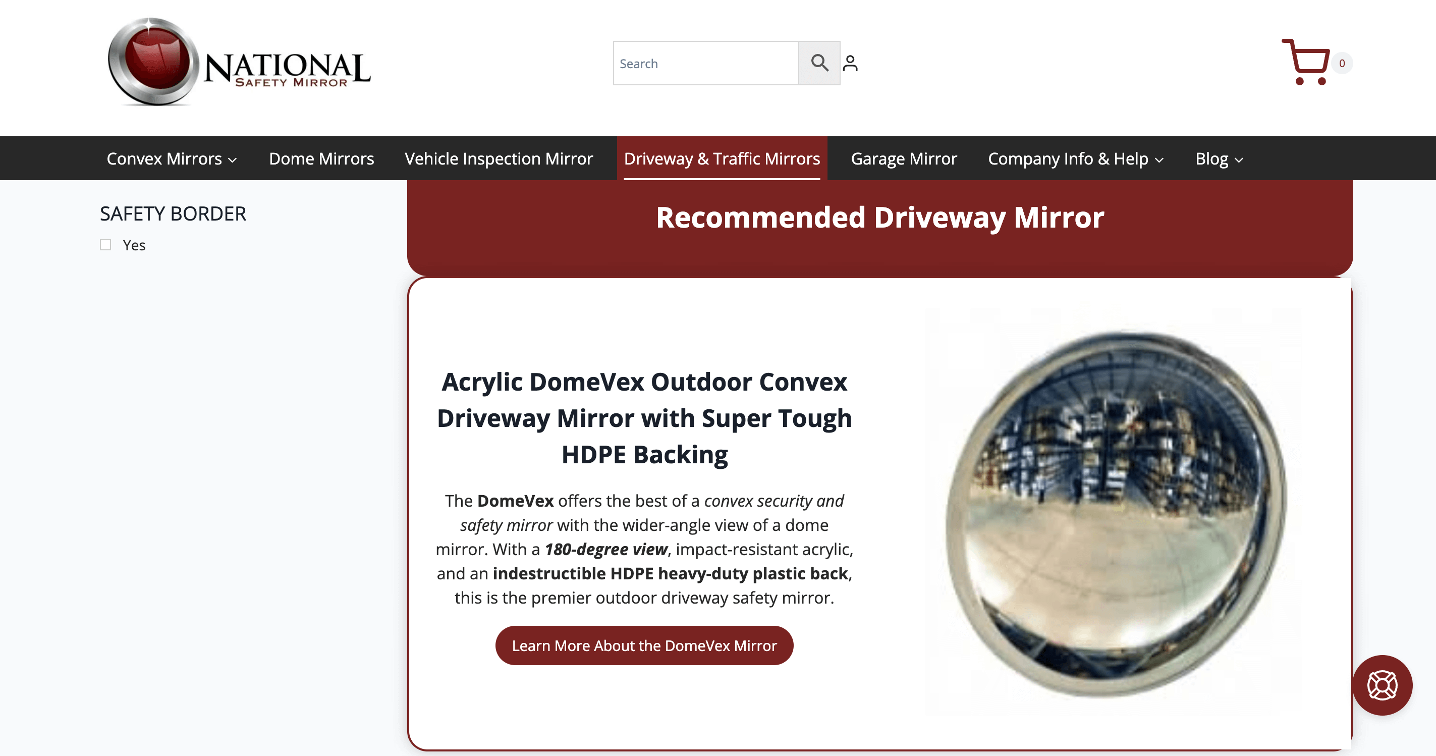
Example:
National Safety Mirror, a major distributor of safety mirrors, shows how a bit more text can make a big difference. On their “Driveway and Traffic Mirrors” category page, they’ve sidestepped generic CTAs.
Instead of a bland “Learn More,” they’ve opted for “Learn More About the DomeVex Mirror.”
What’s the advantage? This CTA:
Gives users a clear picture of what they’ll discover next.
Caters to those specifically interested in the “DomeVex Mirror,” filtering out uninterested visitors.
Positions the product prominently, emphasizing its importance.
5. Highlight price value
One of the pivotal steps of online marketing is communicating the value of what you offer. And when it comes to CTAs, highlighting the price value can be the perfect move to inspire users to take action.
By focusing on value and affordability, you’re addressing a fundamental consumer concern: “What’s in it for me, and at what cost?”
This is why price value matters in CTAs:
Showing a clear value proposition. When users instantly see the value they’re getting, especially at an attractive price, it can spur immediate interest and action.
Counteracting price hesitation. By being upfront about the price, especially if it’s a deal, you eliminate the mystery and potential hesitation associated with hidden or unclear costs.
Promoting transparency. Showcasing the price or a special deal in your CTA establishes trust, positioning your brand as transparent and upfront.
Example:
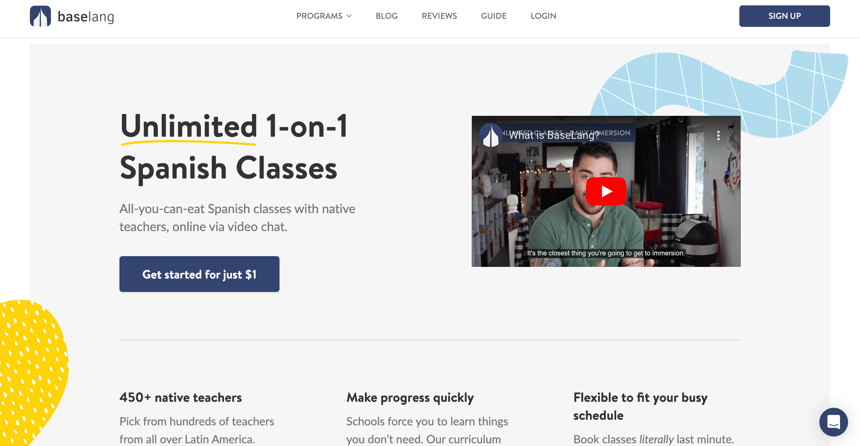
BaseLang, a well-known platform offering Spanish tutoring, utilizes this tactic impeccably. Instead of just inviting users to “Sign Up,” their homepage header proudly announces: “Get started for just $1.”
The implications of this CTA are clear:
Immediate recognition of value. The low price tag instantly catches the eye and underscores the value of giving their service a try.
Diminishing risk perception. A $1 entry point minimizes perceived risks, making users more willing to try out the service.
Stirring curiosity. Such an offer piques one’s curiosity. Users might think, “What kind of quality tutoring can I get for just $1?” prompting them to explore further.
6. Utilize action-packed verbs
A compelling CTA doesn’t only tell users what they can do – it propels them to take action. One of the prime ways to achieve this is by starting your CTA with a vigorous, action-packed verb.
These verbs infuse your CTA with energy, creating a sense of momentum that can be hard for users to resist.
Here’s why action-packed verbs can elevate your CTAs:
Dynamic verbs grab attention instantly, compelling users to take the next step.
They make it abundantly clear what you want the user to do and what they stand to gain or achieve by doing so.
They create a sense of excitement or promise about what’s to come.
So, how do you integrate these vigorous verbs into your CTAs?
Be direct. Choose verbs that directly relate to the desired action or outcome. “Unlock,” “Discover,” “Join,” and “Grab” are all direct and action-oriented.
Stay relevant. Ensure the verb aligns with your service or product. For instance, “Listen” would work better for a music app than “Watch.”
Avoid jargon. Use verbs that are universally understood. Stay away from industry-specific terms unless you’re certain your audience will understand.
Example:
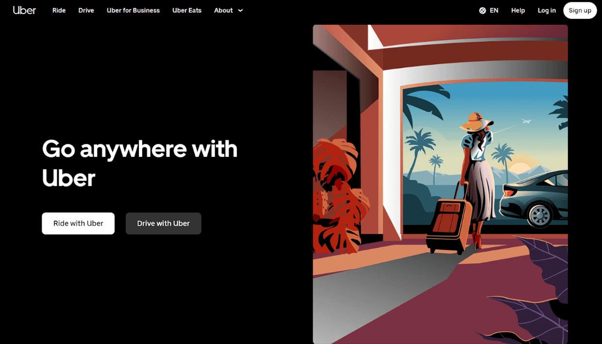
Uber, the global ride-hailing titan, provides a masterclass in this tactic. Instead of generic CTAs like “Get Started” or “Join Us,” they’ve chosen verbs that not only denote action but also seamlessly integrate with their core service.
“Ride with Uber”: This CTA isn’t just about using Uber. It’s about embarking on a journey, emphasizing the convenience and ease of the experience.
“Drive with Uber”: Here, Uber appeals to potential drivers by positioning the action of driving not just as a job but as an active partnership with the company.
7. Talk in first person
Sometimes, the best way to engage users is to let them see themselves in the action. Shifting from the generic second or third person to the first person in CTAs can create a tailored, immediate experience for the user.
This perspective resonates deeply with users and helps foster an immediate sense of ownership. It also clarifies the CTA’s intent, reducing ambiguity.
To successfully use the first-person perspective in your CTAs:
Be empathetic. Understand the user’s primary needs or desires and mirror them in the CTA.
Stay authentic. Ensure the CTA’s promise aligns with what’s delivered post-click.
Test and refine. A/B tests first-person CTAs against other versions to gauge their effectiveness for your specific audience.
Example:
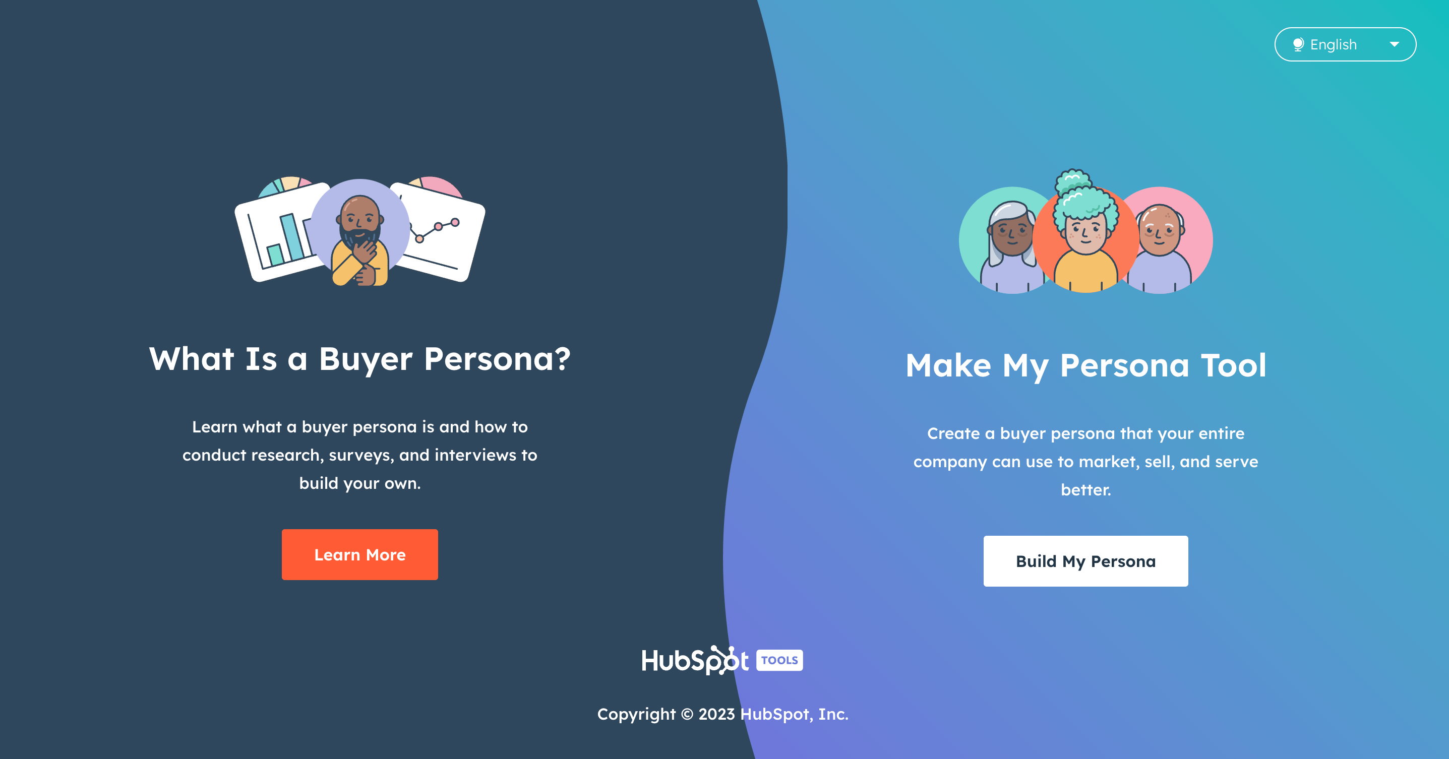
Make My Persona, a HubSpot tool for creating detailed buyer personas, demonstrates the power of first-person CTAs with their CTA, “Build My Persona.”
This CTA shines due to its user-centric emphasis, catering to individual needs. The inclusion of “my” fosters a sense of user-driven action and commitment, while the clear messaging underscores that a click will lead users to craft a tailored buyer persona for their business.
8. Employing color psychology
The hues that adorn your CTAs can wield a profound impact, not because of the inherent power of any single color, but because of the relationships and contrasts they form with surrounding elements.
The principle of color psychology in marketing suggests that colors can evoke specific emotions and behaviors. Yet, it’s essential to note that no magic color guarantees a higher click-through rate for every CTA.
Here’s how to navigate the colorful world of CTAs:
Contrast is key. The CTA button should stand out but not clash with the background. Choose colors that pop against the webpage’s overall color palette.
Stay brand-consistent. While the CTA should pop out, it should also align with your brand’s colors and identity. This ensures recognition and trust.
Mind cultural differences. Colors might have varying connotations across cultures. Always consider your target audience’s cultural background when making color choices.
Test, test, test. Always A/B test different color combinations to find what works best for your specific audience and context.
In essence, there’s no universally “best” color for a CTA. Instead, it’s the contrast and integration with the surrounding design that determines its effectiveness.
The true magic lies in how the color of your CTA reshapes the visual hierarchy of your page, directing users’ eyes right where you want them – to the call to action.
Conclusion
Crafting an effective CTA is an art, marrying both design and psychology to guide users toward taking a desired action.
From the words you choose to the colors you employ, each element plays a pivotal role in the overall user experience and the success of your conversion efforts.
Remember: While individual tactics and strategies offer valuable insights, it’s the holistic approach (understanding your audience, testing variations, and refining based on feedback) that truly makes a CTA shine.
As you journey through the world of online marketing, let these guidelines illuminate your path, ensuring your CTAs not only capture attention but also hearts and minds.
Wonder how you can make your call-to-actions even more compelling and high-converting? Get assistance from our professional team of writers and marketing experts. We’ll help you create content that will leave no one indifferent and boost your sales!