eCommerce Product Category Pages: 6 Common Mistakes And How To Avoid Them
Dominic Tarn
Head of Content - ReVerb
20.05.2024
You’ve spent countless hours perfecting your online store, curating the perfect product selection, and fine-tuning your branding.
But even the most carefully designed eCommerce site can fall flat if the product category pages aren’t up to snuff. Product category pages are the backbone of your online shopping experience, guiding customers through the exploration and discovery process. Fail to optimize them, and you’re leaving money on the table.
From overcrowded designs to underwhelming product descriptions, there are many pitfalls, but they are avoidable. In this guide, we’ll walk through six frequent mistakes that can sabotage product category pages. More importantly, we’ll teach you how to sidestep all of them with finesse.
Let’s deliver a top-notch user experience that keeps customers coming back for more.
6 Most Common Mistakes That Can Sabotage Product Category Pages
Mistake 1: Ignoring social proof
Social proof can be your silent salesman wherever you place it. But, by overlooking it on your product category pages, you’re missing a crucial opportunity to boost trust and conversions. About 98% of shoppers read online reviews when deciding whether to buy or not. Without including yours, you risk appearing less credible and may lose potential sales to competitors who cleverly leverage social proof.
Solution: Showcase ratings and reviews on category pages
To harness the power of social proof, start by integrating star ratings and customer reviews directly on your category pages. This simple visual endorsement can significantly influence browsing behavior and purchase decisions.
Ensure these elements are immediately noticeable, and consider including a small number of standout reviews for high-ticket items or bestsellers.
How to get it right:
Display an average star rating near the product name or price to catch the shopper’s eye.
Select a few high-quality, detailed customer reviews to feature prominently on the page.
Show real-time notifications like “5 people just bought this product” to add urgency and validate the crowd’s choice.
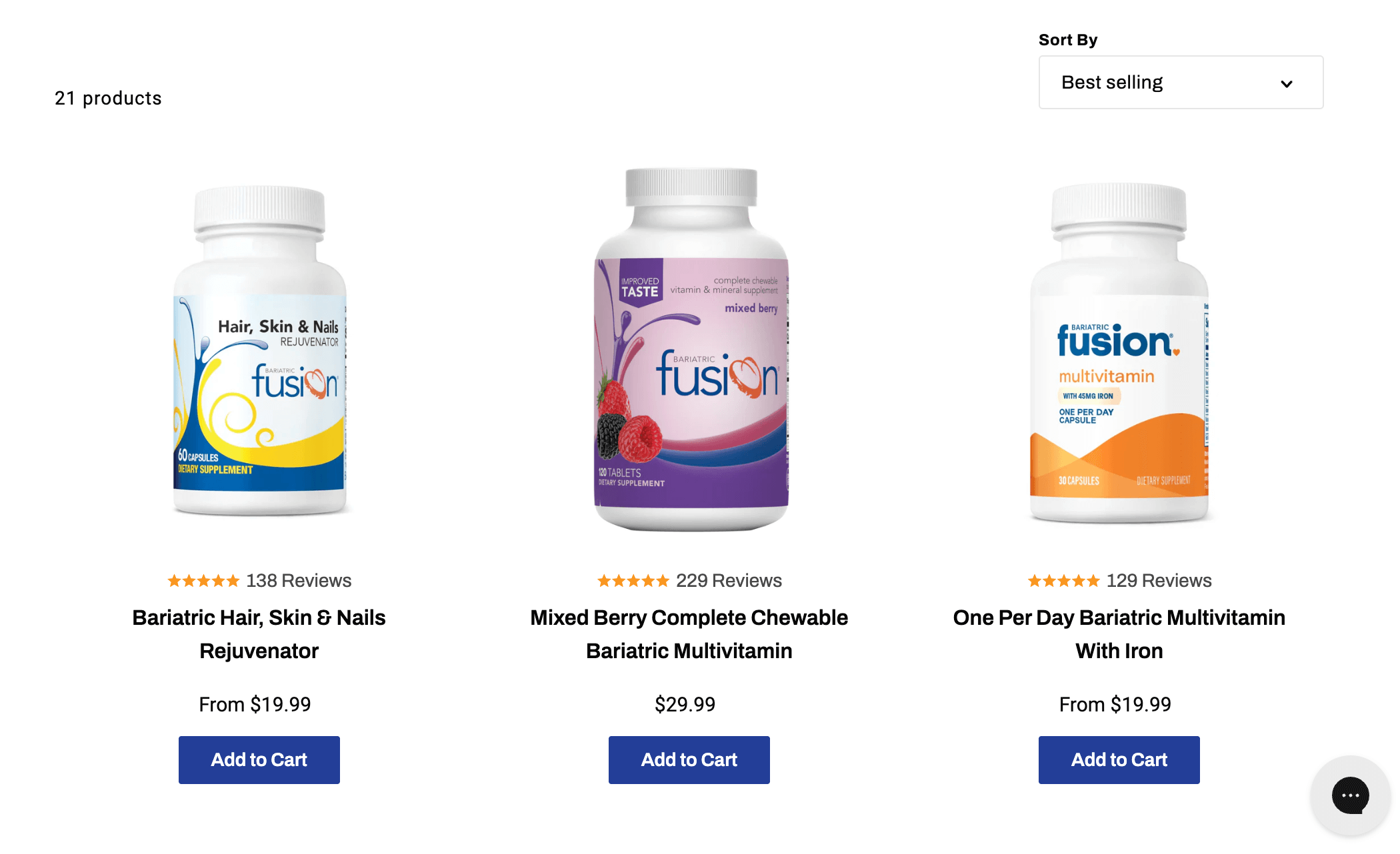
A great example of social proof done right is Bariatric Fusion. Specializing in weight loss supplements, this brand enhances its category page for roux-en-y gastric bypass vitamins by placing star ratings and the number of reviews directly below each product title.
This strategy boosts visibility and instantly communicates customer satisfaction, encouraging new visitors to explore further and trust the brand.
Their approach shows a direct correlation between visible social proof and increased customer engagement, leading to higher sales conversions. By following these practices, any eCommerce business can replicate this success, turning casual browsers into confident buyers.
Mistake 2. Not addressing typical conversion obstacles
Failing to address the most pervasive hurdles to conversion directly on your category pages can leave potential customers hesitant and likely to abandon their shopping journey. When working with ecommerce platforms like Shopify, a Shopify CRO guide can help outline how addressing these friction points improves the overall customer experience. Obstacles like unclear shipping costs, security concerns, and return policies can quickly deter even the most interested buyers. By not tackling these issues upfront, you risk losing sales to competitors who make this information readily accessible and clear.
Solution: Implement trust badges and clear policies
To overcome this hurdle, strategically place trust badges and concise policy statements on your category pages.Trust badges that affirm secure checkout, free shipping, price guarantees, and more can significantly alleviate shopper anxiety and boost confidence in making a purchase.
How to get it right:
Use well-recognized symbols for secure checkout, SSL encryption, and money-back guarantees. Position these badges prominently so they’re immediately visible without scrolling.
Provide short, clear descriptions of your shipping, returns, and security policies. Link these summaries to more detailed pages for shoppers who seek further information.
If you offer special features like price matching or free returns, make sure these are highlighted on your category pages to stand out.
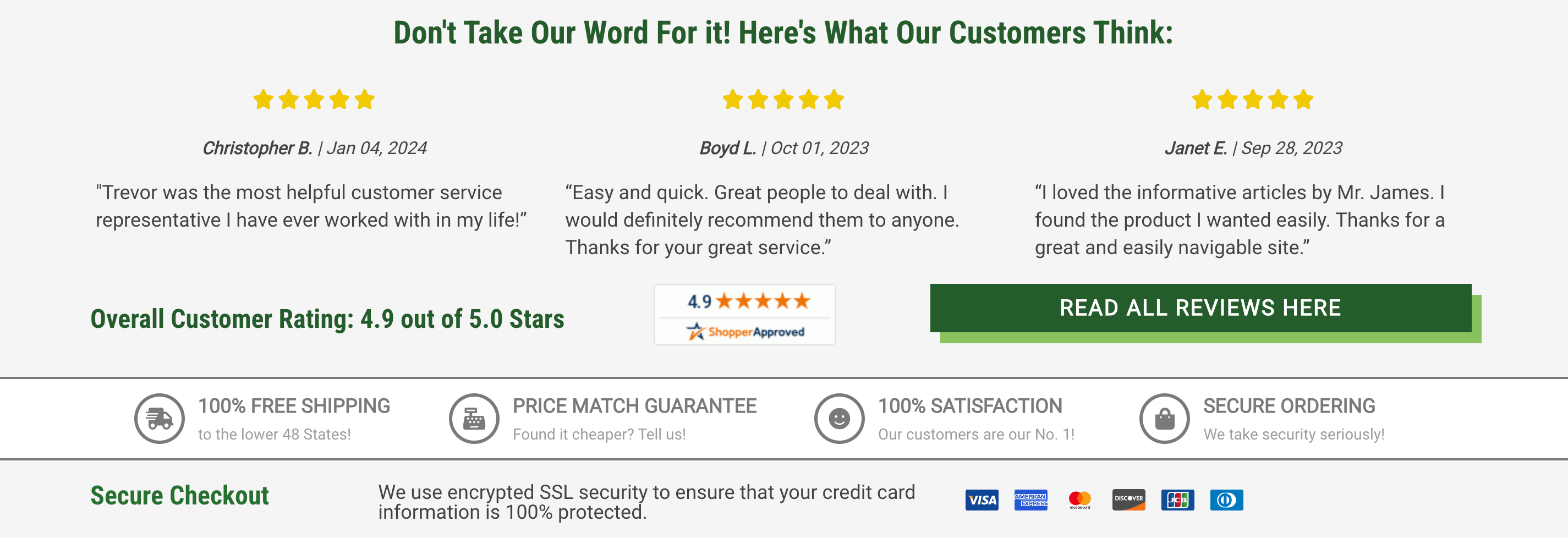
Greenhouse Emporium, which sells gardening supplies and greenhouse structures, shows how to effectively address conversion obstacles. On their category page for Victorian greenhouses, they display several trust badges that reassure customers about free shipping, price match guarantees, secure ordering, and SSL encryption.
These badges are strategically placed to catch the eye immediately upon page entry, offering instant reassurance about the safety and benefits of shopping with them. Such clear, confidence-boosting elements can be vital in converting browsers into buyers.
Mistake 3. Restricting product thumbnails to a single perspective
Limiting product thumbnails to just one angle on your category pages might seem streamlined, but it restricts customers from getting a comprehensive view of what they’re considering buying. This lack of visual information can lead to uncertainty and hesitation, which often results in lost sales. Shoppers today expect an online shopping experience that mimics the in-store feeling of examining a product from all sides.
Solution: Offer multiple views and interactive thumbnails
Enhance the shopper’s experience by incorporating thumbnails that offer multiple perspectives and interactive elements. This approach mirrors the tactile experience of shopping in a physical store and can significantly increase the buyer’s confidence in their purchase decision.
How to get it right:
Provide thumbnails that showcase various angles of the product and give users the ability to expand images for a closer examination. Allow these to be viewed by hovering over or clicking to cycle through different views.
Implement hover effects that switch product views, such as showing the back or side or even the product in use.
Ensure all images are high-resolution and load quickly to maintain a smooth user experience.
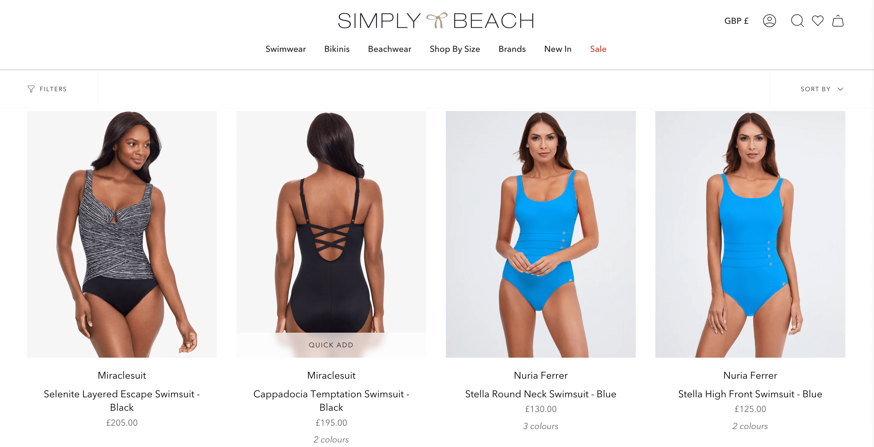
Simply Beach, a swim and beachwear online retailer, masterfully applies this strategy on their swimwear for tummy control category page. They enhance their product listings by providing a secondary view of each swimsuit that appears when a user hovers over the thumbnail.
This additional rear view offers a more detailed look at the product’s fit and style, which is particularly important for apparel where fit is a key concern. This tactic makes it easier for customers to make informed decisions, thereby increasing their confidence to make a purchase.
Mistake 4. Cluttering the page with always-visible filters
Overloading your category pages with always-visible filters can overwhelm your customers and detract from the main attraction: your products. When shoppers are bombarded with too many choices upfront, it can lead to decision fatigue, making them more likely to leave the site without making a purchase. A cleaner, more focused layout invites exploration without confusion, ensuring users find what they need without feeling overwhelmed.
Solution: Enable collapsible filters
To streamline the browsing experience while still offering comprehensive filtering options, use collapsible filters. This allows shoppers to access detailed filtering options only when they need them, keeping the interface clean and focused on the products.
How to get it right:
Organize filters into a collapsible panel that users can expand or hide at will. This keeps your page neat and prioritizes product visibility.
Use clear, intuitive icons and labels for expanding and collapsing filters, ensuring users understand how to access the filter options.
Allow the site to remember the user’s filter preferences during their session to facilitate seamless shopping without needing to reapply filters repeatedly.
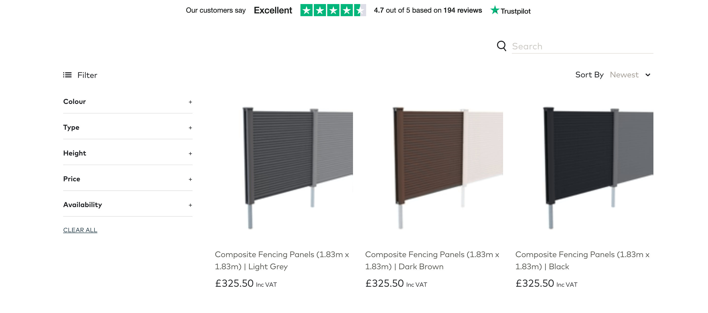
Ovaeda, a company specializing in products for outdoor living spaces, demonstrates this strategy on their category page for composite fence panels. Despite offering a wide range of filters to help customers narrow down their choices, Ovaeda opts to collapse these options into a discrete menu.
This design choice ensures that the filters are accessible without cluttering the page or overwhelming the shopper with options upon arrival.
The result is a clean, user-friendly browsing experience that focuses users’ attention on the products while still providing all the necessary tools to find what they’re looking for.
Mistake 5. Underutilizing video demonstrations
Shoppers always demand more than just static product images. They crave immersive, dynamic visuals that truly bring your offerings to life. This is where videos jump in – they can vividly showcase features, demonstrate use, and convey the real-life appeal of products.
Statistics reveal that 82% of consumers feel more confident about purchasing a product after watching a video about it. Without these, your customers are left relying solely on static images and text, which might not fully capture the value of your offers.
Solution: Incorporate engaging product videos
Adding well-produced videos to your category pages can transform the user experience, providing a dynamic way to explore products and increasing the likelihood of purchase.
How to get it right:
Select a hero product or a typical example from the category to highlight in your video.
Ensure the video demonstrates the benefits and features of the product clearly and concisely.
Videos should be short (no longer than 1 to 2 minutes), load quickly, and not autoplay with sound to respect user preferences.
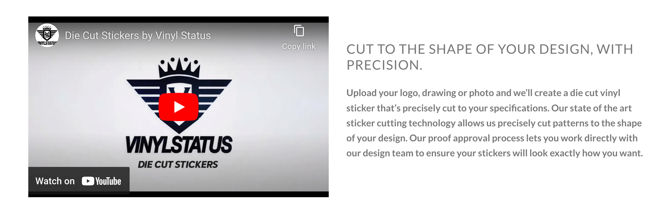
A great example that showcases the power of video is Vinyl Status, a custom sticker service. On their category page for custom trailer decals, they include a captivating video that shows the uses and benefits of their products. This draws attention while enhancing customer engagement by allowing potential buyers to see the expertise that goes into creating each sticker.
Watching examples of use helps customers appreciate the quality and customization of the product, thereby boosting confidence and encouraging purchases. This strategic use of video content significantly enhances the shopping experience and can lead to increased sales conversions.
Mistake 6. Failing to optimize category descriptions for search intent
Neglecting to optimize your category descriptions for search intent means you’re missing out on a key opportunity to connect directly with potential customers who are actively searching for products like yours.
Without SEO-optimized category descriptions, your pages might not appear in relevant search results, reducing your visibility and ability to attract targeted traffic. This oversight can lead to lower engagement and fewer conversions from users who are ready to purchase but can’t find you.
Creating category descriptions that align with search intent involves understanding the keywords your customers use and incorporating them into clear, concise, and engaging descriptions. This approach improves your pages’ search engine rankings and connects with customers by addressing their specific needs and interests.
How to get it right:
Identify high-impact keywords that potential customers use to find products in your category. Use tools like Ahrefs Keyword Explorer for in-depth insights.
Blend these keywords naturally into your category descriptions. Focus on making the content engaging and informative, not just keyword-stuffed.
Mention what sets your category apart, such as special features, benefits, or exclusive products.
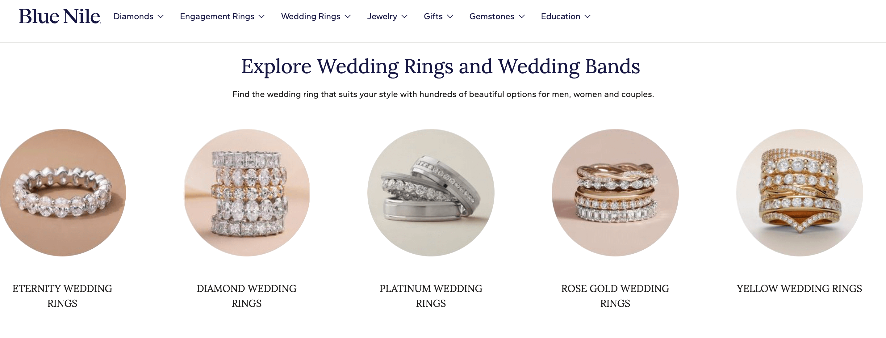
Blue Nile, a premium jewelry brand, does a great job in this regard on their category page for wedding rings. The description at the top of the page captures the essence of the products with carefully chosen keywords that resonate with prospective buyers.
This optimization enhances the brand’s visibility in search engines while perfectly introducing the range of its products, making it easy for customers to understand the value and uniqueness of their offers. With an intent-optimized category description, you’ll rank higher in searches, immediately convey relevance to prospective buyers, and set the stage for deeper product exploration.
Conclusion
Now that you’re equipped with these essential insights to refine your eCommerce product category pages, it’s time to take action. Start with one strategy, see the difference it makes, and gradually integrate more. Each step you take will bring you closer to turning casual browsers into loyal customers.