Nice To E-Meet You!


    What marketing services do you need for your project?


    Graphic Design Inspiration: Carrying Out a Beauty Transformation of Your Website

    Today’s web space is awash with variable information and marketing stimuli that make it challenging to stand out on the modern web.

    To create a distinguishable website that brings a clear message, designers need new approaches and fresh ideas. This year is about intuitiveness, user-friendliness, and impressive graphic design techniques. Splashing bold colors and making creative mixes not tried before are among the new trends.

    Can’t wait to see what awaits and get a dose of graphic design inspiration? Knock-knock! Open the door. The overarching website ideas and graphic design trends are ready to steal your heart.

    13 Amazing Graphic Design Ideas For Your Site

    1. Bold Colors & Simplicity

    Think of supersaturation. In conditions of tough competition, brands need to make bold design decisions and not hesitate to use courageous colors. Being loved and widely applied by web designers in 2019, the vibrant color palette is predicted to be popular in the next years too.

    Many brands use vivid and immersive colors as powerful attention-grabbers. Combined with other graphic design ideas, bold colors can contribute to an unforgettable brand image.

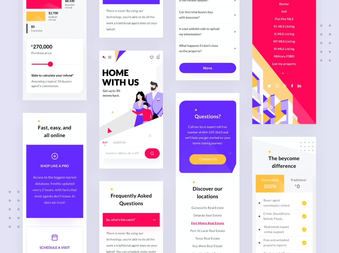
    Web design created by Taras Migulko is a great example of how a bright color palette can create a brand’s visual appeal.

    bold colors

    2. Fluorescent 3D Digital Artwork

    In 2020, futurism will become a new source of graphic design inspiration. You can implement your boldest futuristic concepts in web design by using 3D digital artwork. It will help you make your website look like eye candy if you use beautiful neon shades.

    Combined with fluorescent colors, 3D-rendered animation will add more personality and energy to your website. However, keep in mind that neon hues must be gradually scattered on a website not to overshade the primary color palette. They should look like a harmonious and logical complement to the main brand’s concept and style.

    On the Wix website, you can see how brilliantly they have implemented this graphic design trend.

    3. Animation and Interactivity

    Animation is forecasted to become one of the most popular graphic design trends.

    Motion graphic design is an engaging way to evoke web visitors’ interest and make the user experience even more immersive.

    There are many applications of animation in web design: from micro-interactions that provide feedback as you hover over the website elements to interactive typography, animated headers, and explanation videos.

    Some brands use animated videos, funny micro-interactions, and cute characters as the excuse for unpredictable website issues. For example, you can also use funny animation to make the waiting and loading website processes more pleasant for users. It helps eliminate negative user experience, increases the audience’s loyalty, and positively influences the overall brand’s image.

    Animated video makers can be used to create a variety of videos, including explainer videos, product demos, and marketing videos. They are essential tools for companies looking to create captivating and professional animations that effectively convey their brand’s message.

    Many companies produce animated explainer videos for their websites to communicate their values, emotions, and goals to customers. There is no better way to tell your brand’s story than do it through an eye-catching animated video.

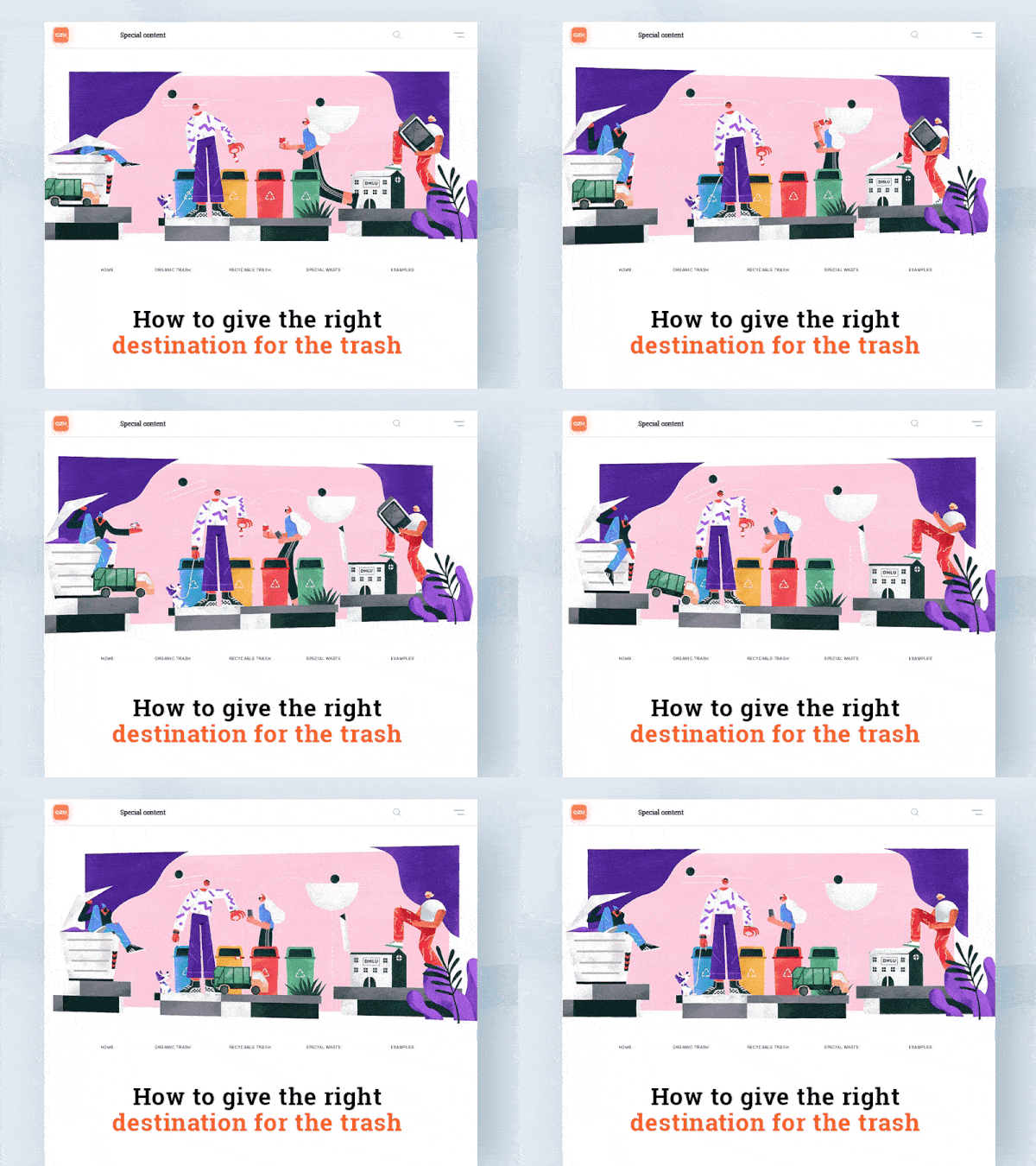
    In the example below, you can see how MiLo Studio has used an animated video on its website background.

    animated-background

    4. Custom Illustrations

    Alongside the animation, custom digital illustration is one of the most spectacular website ideas. The more imaginative, abstract, and dreamy illustration can turn a website into something unique and memorable. You can transmit your brand’s whole story and culture through the use of just one narrative image.

    Today, many brands design engaging illustrations to demonstrate how to use their products, convey the brand’s ideas and build an emotional bond with a target audience. Modern illustration trends include imitation of traditional drawing and painting, collages, vector images with flat colors and gradients, and even realistic renders.

    Do you want to stand out and win the users’ hearts with a unique illustration on your website? Shape your style by blending an infinite variety of techniques into one mind-blowing design cocktail.

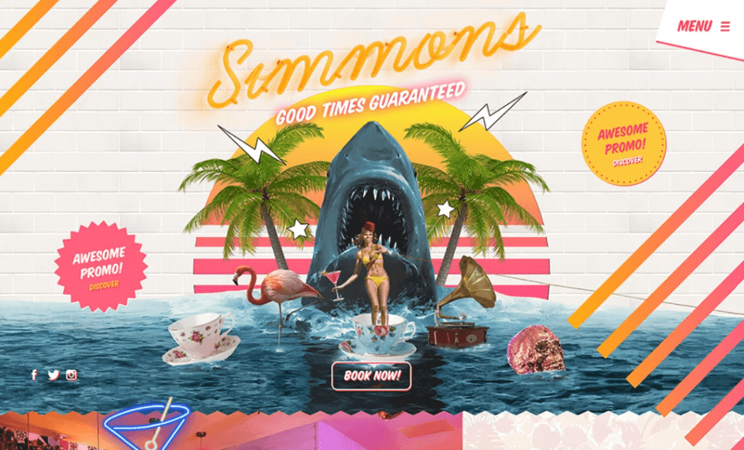
    I like how Simmon’s Bar has applied a digital illustration that looks like a beautiful collage.

    custom illustration example

    5. Asymmetric Layouts

    This decade will be saturated with graphic design ideas that break the rules and contradict traditional techniques. Using asymmetric designs is one of them. It is not about the lack of visual balance but about a whole new view of the website’s composition. Designers intentionally use asymmetry to avoid traditional balance and bring more of a fresh look to web design.

    Experiment with asymmetrically located typography, abstract shapes, illustrations, renders, and text messages to make your website distinguishable. Such a visually stunning phantasmagoria on a website will not leave users indifferent but will help build a strong brand image.

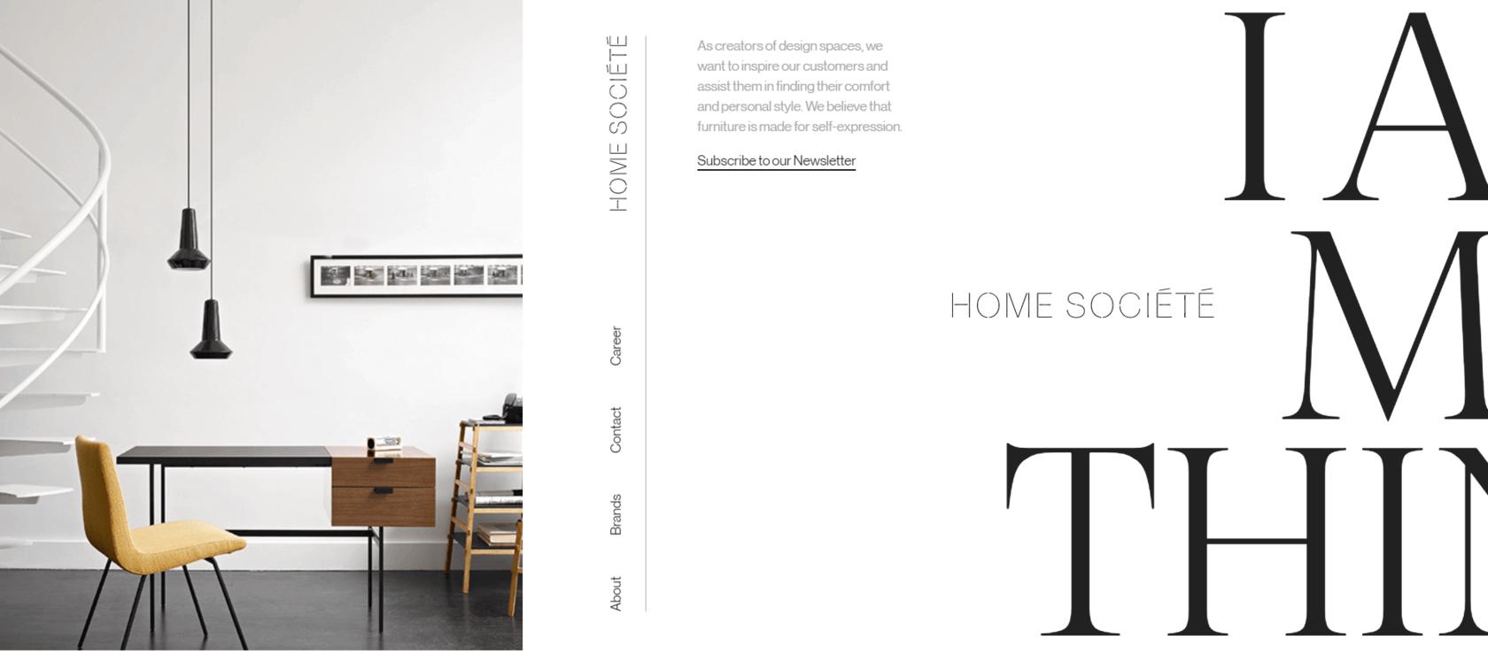
    Here is an excellent example of minimalistic and magnetic web design with an asymmetric layout created by Home Societe.

    asymmetric layouts

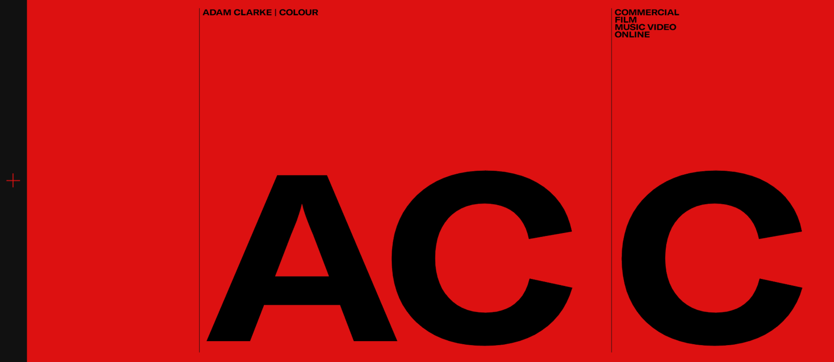
    6. Design Brutalism

    Brutalism is one of the graphic design ideas that is forecasted to boom in 2020. It is a conformist approach to website layouts that strives to humanize design.

    Using design brutalism means that brands are not afraid anymore to be vulnerable to their target audiences. They are ready to give up all their previous achievements and glory for the sake of discoveries that will help design a better future for their customers.

    Brutalism (or antidesign) includes simple and even primitive shapes, old-school typography, and conformist messages that do not talk about the brand’s advantages anymore but about its imperfections and readiness to step forward.

    Don’t you know how to apply brutalism to your website? Get inspiration from this incredible brutalist web design by Adam Clarke.

    graphic_design_trend

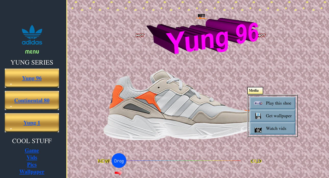
    7. A Sense of Vintage

    The 1970s have become an inexhaustible source of graphic design inspiration. We should admit that old-school design is cool.

    What is your first memory of the World Wide Web? Do you remember those beautiful retro fonts, hint counters, funny GIFs, hand-drawn ink illustrations, and visual over-simplicity? All these elements have become web design hits today. By applying these website ideas, designers try to evoke a sweet feeling of nostalgia for designs of the 1970s, increase user loyalty and interact with the audience on a more personal level.

    Here is how Mediamonks has implemented this approach in this web design concept for the Adidas Yung Series.

    vintage in web design

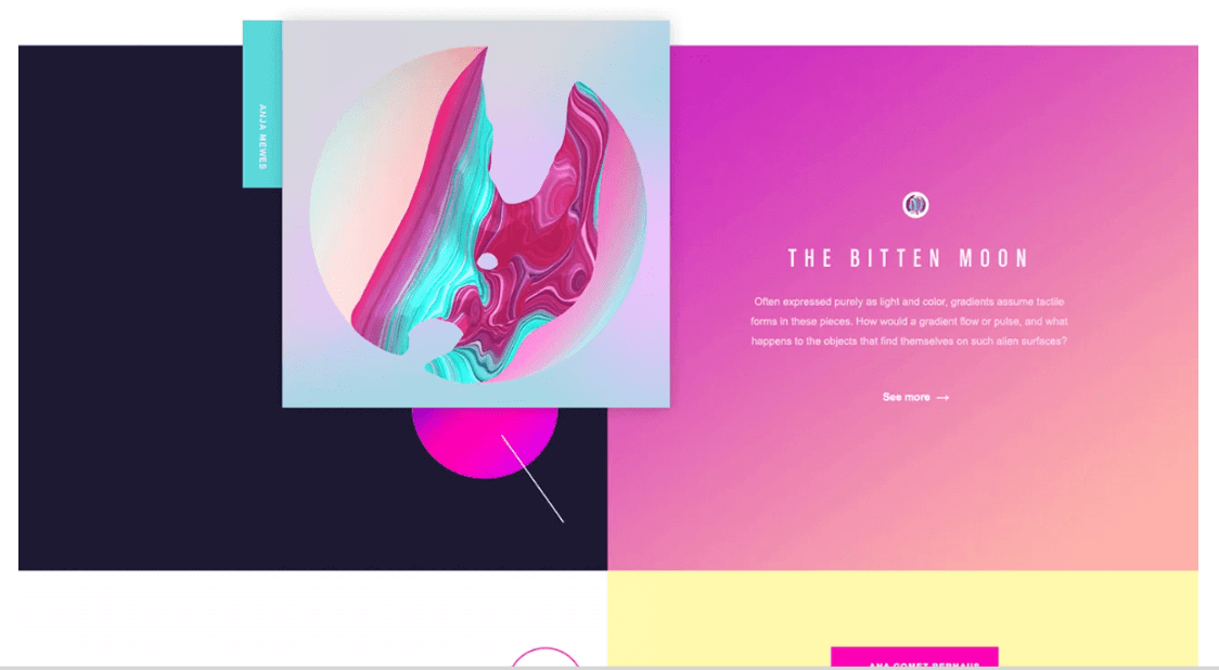
    8. Gradients

    Gradients are the elements of throwback color aesthetics. After giants such as Apple and Instagram have used them, we can see that the gradient is a winning choice in design.

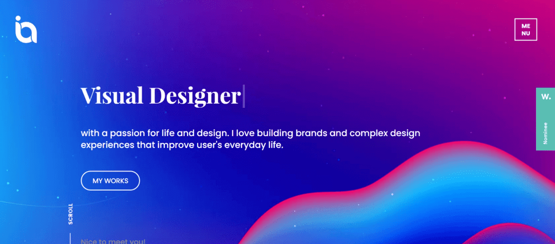
    The gradient is one of the most versatile website ideas. You can use it for a logo, color blocks on a site, CTA buttons, and backgrounds. This year, the gradient is predicted to blend acid colors and contrasting tones into a provocative mix that will bring new energy into web design for different industries.

    The gradient mix can be a perfect tool for UX designers who want to focus the user’s attention on specific content on a webpage and spark positive emotions.

    Here is your portion of the graphic design inspiration suggested by Serge Vasil for Adobe, which is a perfect example of using gradients in web design.

    gradients in design

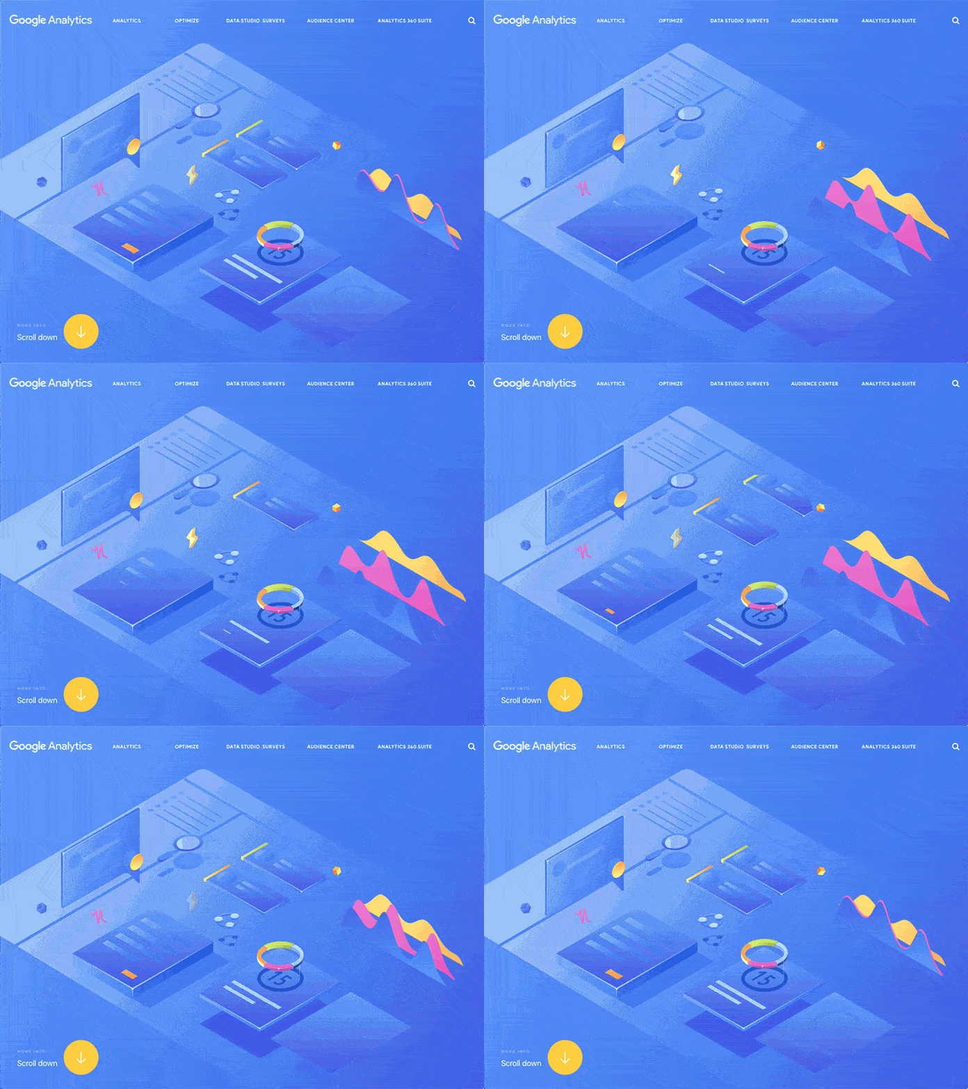
    9. Isometric Design

    The isometric illustration has been trendy for years and has become one of the best website ideas this year too. Usually, it depicts three-dimensional objects in two dimensions and looks like retro design, technical image, or a city scene.

    However, today, it does not end with a simple three-dimensional illustration. Today is an era full of motion, so it’s the best time to transform the isometric design into a fully animated and super-engaging visual solution.

    In the example below, you can see how Jian has used the isometric animation on Google Analytics 360 Suite website to please the eye with its cute and geometry-inspired nature.

    isometric_design

    10. Negative Macro-Space

    Negative space (or whitespace) is the empty space on a website. It is the room that separates different pieces of content and design elements on a webpage. From the UX design perspective, the lack of negative space can cause the user’s cognitive overload. So we should not forget to allow white space to make the web experience enjoyable for users.

    There are two types of negative space on a website: micro- and macro. Micro-space is referred to as the room between small design elements, such as paragraphs, letters, and words. Whereas macro-space is the room between core design elements such as a header and footer.

    Let’s focus on the macro whitespace. It is predicted that the intentional overuse of negative macro-space on a website will constitute a new design trend in 2020. Web designers have started playing with whitespace on layouts. Instead of cluttering a header with navigation details (as we used to do it before because it is the first thing users see when entering a website), designers try to leave this area clean and offer users extra-minimalist step-by-step navigation.

    Here is one of the astonishing website ideas of MiLo Studio that demonstrates the creative use of negative macro-space.

    negative space

    11. Overlapping Layers

    You might be surprised to hear that overlapping layers have become a new graphic design inspiration. The extraordinary combination of different layers on a website can create a magnetic visual effect of added depth to a webpage and a feeling of more than four corners on a screen.

    This optical illusion can be achieved by locating design elements on top of one another so that they are partially hidden from the eyes. You also can allow additional content to pop up and become completely visible once clicked.

    Using overlapping goes far beyond the ordinary in web design and awakes the audience’s interest in a brand.

    See what an excellent overlapping layers website concept BestServedBold has prepared on Dribbble.

    12. Hand-Drawn Elements

    If artists reveal their art on paper, why not do the same on a website? The hand-drawing technique is forecasted to become one of the top graphic design trends these years.

    One of the most significant benefits of hand drawing in web design is that it helps convey information at a more emotional level and establish a personal connection with a target audience. There is nothing better to reflect the brand’s unique style than to do it using sketchy designs.

    Hand-drawing art helps web designers create a sense of human touch and transmit the company’s values and goals behind the offerings displayed on a website. It makes a website look inviting and even fun and helps build customer trust and loyalty.

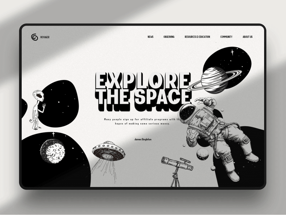
    These hand-drawn astronauts on a website designed by Dannniel for Orizon are a great example.

    graphic design trend

    13. Liquids

    The visual imitation of fluids is another graphic design trend expected to gain momentum in 2020. Opposite to geometric shapes and sharp angles, the liquid-like design is saturated with round forms and smooth curves.

    A brilliant example: is the animation by BestServedBold.

    The liquidy shapes are often associated with something pleasant, safe, creative, and soft, while sharp forms often evoke a feeling of threat. Consequently, we can conclude that the imitation of liquids in design positively affects the users’ mood, helping them feel confident and calm while interacting with a brand.

    Here you can see a liquidy design for Irshad Ahamed‘s website.

    liquid design

    Conclusion

    To build a great website, you need not only a UX skillset but also a whole lot of creativity and compliance with trends. Stay ahead of the curve with the top 13 graphic design trends described above.

    Would you like to create a truly spectacular website? There is no right or wrong answer on how to design it. As Yoda from Starwars said: “Do or do not, there is no try.” Our team of professional web designers can help you execute your most imaginative web design ideas and “do it with no try.”

    Finally, what are your favorite graphic design trends that can help turn a website into magic? Share them with our community in the comments below!

      Once a week you will get the latest articles delivered right to your inbox