Homepage Design Tactics: 8 UI Elements Your Website Can’t Be Without
Dominic Tarn
Head of Content - ReVerb
15.07.2024
User interface or UI elements are the backbone of a website.
They determine how a visitor will interact with your pages and how much they will enjoy it. They are an integral part of enhancing user experience and boosting conversion rates.
Some UI elements you’ve definitely heard of are buttons, tabs, and menus. Wondering what some of the others are and how they can help you improve interactivity and navigability?
Let’s look at eight user interface elements your website’s homepage shouldn’t be without.
8 Essential UI Elements For Your Website
1. Cookie consent modal or banner
Modals are dialog boxes that appear on top of the main page and require the visitor to take a certain action before they can continue browsing the website. They usually contain important messages, which is why they are displayed so prominently. The main purpose of a modal is to grab a visitor’s attention. While a lot of people find them quite annoying, there are a couple of situations where they are absolutely necessary.
Banners, on the other hand, are less intrusive, they don’t block access to the rest of the website and can be just as useful for delivering valuable information. In order to comply with current data privacy laws and regulations, you need to implement a cookie consent form, either as a modal or in the form of a cookie consent banner.
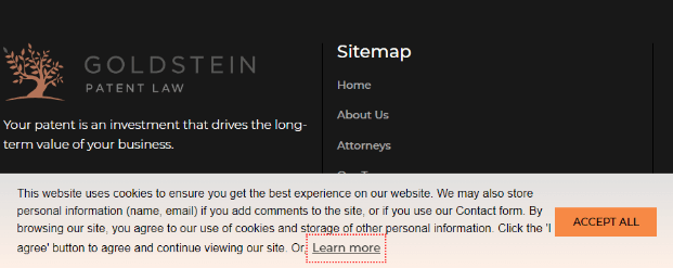
For example, Goldstein Patent Law chose a simple banner. It is unobtrusive enough to allow the visitor to explore the page, but the orange button still makes it pop.
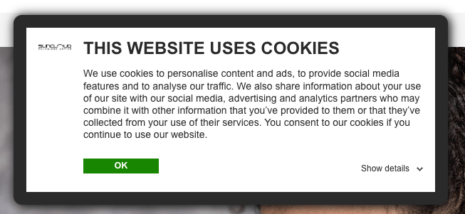
On the other hand, Suncloud Optics went for a modal. They still allow you to scroll down the homepage, but you can’t navigate to another page before you take cookie-related action.
Both of these options are equally valid. It’s up to you to choose one that better suits your needs.
2. Location-specific modals
Modals can also be used to ask customers to select the country or region they want items shipped to. This information should always be requested via a modal. This will ensure every visitor is browsing the correct website and that they won’t be disappointed at checkout if a certain item from their cart can’t be delivered to their country.
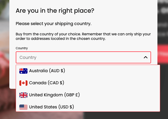
Make sure the modal you use is easy to interact with. Infraredi did a good job here: they listed the countries they see the most customers from at the top and then organized the rest of the list in alphabetical order. The list is also easily searchable, so choosing the correct country will only take a couple of seconds.
If you only ship to one country, you don’t need to use this type of modal. You should, however, make this fact clear on your homepage in order to prevent any frustration at checkout.
3. Conversion-oriented popup
Sticking to the theme of modals for just one more example, another useful one to have is the purely conversion-oriented pop up. Since visitors don’t like to be kept from what they are looking for, you need to ensure that your hook is a good one. You need to offer customers something they are likely to be interested in, something with an obvious benefit, or a freebie.
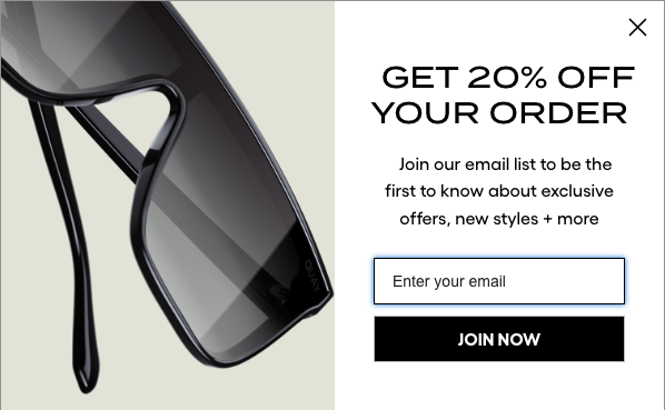
Quay, for example, chose to offer a significant discount to every new customer that signs up to their newsletter. This is not only a great way to grow your email list, but also a way to increase conversion.
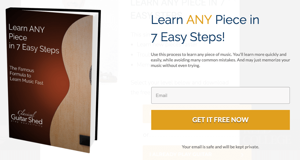
Classical Guitar Shed offers a free ebook, one that is bound to excite their audience, since it solves their key pain point: learning how to play classical guitar. Not everyone will want to download it, of course, but it goes a long way in boosting credibility and showcasing expertise.
Choose carefully when you want to display the popup. If you are offering a discount, ideally, you want it to appear as soon as someone opens your homepage. In the case of a freebie, you can offer it when a visitor shows signs of leaving the page.
4. Product carousel
Carousels are elements that let visitors browse through a certain set of content, most often images. They are used to display multiple items in a limited space. You can set up a carousel to spin automatically, or you can let visitors manually click through the items at their own pace. Both are good choices, so you’ll want to A/B test which option works better for your target audience.
Carousels are a good way to boost page interactivity. They can also be easily adapted to all screen sizes and orientations, so you can use them on mobile as well as desktop homepage versions.
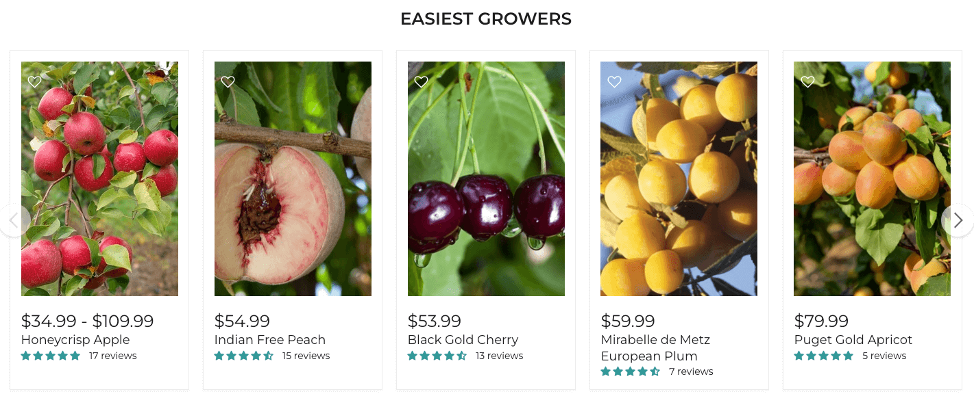
Raintree Nursery, for example, has a neat carousel of their easiest-to-grow products. These are likely the trees the majority of their audience will be interested in, so they have given them the spotlight.
When choosing items for your carousel, make sure to group them logically and provide an appropriate heading. The visitor should understand exactly what they are looking at and be able to distinguish between different product types or categories.
5. Cards
Cards are a very useful UI element that can contain practically anything: text, images, video, buttons, and so on. They can be considered access points for specific content or actions. You can stack cards either in a grid or on top of each other, entirely depending on the design of your homepage.
You can use them to showcase products or services or to highlight your latest blog posts — any time you want certain similar pieces of content to be visually appealing and neatly organized.
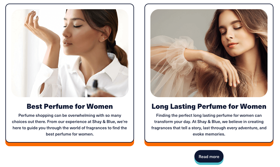
Shay & Blue uses cards to entice visitors to click through to their blog posts, for example. It is an incredibly simple but highly effective way to display interconnected information and group similar items together. The thin borders clearly separate individual items without taking up too much space or attention.
You can experiment with cards a lot until you find the best layout for your target audience. You can play with image and font size, the layout of the information in the card, the shape and shadow of the border, and so on.
6. Search fields
Search fields are used to find specific information. They consist of an input field and a button, usually with a magnifying glass icon that has become synonymous with search.
They are an incredibly important and useful UI element that you simply have to incorporate on your homepage if you are an ecommerce business. Ideally, you’ll make it a part of the main menu area so that it can be easily accessed from every page. This will significantly improve user experience.
You should also make it a part of your blog to help visitors quickly pinpoint the content they are interested in.
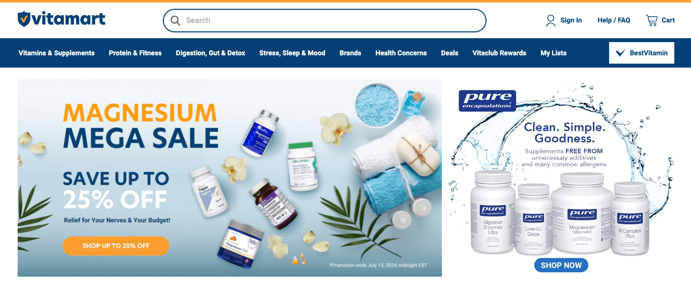
Look at how cleverly Vitamart incorporated a search field into their menu. Visitors will instantly spot it and know they can find what they are looking for in a matter of seconds.
The more interactive and responsive the search results, the better. Here are some key tips:
Display results as soon as the searcher starts typing.
Always display the most popular matches first.
Try to also allow for common spelling mistakes and typos to help your visitors find what they want, even if they mistype.
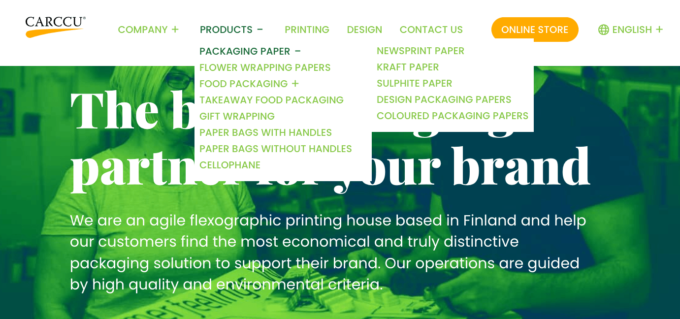
7. Dropdown menu
Dropdown menus are elements that allow visitors to select an item from a list that appears when they click or hover over it. They are a great way to hide information that does not need to always be on display.
You’ll often see dropdown menus that don’t look like what they are, i.e., without an arrow or other indicator that signals there are more items to be accessed. Ideally, you will clearly tell your visitors that your menu provides additional options they can check out. It is also advisable to display items on hover rather than just on click.
Carccu has a great dropdown menu from which you can draw inspiration. They use a plus icon to signal that a certain menu element has dropdown elements. When you hover over it, the plus turns into a minus.
They use this same principle all throughout the menu, so you can easily figure out that the packaging paper element has numerous options, while the gift wrapping one doesn’t.
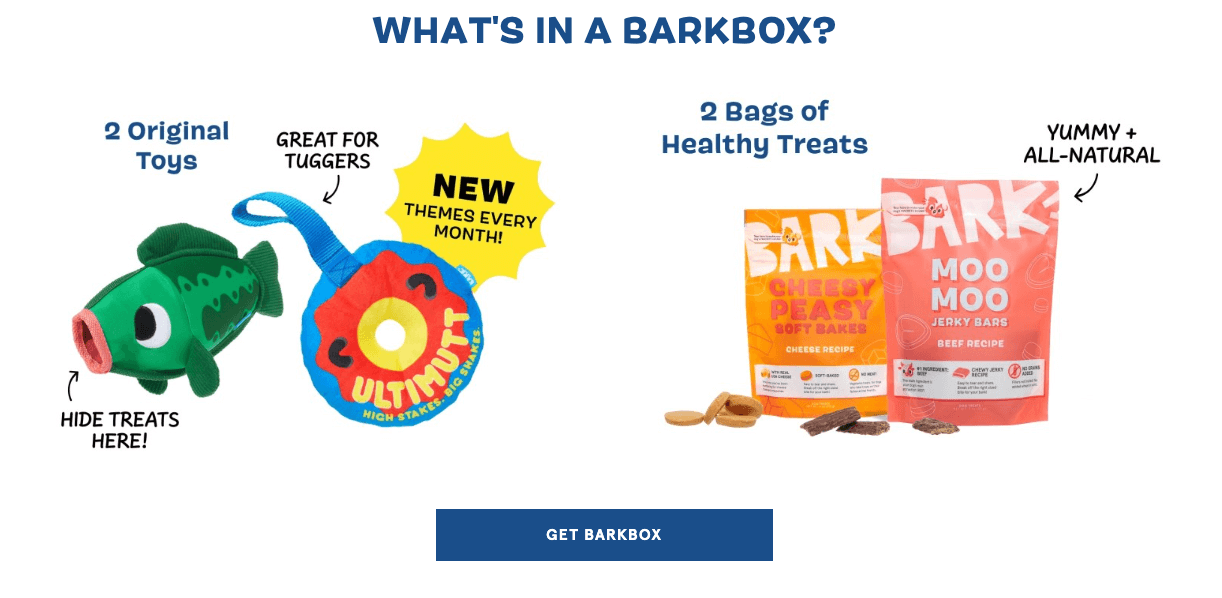
8. CTA buttons
Buttons are probably the most commonly used UI element. They allow visitors to perform a specific action: submit a form, get to another page, make a call, and so on. They usually take the form of a certain shape with a label on it. They can be rectangular or rounded, depending on the design of the page. The label provides more information about the result of the action.
Your homepage needs to incorporate one very specific type of button: the CTA. This is the button that will result in conversion: a purchase, a newsletter signup, or a contact.
If you look at BarkBox, you’ll notice how clever they are with their buttons. Their main one is “Get BarkBox,” which you will notice throughout the page. See how that action is triggered by a button, while the “give gift” one is merely a link? This clearly separates these two actions and places one above the other.
They incorporate other CTA buttons as well, like the “sign up” one for their newsletter, as well as some that take you to specific products. Carefully think your CTAs through, and make sure that they blend into the design and hierarchy of your homepage effortlessly.
Conclusion
Have you already incorporated some of these UI elements on your homepage? If not, consider how you could best utilize them to help your visitors navigate your pages more easily.
Take your time to find the best layout and page hierarchy, and always have the visitor’s pain points and funnel stage in mind.