Instant Engagement: How To Get The Most Out Of Your Site’s Header
Dominic Tarn
Head of Content - ReVerb
11.05.2023
There are a lot of factors that can boost (or decrease) user engagement on your website.
For instance, research shows that visual design plays a role in getting web visitors to interact with pages, with 59% of people preferring to consume beautifully designed content over something plain and simple. Similarly, element positioning can also drive engagement. According to data collected via eye-tracking studies, people spend approximately 57% of their page-viewing time above the fold, showing how impactful website layout can be at holding internet users’ attention.
However, if you’re looking to achieve the effect of instant engagement — which will be reflected in critical engagement metrics like average time on page, pages per session, bounce rates, and conversion rates — you have to employ strategies that give the best bang for your buck. And that means addressing your target audience’s pain points, optimizing CTA buttons, and using a variety of design tricks that will allow you to get the most out of your site’s header.
So, without further ado, here are the best techniques to capture and retain your audience’s attention and get them to explore your offer and genuinely consider becoming customers of your brand.
The Best Techniques For Creating An Engaging Website Header
1. Trigger the right emotions
Using emotions to get consumers to engage with products is one of the oldest tricks in the marketing book. But the reason it’s still relevant in 2023 is that it works.
For starters, we know that emotions affect buyers’ purchase intention (via brand recall, recognition, and perceived product quality). But much more importantly, using your site’s header to get your audience to take action has tremendous potential for driving engagement (and conversions) because it addresses consumer worries head-on.
One excellent way to trigger the right emotions — and consequently implore your prospects to act — is to address any negative feelings your target audience may have.
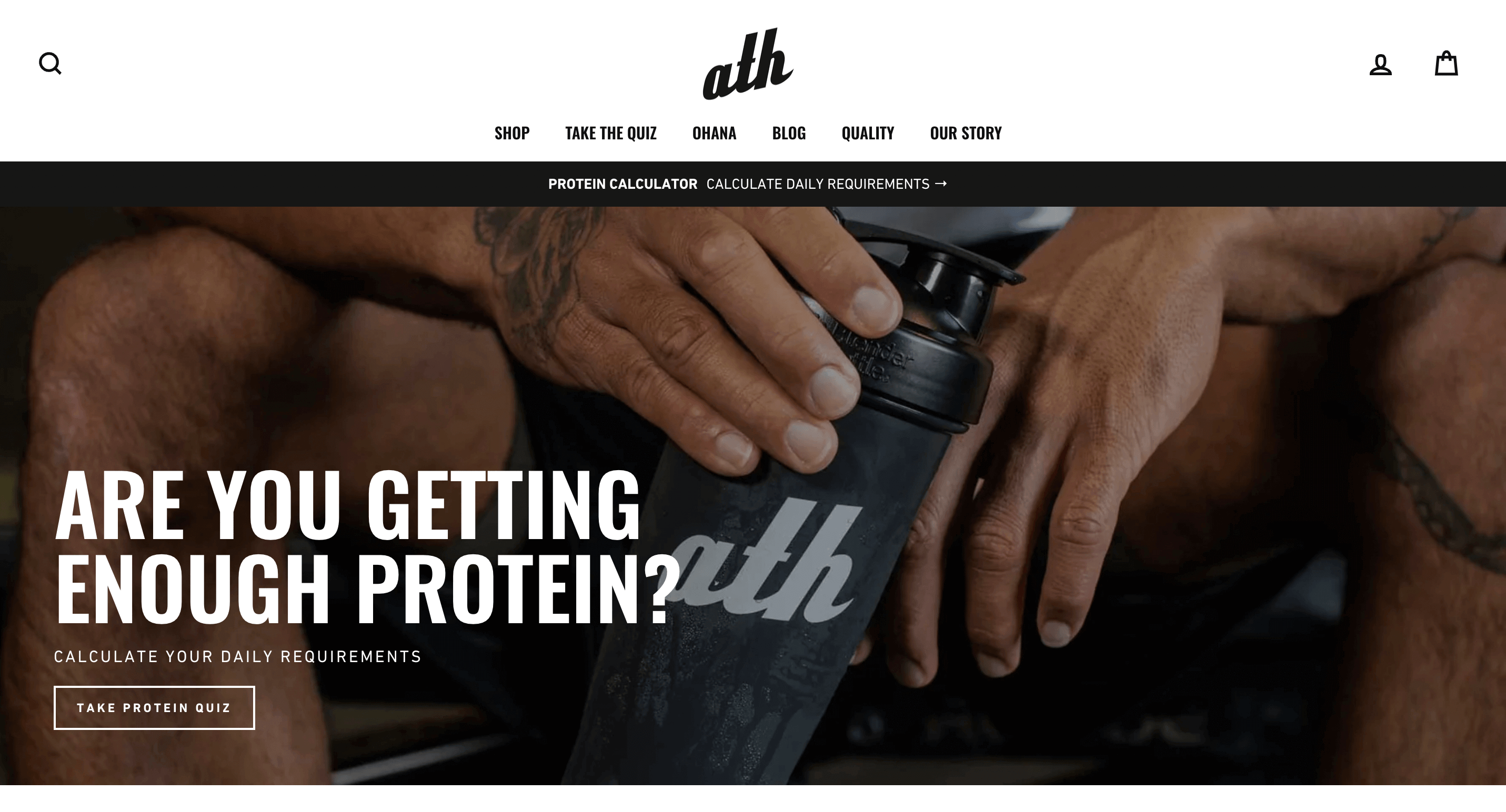
For example, if you check out the ATH Sport homepage, you’ll see that the header asks web visitors whether they’re getting enough protein. The hook, which makes consumers aware of a risk, isn’t overly aggressive — it’s merely asking a question. But the very fact that the possibility of people not getting enough protein is implied is enough to drive most people to action.
And if you consider that the CTA below the heading invites them to check their daily requirements, offering a solution to their problem, you’ll quickly realize just how effectively this brand uses the site header to drive user engagement.
Naturally, addressing risks isn’t the only way to trigger engagement by appealing to your target audience’s emotions. One traditional way of encouraging consumers to act is by playing with people’s inherent fear of missing out. The most common way to do that is by enhancing web headers with countdown timers or limited sale banners.
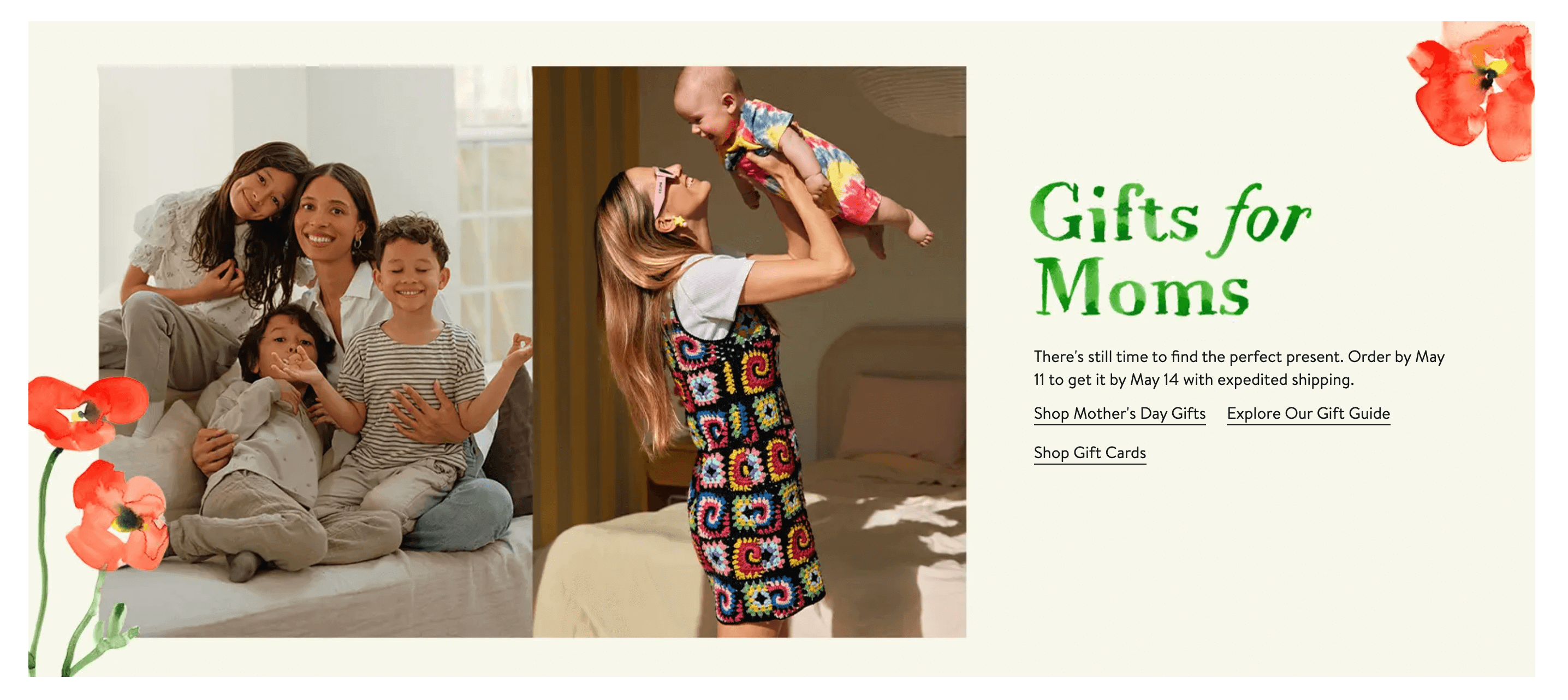
Or, you could use copy to achieve the desired effect, as they did on the Nordstrom website, with “there’s still time to find the perfect present.”
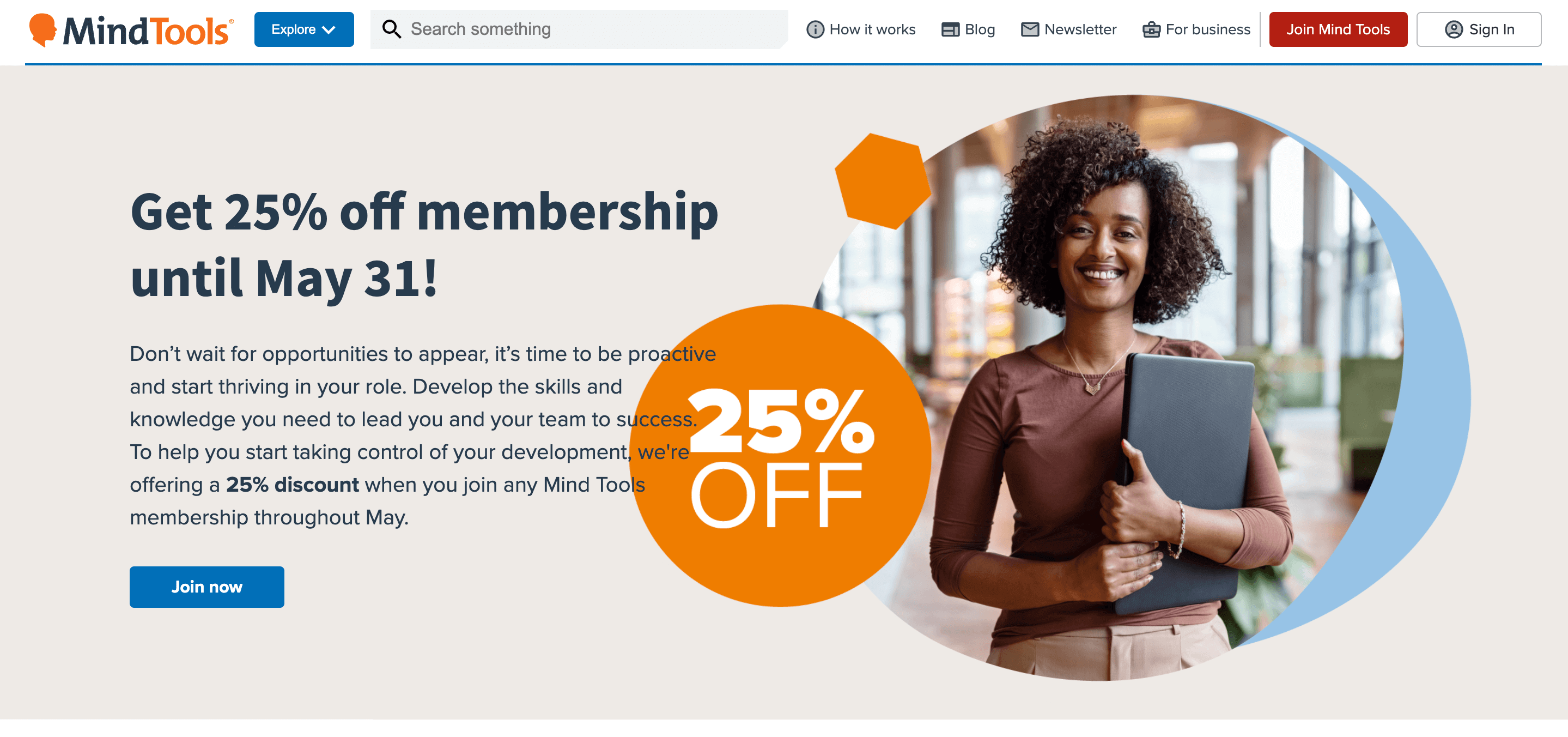
You could also address positive emotions, like goals and aspirations. A quick look at the Mind Tools homepage shows this is precisely the effect the brand is going for, inviting its prospects to “be proactive and start thriving in their role.”
So, if you’re looking for an easy method of getting your target audience to become instantly engrossed with your website and your offer, emotional copy, and visuals could be the solutions you need.
2. Showcase your product with striking visuals
We’ve already mentioned that consumers prefer aesthetically pleasing content over its unembellished or overly practical alternatives. So, it’s easy to conclude that by choosing the right visuals for your site’s header, you can unlock the required potential for encouraging web visitors to engage with the elements on the page.
Header visuals — whether in photo or illustration format — can be hugely impactful in getting consumers to click through to relevant pages. Look at the websites of fashion brands like Brunello Cucinelli, which regularly use imagery to drive consumer action. You’ll quickly see how effective the right photo can be at getting people to engage with a site or product.
However, if your goal is to grab, retain, and direct your web visitors’ attention in the direction that benefits your brand, consider playing around with videos on your site’s header.
Video can be visually stunning, and, more importantly, it can add an educational element to a purely aesthetic format. That makes it easier for your prospects to understand your products, recognize their value, and realize they could solve their pain points by buying your solution right then and there.
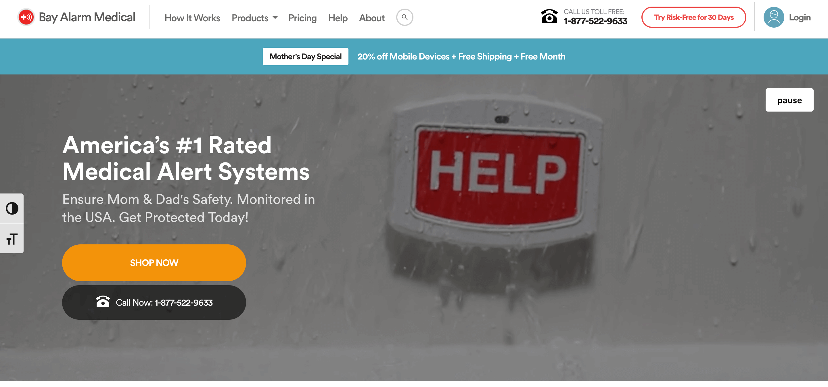
For example, if you check out the Bay Alarm Medical homepage, you’ll see that the business uses a video header to tell a story about how its product works. By going in this visual direction, the brand doesn’t just boost product understanding. More importantly, it uses attention-grabbing, emotion-triggering video clips that are guaranteed to get most web visitors thinking about whether they’re prepared for an emergency and whether investing in a medical alert system could make them feel safer.
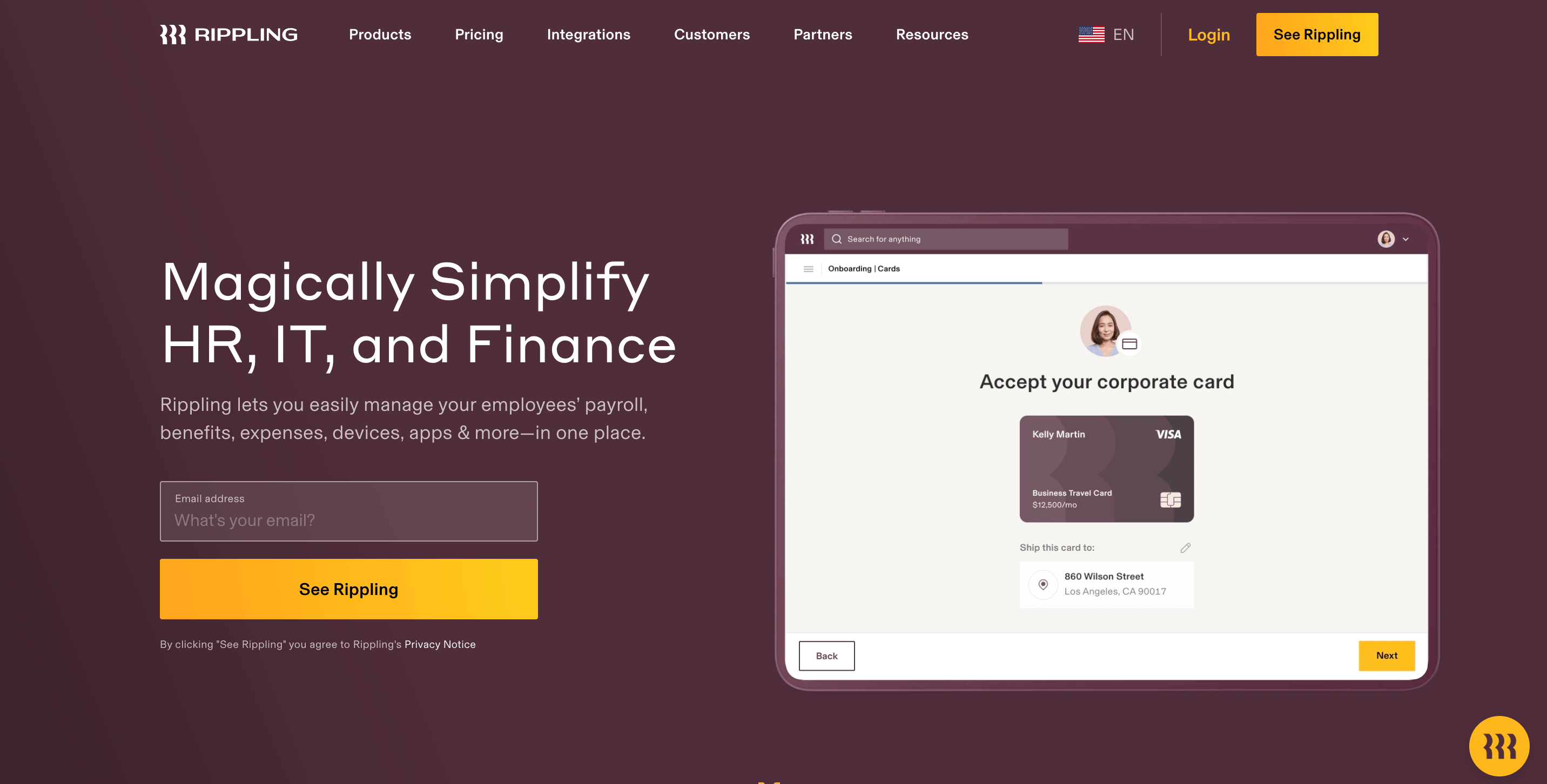
This strategy can also be adapted for the B2B sector, as showcasing a product doesn’t have to involve a dramatic element. A glance at the Rippling homepage shows how the SaaS brand utilizes a short video loop to inform potential customers, in no more than 38 seconds, exactly what they can expect to get by investing in the solution.
3. Enable sophisticated and intuitive searching
One of the best ways to encourage instant engagement on your site is to optimize UI elements you know visitors will want to use. And according to statistical data, the site search box is one of those elements.
A research report from Forrester discovered that 43% of web visitors go directly to the site’s internal search feature when first using a website (the number of people who do this is even greater if you consult Nosto’s The Future of eCommerce Search report). Yet most eCommerce search bars don’t function — with nearly one-third of all product searches ending without a positive outcome for web users.
To avoid this faux pas and allow your target audience to seamlessly interact with your site (ideally with a conversion happening down the line), it’s genuinely worth investing in an intuitive site search box.
In addition to ensuring that using product synonym search terms and making spelling mistakes doesn’t diminish the site’s UX, it’s also not a bad idea to employ the search box to encourage web visitor engagement.
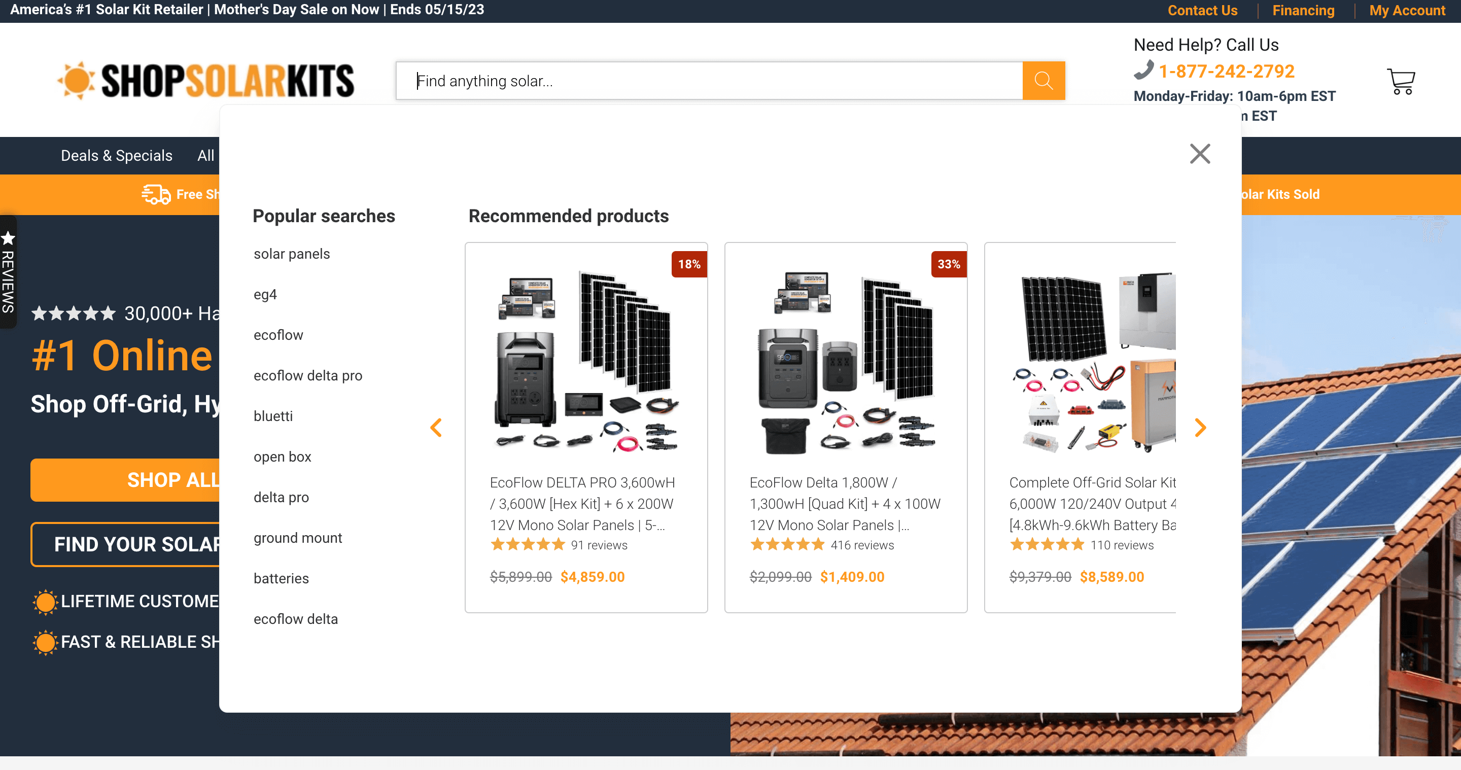
To see an excellent example of how you can do this, check out the Shop Solar Kits website. You’ll notice that the search box includes several hints that help people formulate and define their interests (including terms like “open box” and “batteries”). But what stands out even more are the versatile product links shown in the results section, allowing potential buyers to view the brand’s offer without having to navigate away from the homepage and risk ending up on a product collection page irrelevant to their requirements.
4. Double down on your brand’s unique selling point
One of the main techniques you can use to capture your audience’s interest and get web visitors to engage with your brand is to be crystal clear, from the start, about what makes your offer unique.
If you think about it, the effectiveness of this method shouldn’t be that big of a surprise. After all, your prospects are being targeted by countless businesses in your industry. And you can rest assured that they’re not cutting costs. In fact, the Hubspot 2023 State of Marketing Report found that as many as 47% of marketers plan on increasing their marketing budgets this year, making it quite clear that getting people to engage with your brand won’t be easy (or cheap).
Fortunately, there is one secret weapon that you can use to overcome this obstacle — your brand’s unique selling point.
By defining the one thing that sets you apart from your competitors and doubling down on it, you can effectively ensure your solutions stand out from the noise. Moreover, by avoiding generalized and vague promises, you can maximize the chances of your unique value proposition resonating with your audience and inspiring them to convert.
In addition to enhancing all of your marketing strategies with a strong sense of brand individuality, it’s also essential that your site’s header communicates the distinctive benefits you offer. So don’t be afraid to hit this information hard.
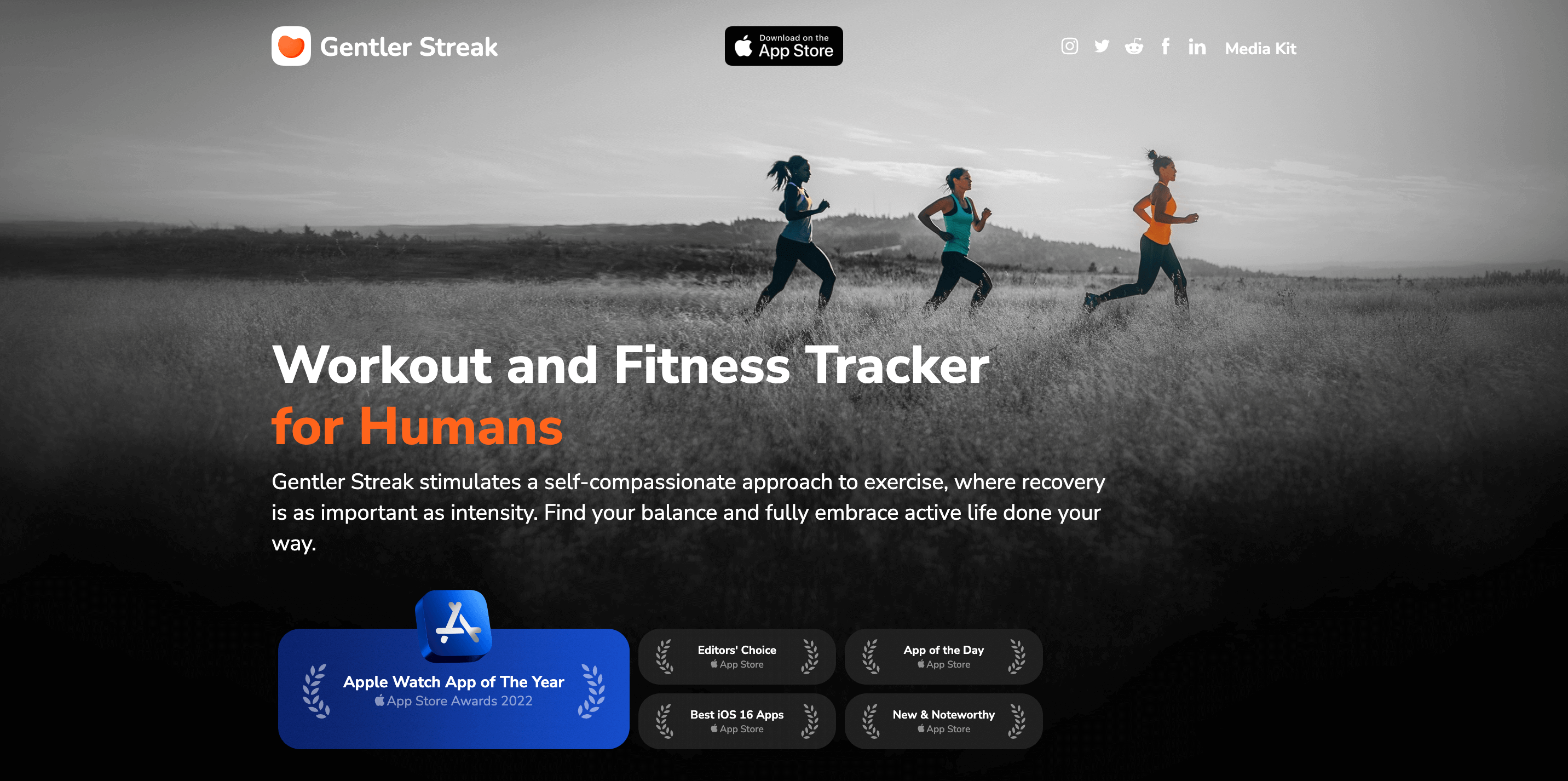
For inspiration on how to achieve the effect, check out the Gentler Streak homepage. You’ll notice that the main benefit mentioned in the USP is that the app allows users to adopt “a self-compassionate approach to exercise, where recovery is as important as intensity,” which is considerably different than the outcome competing products go for.
5. Be very clear about what you do
As you go after instant engagement with stunning visuals, attention-grabbing USPs, and industry-disrupting promises, you must remember that there are pitfalls you’ll have to navigate when using your header to boost site performance. And one of these is falling into the trap of thinking that your audience will automatically understand the value of your offer.
Yes, many of your website visitors will be people who have already interacted with your brand — through social media, your business blog, or legacy print. But you also have to account for the possibility that your website header will be your brand’s first contact with at least some of your prospects. So, to avoid the risk of coming off as vague or irrelevant, you need to be very clear about what you do if you want consumers to continue interacting with your website and brand.
In other words, don’t try to be cute or clever. Don’t think using industry jargon will show off your expertise (in fact, it’s more likely to alienate buyers in the top stages of the buyer’s journey). Instead, state what you do and offer in a direct and easy-to-understand manner.
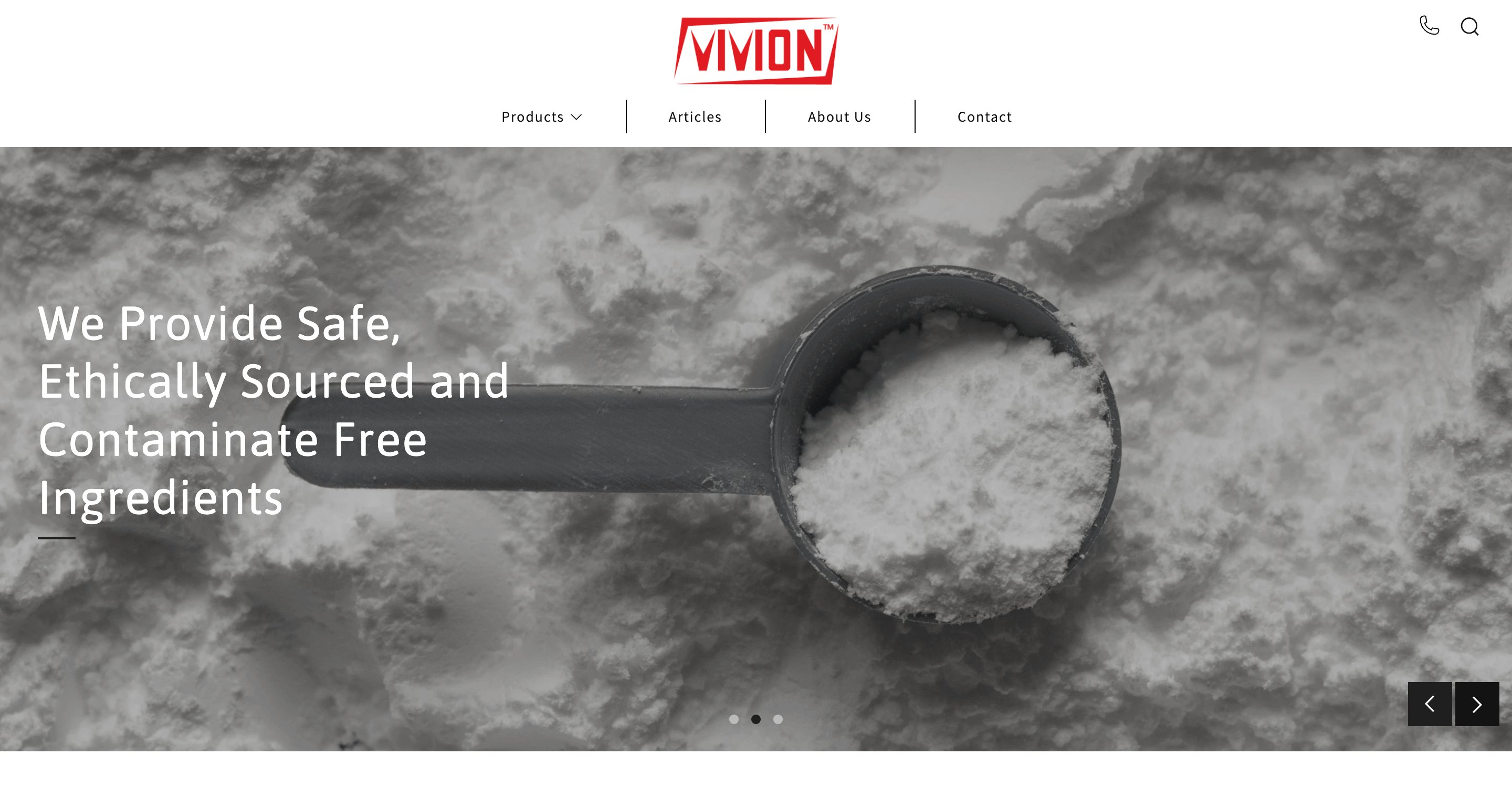
For an excellent example of how easily you can do this, even in highly technical industries, check out Vivion. On its homepage, this header states that Vivion “provide safe, ethically sourced and contaminate free ingredients.” Is there more to the story? Absolutely. But the truth is, the website header is not the place to get into details. Instead, it’s where you reassure web visitors that they’re in the right place and that they can find out more about what you can do for them by scrolling down the page or clicking on the relevant CTA.
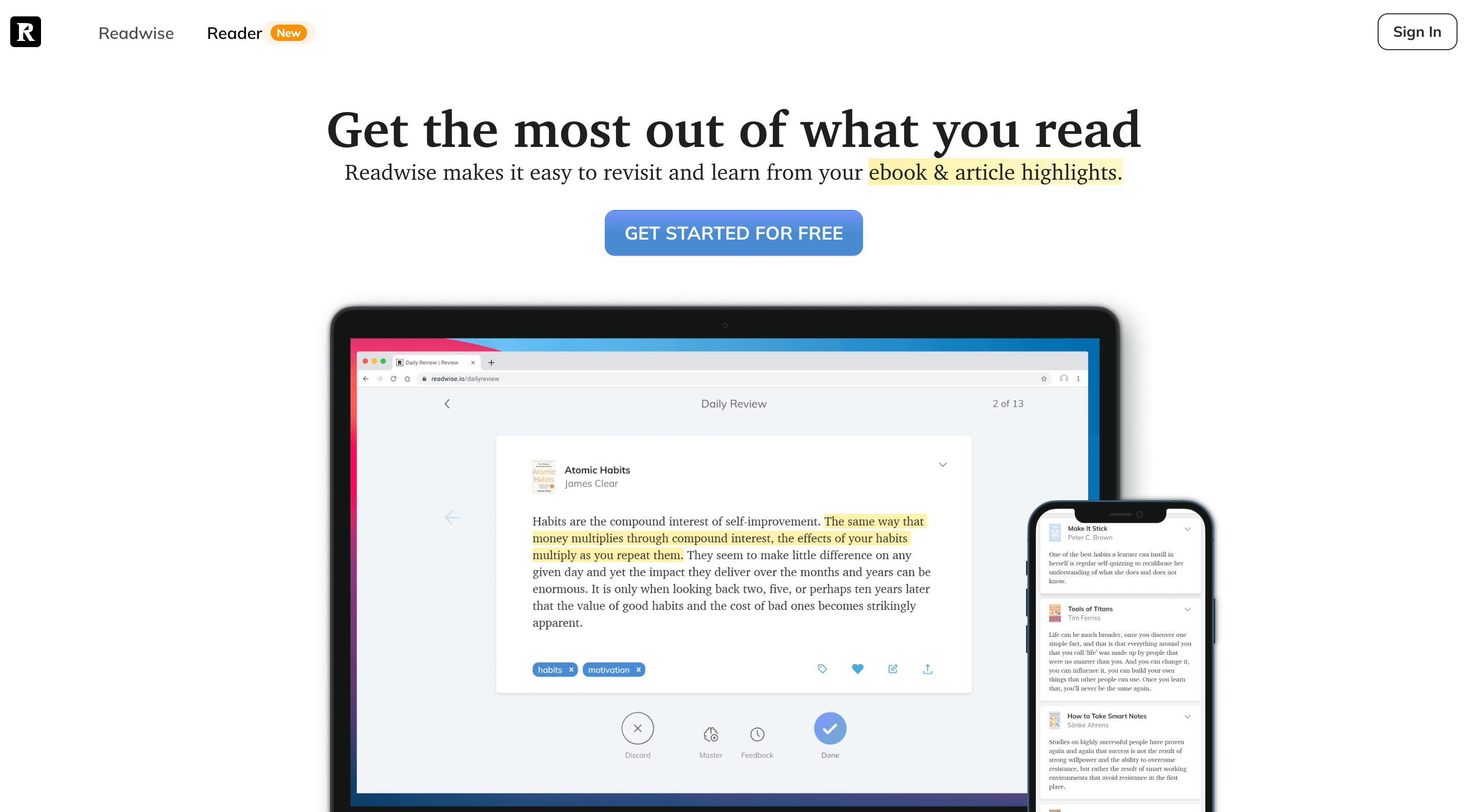
Similarly, you could also check out the Readwise homepage. This is an example of a B2C business employing well-written header copy to ensure web visitors know what to expect from a complex solution. Yes, the marketing team behind the brand could have gone with some more exciting value propositions. But at the end of the day, that might not have gotten the message across, which is the opposite of what you should be doing on your website header.
6. Make your CTAs clear and enticing
Once you’ve optimized the visual and textual aspects of your website header, you have to remember that the only way for it to benefit your business will be if it’s used together with an enticing call-to-action.
So, as you explore strategies that will allow you to get the most out of your site, make sure that you pay attention to CTA button optimization. Some of the best design tips you can implement include:
Paying attention to visibility by choosing the right color and contrast ratio.
Positioning the buttons in logical places to encourage web visitors to continue their browsing journey on a page that gets them one step closer to a conversion.
Lowering the word count and using clear, action-driven language to get people to click through.
Employing microscopy, where appropriate, to communicate trustworthiness and manage risk.
Continually monitoring CTA button performance to reveal possible improvement opportunities that can be addressed with small design or copywriting tweaks.
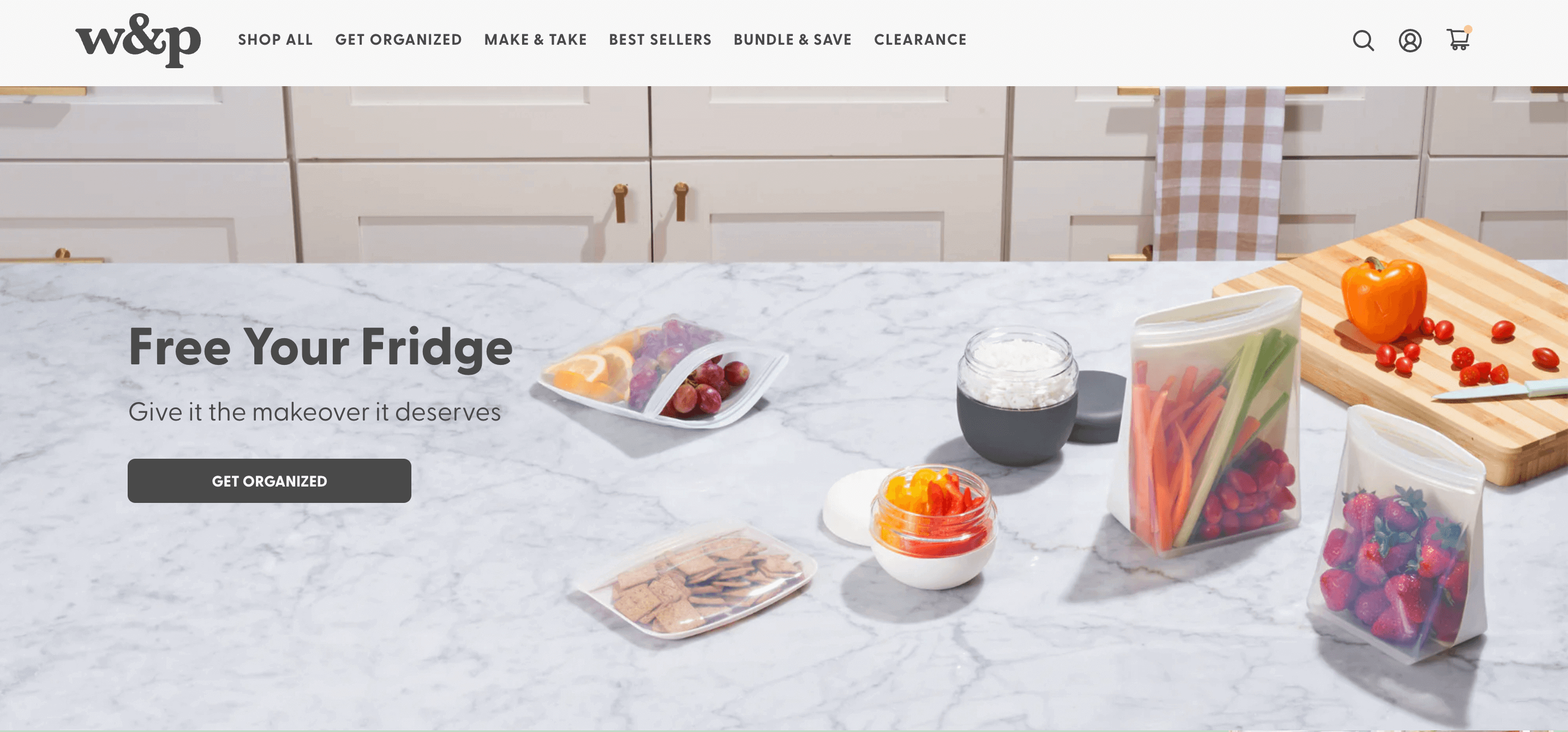
If you visit the W&P website, you’ll see one of the best examples of a fully-optimized CTA button. The button doesn’t just perform visually. But it also employs one of the best instances of CTA copy with the “get organized” phrase. It’s not just fun and quirky — it effectively inspires people to purchase the brand’s products and experience their benefits for themselves.
7. Give visitors reasons to trust you
Lastly, don’t forget to employ the power of trust in getting people to interact with your brand.
Ultimately, people choose what brands to buy from and support based on their trustworthiness. According to a 2021 survey, a whopping 81% of consumers make purchasing decisions based on trust. And even if economic shifts in the past 12 months forced people also to consider price when evaluating products, it’s safe to say that highlighting your brand’s trustworthiness and credibility in your site’s header still makes for an excellent engagement-boosting strategy that will encourage people to interact with your site in a more open-minded way.
So, if you’re looking for trust-building tricks to help you achieve your goals, consider header elements that will address consumer worries like shipping, refunds, quality guarantees, and other potential risks.
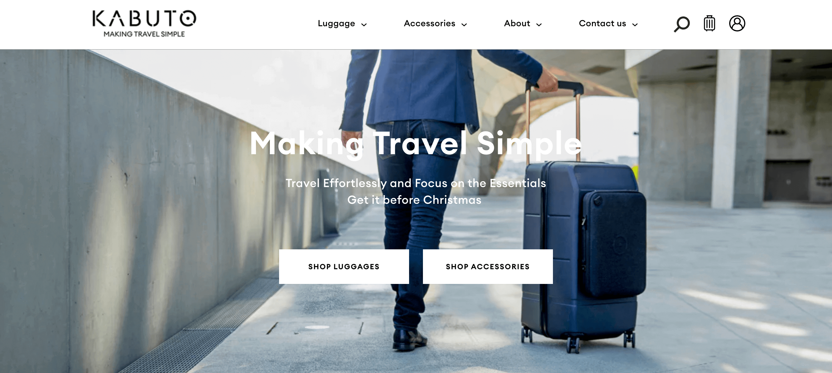
For example, a basic 100-day money-back guarantee banner, like the one on the Kabuto website, makes for an excellent way to build brand and product trust in your site’s topmost section.
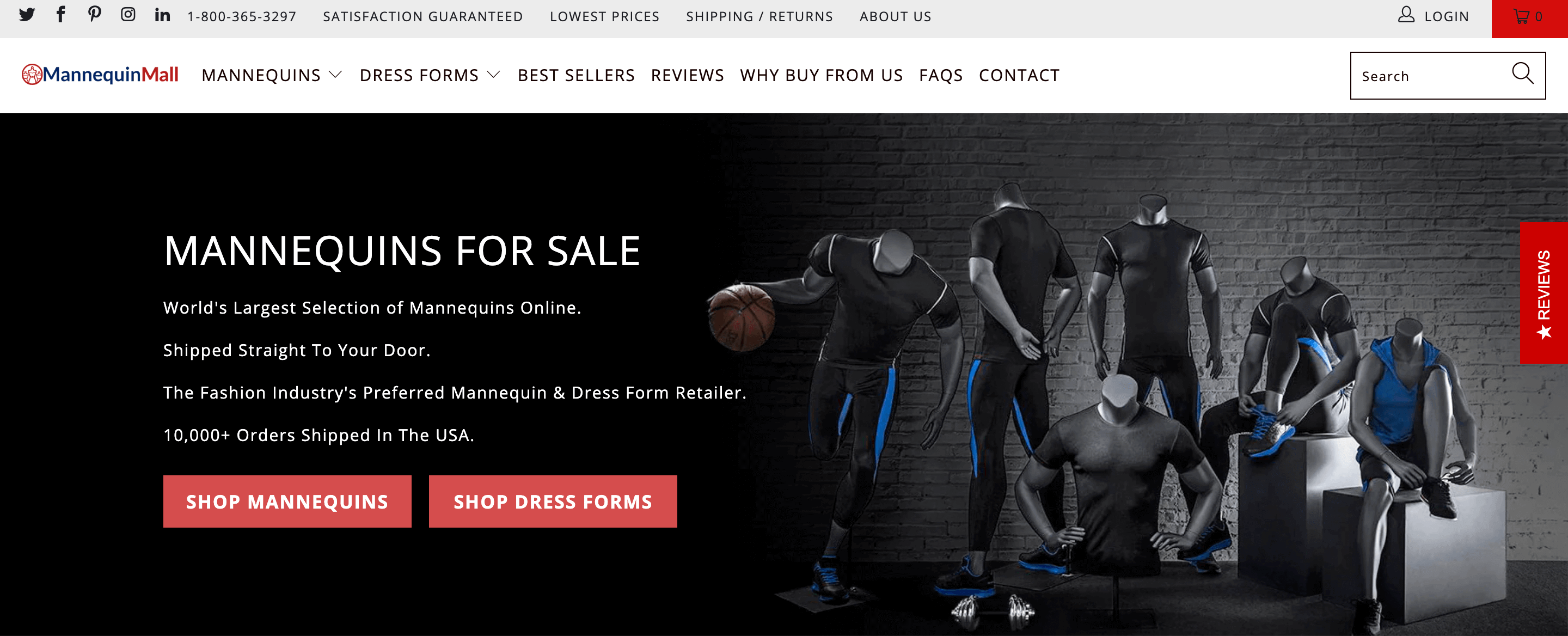
Or, for an even more direct approach to driving consumer trust, you could enhance your header with a Reviews flyout element, like the one on the right side of the Mannequin Mall website.
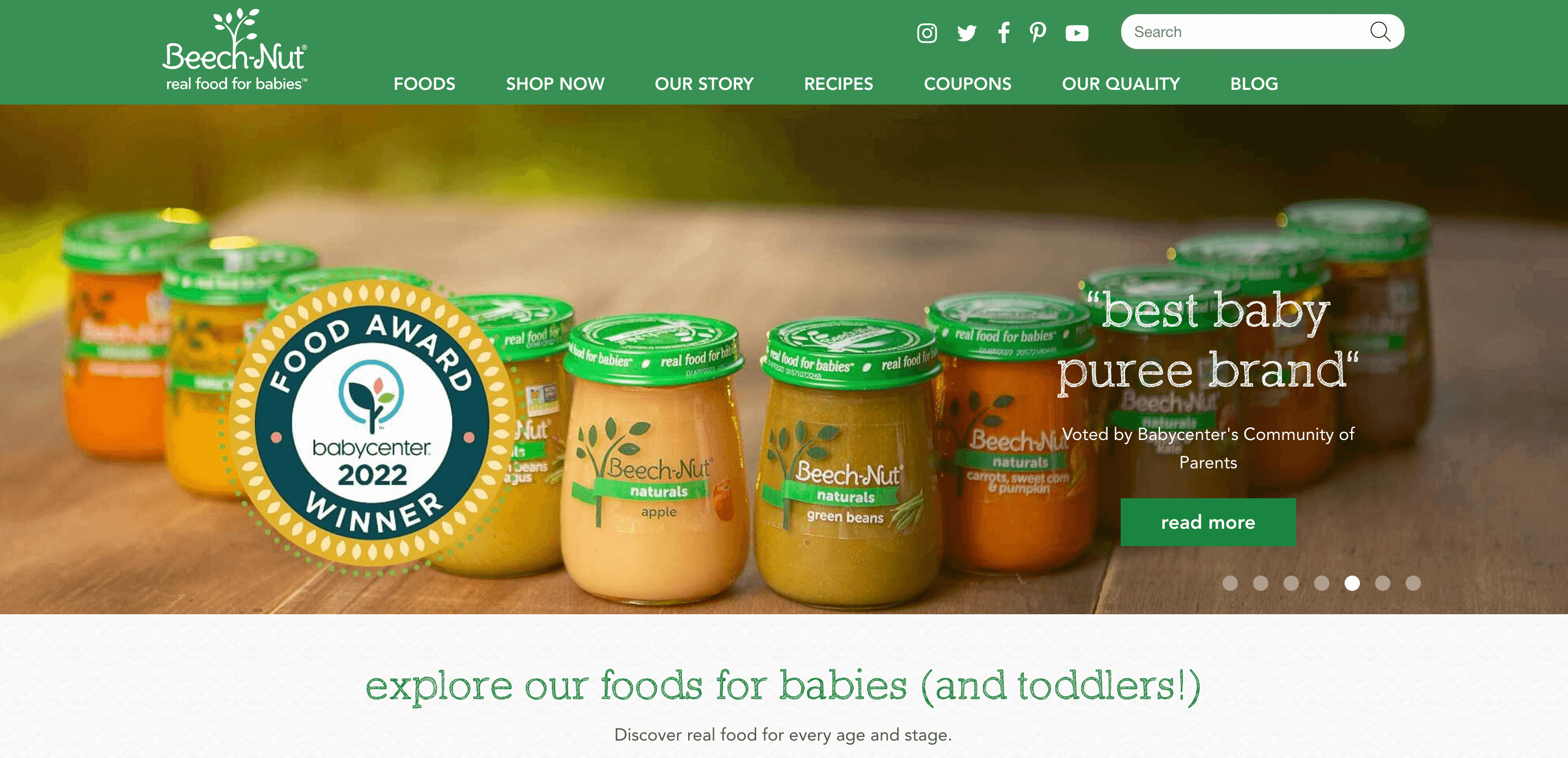
Finally, it’s also a good idea to play around with trust badges like awards and certifications. You can easily incorporate them in your site’s header, like on the Beech-Nut homepage.
Conclusion
Considering the fact that your website plays a crucial role in helping impress and convert prospects, it’s easy to see why ensuring satisfactory engagement rates matters. After all, a site that doesn’t hook visitors most likely won’t have what it takes to turn them into customers either.
Fortunately, guaranteeing instant engagement can be as easy as tweaking your header with a few well-chosen design, layout, and copywriting upgrades.
So don’t hesitate to try the strategies discussed in this article. Sure, some of them might require a bit more work than others (like replacing visual headers with videos). But you can rest assured that every small change will add up, resulting in an overall impressive site that encourages interactions and gets you the results you’re after.