Mobile Optimization Strategy And Best Practices That Will Get Your Site On Top Of The SERPs
Dominic Tarn
Head of Content
20.01.2020
Are you eager to make a mobile optimized website but need to know how to start? Or, are you just trying to find out what does mobile friendly mean on the whole?
Here are the answers:
The mobile friendly website is a tiny version of the web interface displayed aesthetically pleasing on mobile devices and tablets. Although it looks smaller on the smartphones, it’s still user-friendly and provides users with primary functionality and works fast.
A mobile optimized website is a must-have element of any online business as it prevents users from leaving a resource due to poor interface and low performance.
In case you don’t know the steps towards the creation of a mobile optimization strategy, you’re in the right place.
By reading this article to the end, you’ll find out the major mobile optimization terms and hacks, namely:
What does mobile friendly mean? (already explained above)
Why is mobile optimization so important nowadays?
Is your platform already optimized? How to check it.
Tips for developing a mobile optimized website.
Three types of mobile optimization strategies.
Are you ready to go? Let’s get started!
Why is mobile optimization strategy so important?
Over 51% of websites are opened on mobile devices. Global traffic is becoming more mobile as it’s more convenient and faster – people use phones on the go, waiting for coffee or in the subway. Thus, a mobile-optimized website meets the interests and lifestyle of contemporary users.
Some more statistics to prove the significance of the mobile-first strategy for business:
The number of mobile device users is continuously growing. By 2023, it will be around 7.33 billion, while in 2019 there were 2.71 billion.
The culture of using mobile devices has fundamentally changed. A smartphone replaced both a telephone and a computer. Today, 3 billion people have smartphones, and only half of them have computers.
It’s impossible to ignore mobile-first indexing by Google if you want to get on the top of Google SERP.
So, the popularity of the mobile optimization concept is beyond any doubts. It’s time to determine your site compliance with it.
How to check whether your website is mobile-optimized well
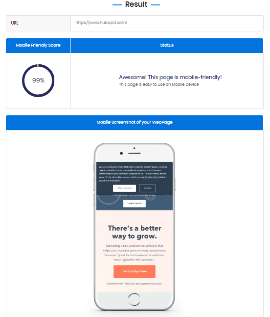
1. The simplest way to check your website is to use this free Google tool. Developers can further enhance their website’s performance by utilizing comprehensive Mobile Friendly Test tools to identify and resolve optimization issues. All you need is to enter your website URL. If the site has some issues, you’ll be provided with a precise list of recommendations.
2. A more comprehensive but very insightful method is interviewing your users. Ask them to test different sides of your site on mobile, including navigation, loading speed, and other features, and write a feedback letter. Their answers will reveal the additional technical and user experience issues presented on the mobile version.
Did you detect some room for improvement? You’re good to go with the tips below.
Tips for making a mobile-friendly website
Images. Do it by yourself or ask your web developer to create different types of alternative pictures with the meta name “viewport.”
Navigation. The minimum set of elements should be included in the mobile version of the site. What kind? Explore the audience’s behavior, the most visited categories, the most often used buttons and functions. It’s also preferred to redo a side menu, the so-called “hamburger” menu.
Pop-ups. There are bad and good windows solutions. The bad ones cover the entire screen. The good ones leave enough space to see and not obscure the whole page.
Text. Make lists, short paragraphs and text presented on the web version. One screen should contain both key text information and a CTA button.
Hubspot’s web version
CTA buttons. The conversion rate on mobile versions of sites compared to web pages is much lower. The reason is the lack of clear calls to action. Users are confused about what to do next. So, take advantage of noticeable and catchy CTA buttons.
Responsive WordPress theme. If your website is developed on WordPress, choose mobile optimized ready-made layouts. You can check the display of the site after installing the theme by clicking on the appropriate icon – web, mobile, tablet.
Web Hosting. If you have recklessly chosen the lowest option with the smallest set of features, then no matter how well adaptive and mobile friendly your website is – there still will be a problem with page loading speed. What to do then? Change the hosting plan immediately. You can go further, by switching to another hosting provider that guarantees robust speed and high security.
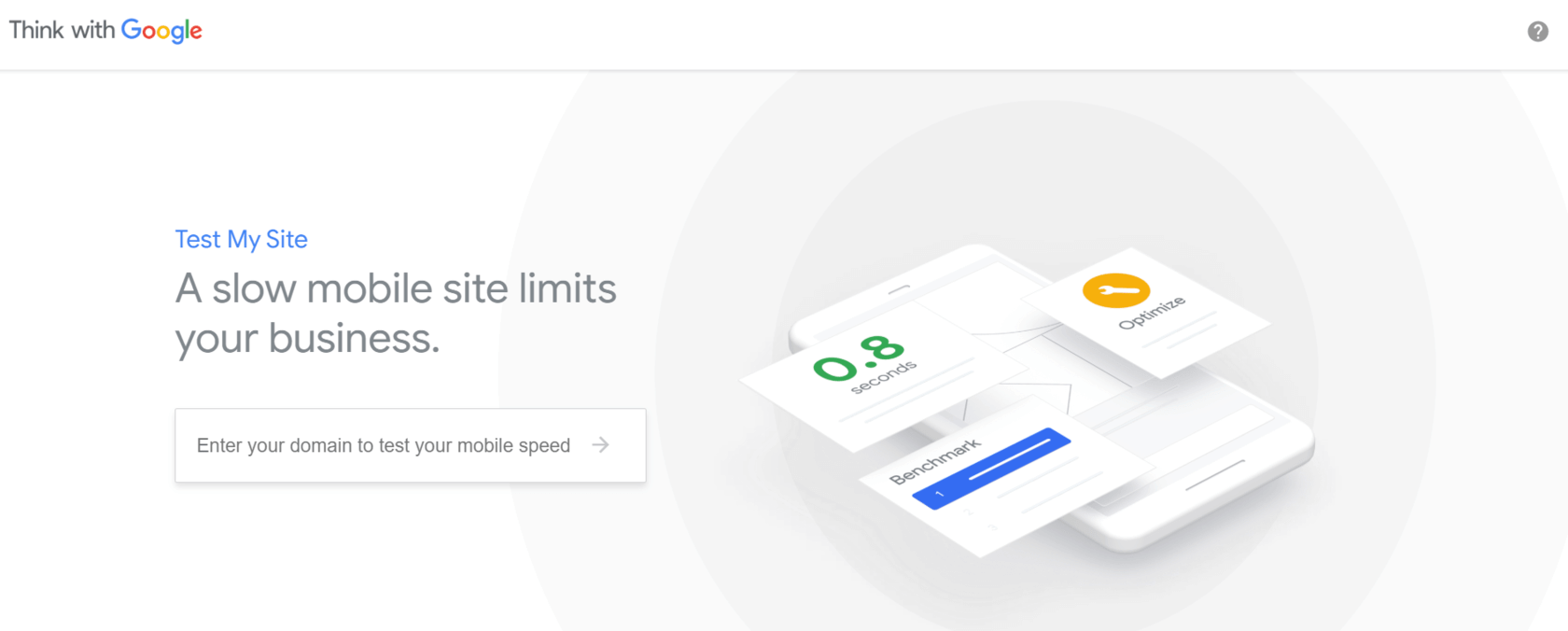
Download time. The faster pages load, the lower the bounce rate is, and the higher the chances to convert users to customers. Google made the site loading speed on mobile one of the most important ranking factors.
Check the loading speed of your web pages right now using a free Google’s Mobile Speed Test Tool. You can even compare the download speed of your site as opposed to competitors’.
Got the result? Need some improvements? Start speeding up with these methods:
Allow caching. Let some files of your site be stored on users’ devices – there will no longer be a reason to load data every time the site is opened.
Optimize images to reduce the weight of your site. Use specific plugins or a special service, for example, TinyPNG.
Optimize your code (CSS, HTML, Javascript) according to Google’s Mobile Speed Test Tool report. ‘How to get to the top of google search results‘ won’t be your question anymore if you start compressing the code and reducing the file sizes, such as images, that will have an unbelievable effect on your website’s loading speed and performance.
Make user-friendly pop-ups. Google has come up with rules that website pop-ups must comply with and introduced fines for not complying with them. Now, if you want contact forms or pop-ups to appear on mobile devices, make them small and easily closeable, so that they don’t annoy users.
Use the AMP (Accelerated Mobile Pages) plugin. The idea is to download a light version of each page without media files or other weighty code.
Mobile on-page SEO fixes:
Title, description, URL. Follow these universal recommendations to ensure that your site has a good presence in SERP:
– Title: 65 symbols + space included
– Meta Description: 122 symbols + space included
– URL: 42 symbols + space included
If you want to make truly striking Titles, stick to approximately 32 symbols.
Focus on geo-referenced mobile optimization. If you need to receive local clients, add your address, timetable and phone numbers to the meta description. For enhanced mobile optimization, prioritize a seamless phone carrier check for users to verify compatibility with your services.
Make content scrollable. Do not force users to leave the site, switching between a dozen links.
All image attributes must be registered. Now “alt” is taken into account by Google.
Three types of mobile optimization strategies
You can choose one of these approaches when forming your mobile first strategy:
Responsive Design
Adaptive Website
Separate Mobile Web-Site
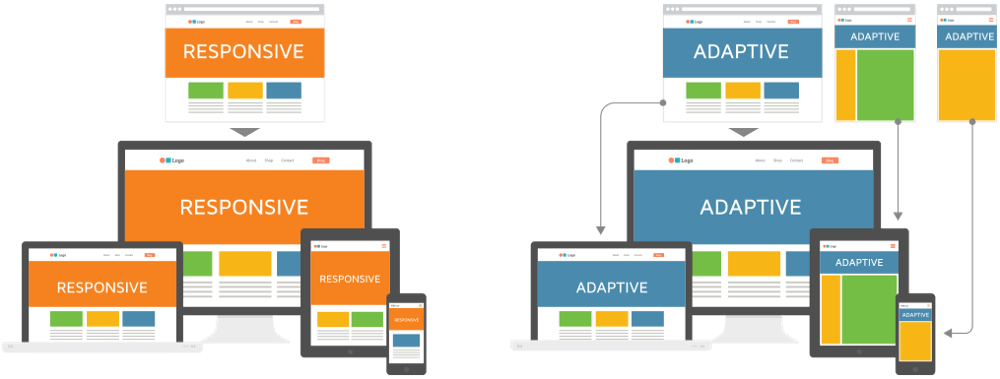
Responsive design
In the responsive design, the content of the web and mobile versions of the site is similar. They contain the same URLs, HTML, and images. However, you should specifically optimize the website using CSS media queries to adjust styles based on the target device characteristics.
Adaptive Website
This type of mobile optimization assumes that the web and mobile versions of the site have the same URLs but their HTML and CSS are generated independently, depending on the device which sent a request. Also, the content is adapted to different screen sizes based on the primary created static layouts.
To get the adaptive website, you need to overcome some technically sophisticated issues:
Cloaking – avoid the situation when both the search engine system and a user see two different versions of one page (you can configure it through the Vary-HTTP header);
Design – adapt it to at least six screen sizes.
On the surface, it appears that adaptive requires more work as you have to design layouts for a minimum of six widths. However, responsive can be more complex as improper use of media queries (or indeed not using them at all) can make for display and performance issues.
Luckily, there is an optimal option – combine Responsive Design with the logic of the Adaptive website.
Separate website mobile optimization
Here I’m talking about an independent site with m-dot in the URL and application of the specific SEO features.
At first, each mobile URL must contain “m” – m.websiteexample.com.
Then, you need to add rel =” canonical” to the URL of the mobile site and rel =” alternate” to the web version.
It is also essential to do the next operations:
Check mobile site’s connection in the Google Search Console;
Check if links from XML Sitemaps & Robots.txt are accessible from the mobile version of the site.
Conclusion
Now, when you clearly understand how vital the development of a mobile optimized website is, it’s time to start practicing. Do your business online with a mobile first strategy in mind. Or, be prepared for the fact that users will bounce right off the page within the first three seconds.
It’s your turn. Do you use some special mobile optimization tactics that I missed? Write about your unique approach in the comments.