Nice To E-Meet You!


    What marketing services do you need for your project?


    7 Impressive Graphic Design Techniques That Will Make Your Website Stand Out of the Crowd

    When surfing the Internet, you find dozens of the same type websites, most of which you forget about a few seconds after closing a tab.

    People remember better resources that are full of exciting graphic design pictures.

    The cool website ideas not only grab the attention of visitors but also make the interaction with a page convenient and clear.

    In this article, I’ll introduce you to seven impressive graphic design techniques that will help you create a unique, eye-catching web design with excellent navigation.

    Particularly, we’ll consider:

    • double exposure
    • hover effect
    • grid
    • blurred background
    • duplex
    • vintage and retro style
    • mixed scrolling and animation

    Let’s get started.

    7 Fascinating Graphic Design Techniques

    Double exposure

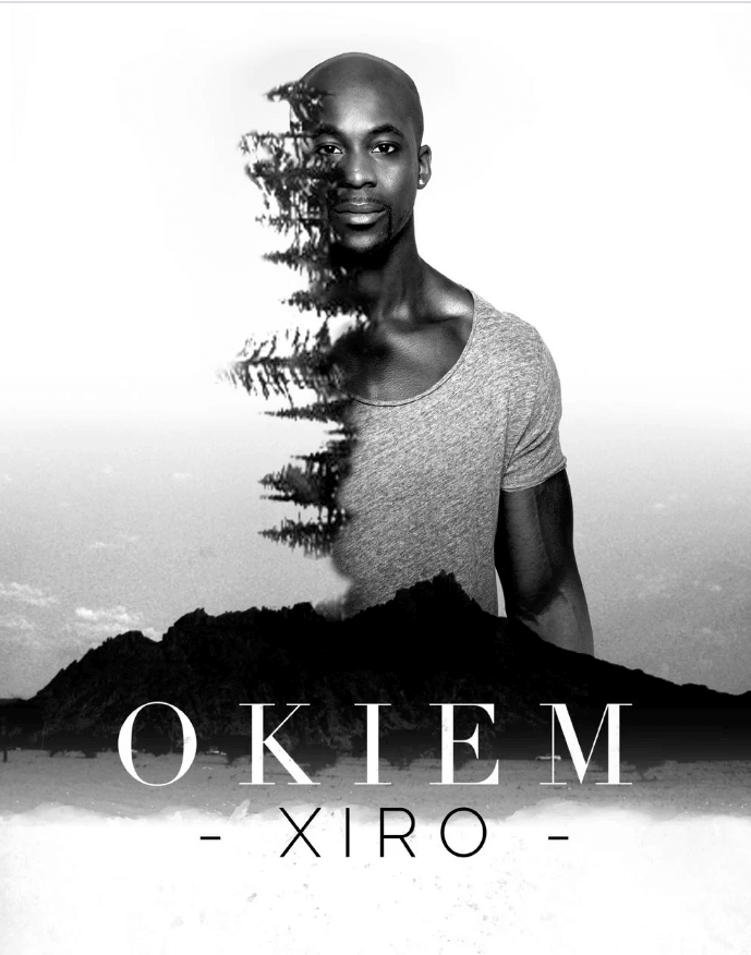
    Double exposure is a special technique in photography, cinematography and graphic design that creates spectacular visual combinations. Through the superimposition of two or more exposures, you can get a double image.

    You probably have seen this interesting effect of several overlapping photos on the covers of music albums, in modern magazines and in advertising.

    double exposure

    It’s up to your imagination which objects to experiment with. You can combine different textures, sizes, colors, etc. On Pinterest, you’ll find a lot of examples for inspiration.

    The most commonly used combinations of double exposure are a human with some natural phenomena or overlapping materialistic things.

    For example, the photo of a floral perfume overlaying a flower field is a nice solution for presenting a new aroma in your branded store. Such a picture will allow consumers to imagine the smell by evoking deep associations with the aroma of flowers.

    double exposure exam

    The process of creating double exposure is quite simple. In Adobe Photoshop, use the Screen – Blend mode. Multiple the lightness of the upper layer of an image by the lightness of pixels of the lower layer. White pixels will remain white, and as a result, you’ll get even lighter image. It will never be darker than any of the two original images.

    The pre-built effects will save you time, but you still can implement a double exposure effect from scratch.

    Double exposure is one of the most unusual and popular graphic design techniques. It helps you create real magic: connecting living and inanimate nature, animate rivers and stones or conveying the atmosphere of some far-off place through the screen.

    Hover effect

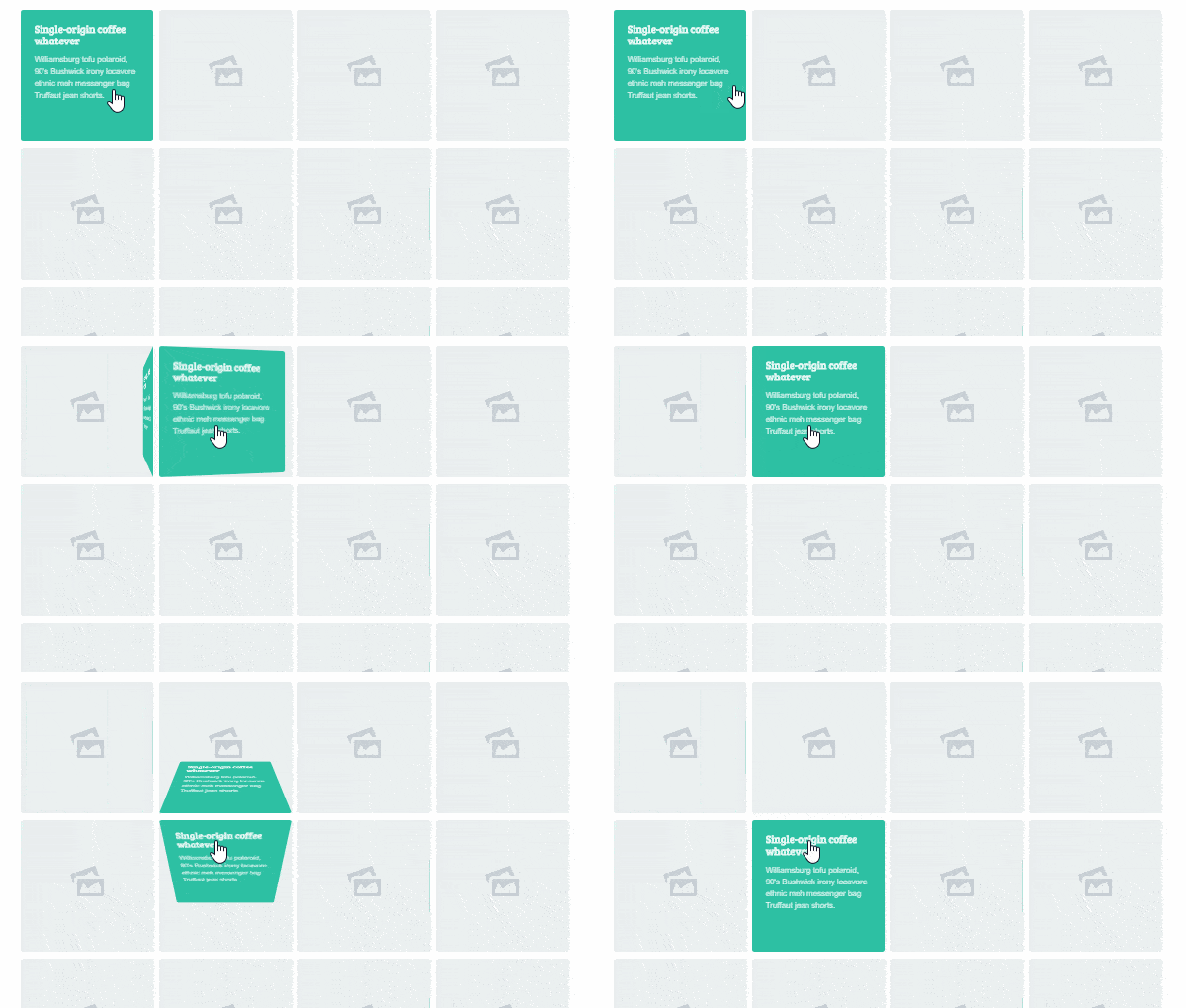
    Another exciting graphic design element for a web page is a hover effect. Hover effects are applied to website buttons and blocks (pop-up captions, hints, smooth transitions, transformation, rotation, zoom, offset, etc.) when you hover the mouse cursor on them. Typically, these change the color and style of the elements.

    For example, a cursor can turn into a small hand when you hover over a button. A link may become underlined or change the color from black to blue.

    However, you should know the golden mean since the big quantity of different pulsing elements or changing effects may cause irritation, especially if the hovered elements serve as navigation through a website. Highlight only the most important, functional points and remember that minimalism is always effective.

    This technique looks nice in sections designed in a card style. For example, you can add a hover to the card that a user chooses.

    direction aware 3d

    By applying hover effects, you’ll make your website more dynamic and the interaction will be more unusual and unpredictable for visitors.

    Grid

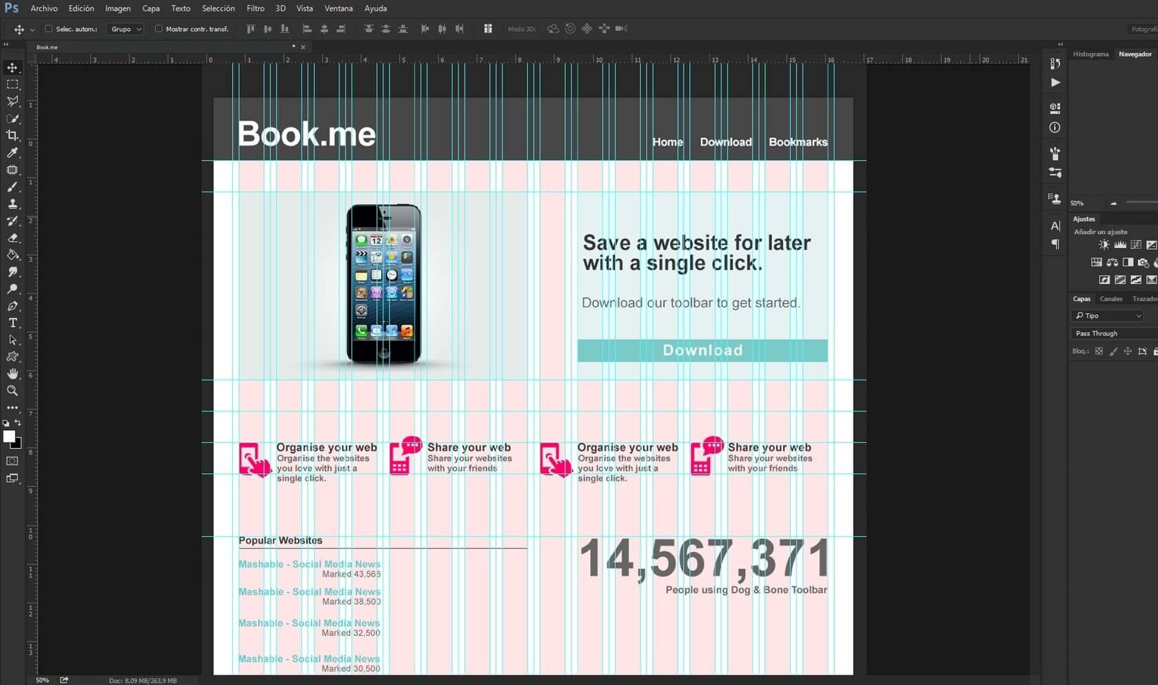
    To make web design not only attractive but also correctly structured, the grid is an indispensable tool. It represents a set of invisible guides, along with which you place web page elements.

    It makes the placement of the components easier, provides a visual connection between the separate blocks and maintains design continuity in the transition from one page to another. By using it, you won’t have to spend a lot of time trying to combine all the elements harmoniously.

    You’ll clearly see what elements to insert and what size each block should be. In general, a modular grid is a carcass, which greatly facilitates the construction of the whole site.

    grid design

    Thus, the grid keeps the esthetics and provides control over the development process, making it flexible for both a designer and a developer.

    Although the grid is required for a proper website structure, nothing prevents you from “breaking” standard columns if you plan to create some extraordinary graphic design pictures.

    Blurred background

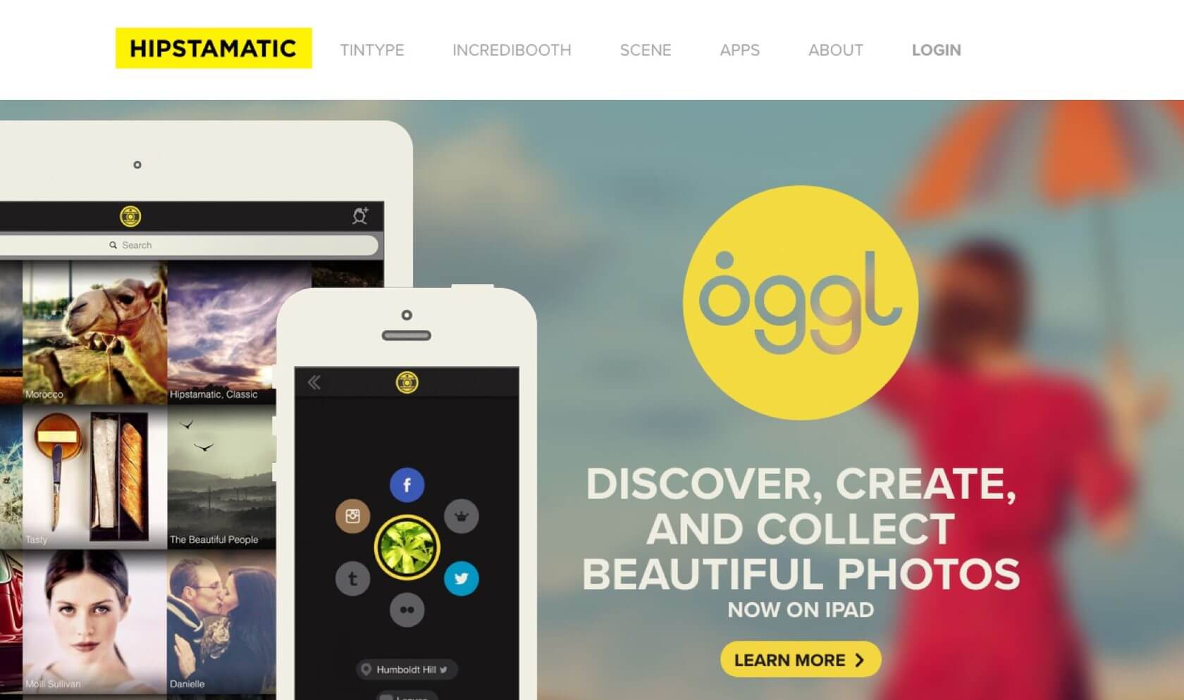
    Photos with blurred background look much more professional and artistic. The same principle relates to web design.

    Go through modern websites and notice that the majority of them use plenty of sharp images, fonts, shapes, and lines. The visitor starts examining the content of your page, logo, and design elements and all this instead of studying the product you offer. Sixty percent of web pages are overloaded with information.

    The use of a blurred background adds warmth and coziness to your site and helps users to focus on the central objects (product description, features, special offers).

    blurred background

    There are many ways and programs to create a blurred background. The easiest one is to apply the blur filter (Filter -> Blur -> Gaussian Blur) in Adobe Photoshop.

    A blurred background is one of the most favorite graphic design techniques of designers as it allows to put the emphasis on the company’s services/goods and makes the graphic design pictures soft and pleasant to perceive.

    However, if such a tender approach isn’t your cup of tea and you want to impress visitors with bold solutions, take a look at the duplex method.

    Duplex

    The duplex design consists of two colors and their halftones. It looks stylish and very creative.

    This filter can come in handy when you need rebranding in a short time while leaving the whole concept and structure of the site unchanged. Even such a minor addition will help you update the site literally beyond recognition.

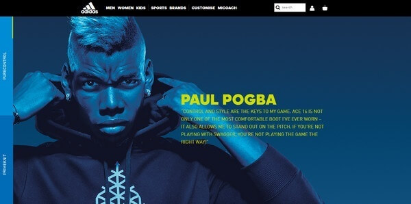
    Among the cool website ideas based on duplex technology, I want to highlight Adidas with their large-scale advertising campaign devoted to the release of football boots Ace 16+. They used a series of stunning background photos designed in a blue color gamut in the style of a duplex. The two-color illustration creates an amazing atmosphere that fits their brand strategy and enhances the energy of the sports.

    duplex graphic design

    The innovative duplex technique has gained great popularity among contemporary web designers, but if you’re a lover of the past century, keep an eye on retro graphic design pictures.

    Vintage and retro style

    Web design in vintage and retro style is extremely popular in the twenty-first century. By implementing some cool website ideas in this old manner, you’ll give your visitors a chance to look at the contemporary reality from the new perspective, by returning to the past.

    Fashion trends of the 1920-1980s are the most recognizable among household items such as furniture, dishes, appliances, transportation, clothing, and shoes. Therefore, such images are actively used in web design. Also, you can follow this approach by modifying modern objects as antiques.

    The vintage style maintains the corporate identity of the company or organization, which is designed in the same fashion direction. Feel free to apply this technique if your business is somehow associated with the past age — for example, if you sell antiquarian diamond rings, manufacture luxurious furniture or own retro-cafes, retro-cinemas, retro-clubs, etc.

    Such a design can also be suitable for tourism companies, photo studios, photographers and artists, models, entertainers and other spheres of art.

    Even if your business isn’t connected with vintage and retro products, you can still use their particular elements (fonts, images) in your marketing, e.g., in thematic ads, landing pages, e-books, etc.
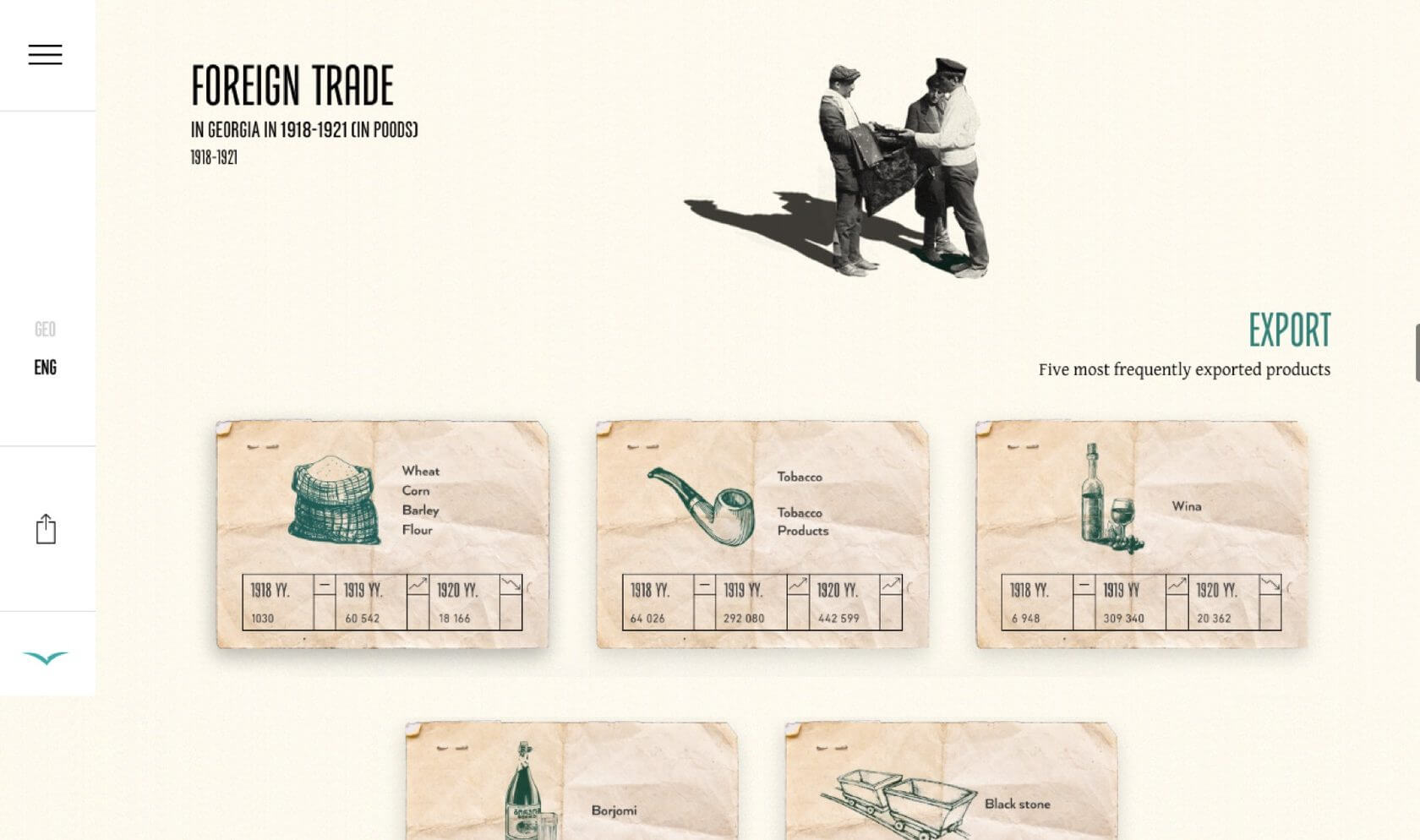
    retro web design

    Be cautious, this style should be used mindfully in order not to create the image of an old, dusty site.

    Retro is a perfect choice if you’re are a faithful conservative person who respects traditions and strives to renew history.

    Assuming that the 21st century is an era of new trends, needs, and preferences, people can expect something extraordinary and more modern. To surprise users with advanced design solutions, pay attention to such graphic design techniques as mixed scrolling and animation.

    Mixed Scrolling and Animation

    The real trend of recent years is layouts with long scrolling and divided sections. It’s not just a one-page layout that has similar navigation, but content divided into separate parts. Such websites usually provide good old parallax effect and, of course, use a lot of animations appearing during scrolling.

    The video below shows a brilliant example of how you can apply scrolling in different directions. The navigation of the presented site combines vertical and horizontal scrolling in a single page layout.
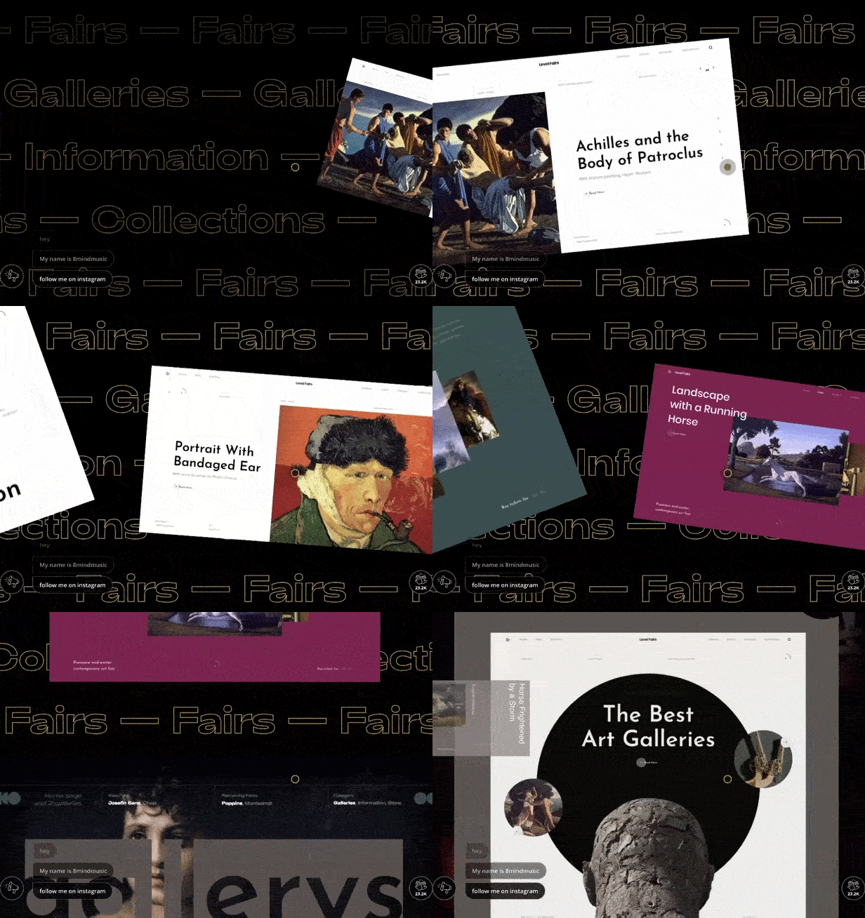
    scrolling effect

    Mixed scrolling can be an excellent technique for the website of an IT company as it will unconsciously show users that you know how to implement complex things. By the way, earlier we’ve described some more ways of how to create an effective IT marketing strategy.

    Talking of animation, remember that the purpose of any kind of dynamic element is the improvement of the website usability. If earlier designers have been implementing animation as decoration, nowadays, experts strictly recommend to use it with the aim of attracting user’s attention to important points like CTA buttons, forms and offers.

    Here is a list of the most popular types of animations:

    • rotation
    • slip
    • flash and throbbing
    • shift and jelly-like effect
    • color change
    • swing and others

    Also, be aware that animated elements and scrolling effects can reduce site speed and spoil the user experience. Make sure that they’re not excessive and don’t irritate and put any pressure on the eyes.

    The animation is an extremely useful web design technique unless you use it solely as decoration with no functional purpose.

    Conclusion

    Realize your cool website ideas by playing with colors, shapes, images and textures. You can use one of the listed graphic design techniques or combine several of them accordingly to website requirements and your skills.

    In case you want to create a professional web design with sophisticated solutions and elements that can boost conversions, ReVerb will gladly assist you in this creative endeavor.


      Once a week you will get the latest articles delivered right to your inbox