Designing Mobile Popups: Best Practices For High Conversions
Dominic Tarn
Head of Content - ReVerb
11.19.2024
Mobile users reveal their intent with every swipe, yet too often, these moments slip by without converting.
The problem isn’t mobile popups themselves — when done right, they’re powerful tools. But poor design and misuse can quickly turn them from engaging to annoying, creating friction in the customer journey.
With mobile now accounting for 70% of web traffic, optimizing popups for these devices is essential. In this post, we’ll explore proven strategies to create mobile popups that grab attention and drive meaningful conversions.
Mobile Popup Best Practices Checklist
Here is a quick checklist of the mobile popup best practices covered in this guide, with the reason each one matters.
Best practice
Why it matters
Use a responsive design
The popup must fit every screen size without covering content the visitor came for.
Keep the message short and clear
Small screens leave room for one headline, one offer and one button.
Make the close button easy to tap
A visible, thumb-sized close control stops visitors from bouncing in frustration.
Ask for as few fields as possible
Typing on a phone is slow, so every extra field lowers completion rates.
Use mobile-specific triggers
Scroll depth, time on page and back-button behavior work better on mobile than mouse-based exit intent.
Prefer banners and slide-ins
Floating bars and small slide-ins capture attention without blocking the page.
Delay the popup
Showing it after the visitor has engaged avoids intrusive interstitials and early exits.
Add light gamification
Spin-to-win or reveal offers can raise engagement when the reward is real.
Run A/B tests
Testing copy, timing and format shows what actually converts for your audience.
How Mobile Popups Work
Mobile popups are smart, responsive overlays that appear based on user actions like scrolling or time spent on a page, engaging visitors without interrupting their flow. Unlike desktop popups, these are compact, covering only a part of the screen and keeping a clearly visible close button for quick exits.
By following Google’s guidelines to avoid obstructive designs, these popups offer a user-friendly way to engage visitors right where they are, ensuring they support rather than interrupt the journey.
The Claspo guide offers best practices for mobile popups, actionable strategies and real-world examples to help you create effective popups for mobile that engage users without interrupting their experience.
Now, let’s reveal some tips to make effective mobile popups.
9 Tips For Catchy Mobile Popups
How can you make mobile popups effective — helping you connect with visitors without driving them away? Let’s reveal the details and show you how to create popups that engage, not annoy.
1. Provide a responsive resign
Given the variety of screen sizes from smartphones to tablets, your popups must adapt smoothly to different devices. They should automatically resize and realign to fit the screen without blocking important content.
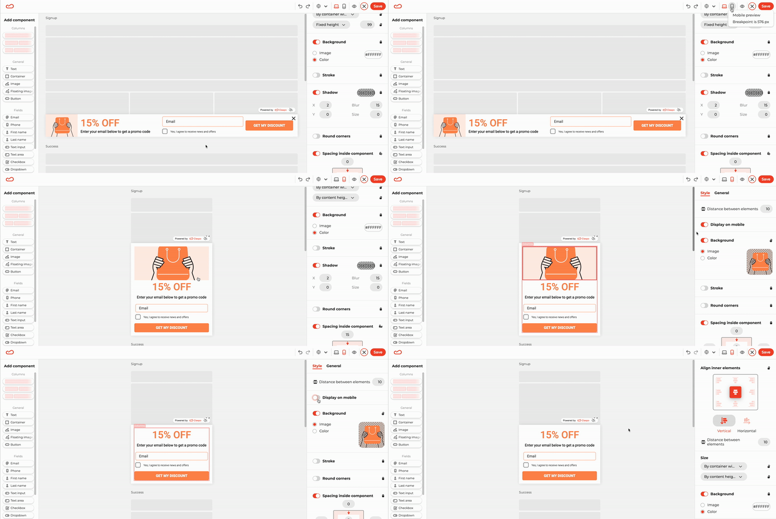
Claspo’s column component makes this easy by rearranging widget elements vertically on mobile screens. You can also hide certain elements, like images, in mobile mode to reduce pop-up length.
Test your popups across multiple devices to ensure they look great everywhere. For instance, when building widgets in Claspo, you can preview how they appear across various screen sizes to ensure a seamless user experience.
2. Embrace simplicity and clarity
Mobile popups should communicate a straightforward message with minimal distractions. Steer clear of long blocks of text, large images, or overcrowded designs. Opt for a simple layout with easy-to-read fonts, a catchy headline, brief supporting text, and a clear, attention-grabbing call-to-action.
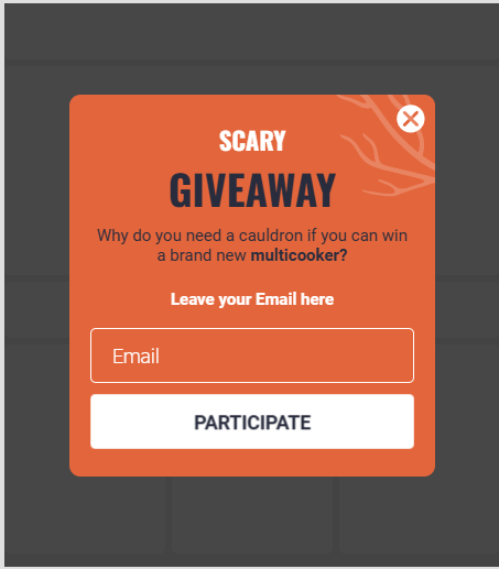
Example of a mobile popup from Claspo’s template library.
3. Make the close button easy to access
Ensure mobile users can easily find and click the close button. Place it in a familiar location, like the top right or left corner, and make it large enough for easy tapping — aim for a size of at least 44 x 30 px. A well-positioned, accessible close button prevents frustration and encourages a smoother experience, reducing bounce rates.
4. Keep form fields to a minimum
Mobile popups are all about ease and speed, so when adding forms, keep them short. Stick to one or two fields, like email and name, to keep it quick and hassle-free. Long forms can frustrate users, especially on small screens, leading to higher abandonment rates.
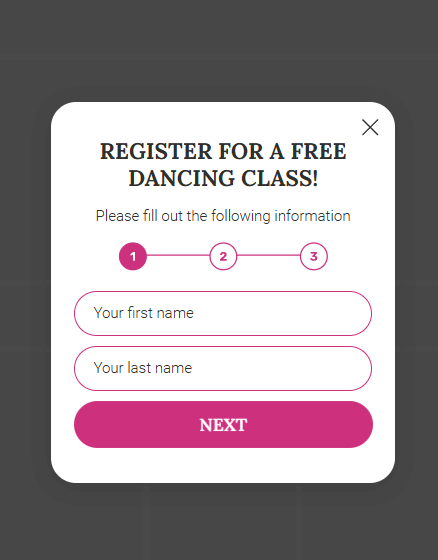
If you need more info, try multi-step forms that break things down into bite-sized, manageable steps — users are more likely to finish when it feels less overwhelming.
Example of a mobile multi-step popup from Claspo’s template library.
5. Implement mobile-focused triggers
Tailor your pop-up triggers to user behavior, such as using scroll-triggered pop-ups when users reach 50-75% of the page or time-delay pop-ups after a few seconds of engagement. Avoid showing pop-ups immediately after page load to prevent disruption.
With Claspo, easily set triggers through widget display settings. Plus, take advantage of features like Overlapping Protection, which prevents multiple popups from appearing at once, and Annoyance Safeguard, which limits popup frequency to ensure better user engagement.
6. Use floating bars
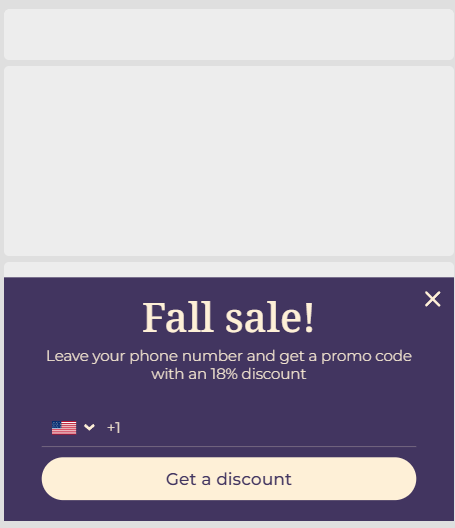
Placing a floating bar at the bottom of a mobile screen provides a non-intrusive way to grab attention without disturbing the user experience. It’s perfect for gentle prompts like sign-ups, promotions, or abandoned carts. As users scroll, the floating bar remains visible, boosting visibility while ensuring a smooth, enjoyable interaction.
Example of a mobile popup from Claspo’s template library
7. Use exit-intent trigger
Exit-intent popups can be effective on mobile devices by triggering when users tap the back button to leave. This non-intrusive strategy gives you a chance to engage users, whether through discounts or lead captures.
Claspo also offers the option to activate popups based on a “Not active on the page for X time” rule, allowing you to trigger them after a user has spent a specific amount of time on the page.
Example of a mobile popup from Claspo’s template library.
8. Add gamification
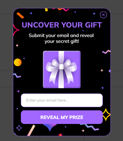
Incorporating gamification into your mobile popups can enhance user interaction and conversion rates. By adding game-like elements such as spin-to-win wheels, progress bars, or quizzes, you make the experience more interactive and rewarding for visitors.
Claspo provides ready-to-use gamification elements that can be easily integrated into your popups. This encourages users to engage with your content, increasing the likelihood of conversions while keeping the process fun and enjoyable.
Example of gamified mobile popup from Claspo’s template library.
9. Run A/B tests
Focus on elements like popup formats, timing, and copy to discover what resonates with your audience. Test different popup types (full-screen, slide-in, floating) to gauge what grabs attention without disrupting the user experience. Experiment with timing triggers — such as time delays or exit-intent — and test various CTA texts to see which drives more conversions.
Claspo’s A/B testing feature allows you to experiment with different versions of your popups to identify which design or content performs best and automatically get testing results.
Google’s Intrusive Interstitial Guidelines
Google has said that pages where content is not easily accessible to mobile users can perform worse in search. Its guidance on intrusive interstitials focuses on how a popup affects the visitor who arrives from search results, and it separates popups into those that cause problems and those that are acceptable.
Popups that are likely to be seen as intrusive include:
A popup that covers the main content immediately after a visitor arrives from search, or while they are reading.
A standalone interstitial the visitor has to dismiss before reaching the content.
A layout where the top of the page looks like an interstitial and the real content is pushed below the fold.
Popups that are generally acceptable include:
Legally required notices, such as cookie consent or age verification.
Login dialogs on sites where the content is behind a paywall or not publicly indexable.
Banners that use a reasonable amount of screen space and are easy to dismiss.
The practical takeaway: on mobile, favor small banners, slide-ins and popups that appear after engagement rather than full-screen overlays on page load.
Mobile Popup Examples
These common formats show how the best practices above work in practice.
Bottom bar discount offer: a thin bar at the bottom of the screen offers a first-order discount in exchange for an email address. It stays out of the way and can be closed with one tap.
Scroll-triggered newsletter slide-in: after a reader scrolls through most of an article, a small card slides in inviting them to subscribe for similar content.
Cart reminder: when a shopper with items in the cart starts to leave, a compact message reminds them of the cart and offers free shipping or help.
Spin-to-win wheel: a gamified popup shown after some browsing time, with a short form and clear prize terms.
Click-triggered popup: a popup that opens only when the visitor taps a button such as “Get the guide”, so it never interrupts reading.
They can if they are intrusive. Google has said that pages where interstitials block content for mobile visitors arriving from search may rank lower. Small, easy-to-dismiss banners, legally required notices and popups that appear after engagement are generally fine.
When should a popup appear on mobile?
After the visitor has shown interest, not the moment the page loads. Good triggers include scrolling past a set share of the page, spending a set amount of time on it, adding to cart or tapping a button. Test different timings to find what works for your audience.
How big should a mobile popup be?
Small enough that the visitor can still see and use the page behind it. Banners and slide-ins that take up a modest part of the screen are the safest choice. Whatever the size, the text should be readable without zooming and the close button easy to tap.
Creating mobile popups that drive conversions is all about striking the right balance — engaging users without disrupting their experience. By keeping your designs simple, optimizing for different screen sizes, and testing triggers you can maximize their impact. With tools like Claspo, fine-tuning your mobile popups is easy, allowing you to improve results for mobile users.