10 Proven Website UI Tips for Creating Outstanding Brand Image
Julia Pirogova
Art Director - ReVerb
11.11.2021
Creating a positive brand image through a website user interface (UI) is a challenging task that requires some thorough and expert knowledge.
If you don’t have time for experimenting in addition to the whole trials/errors hustle, a simple list of tried-and-true UI design tips will help you reach better results.
In this article, I’ll share with you some useful and foolproof UI design hacks that are easy to implement for both novice designers and product owners. Try them out to make users fall in love with your website UI at first glance!
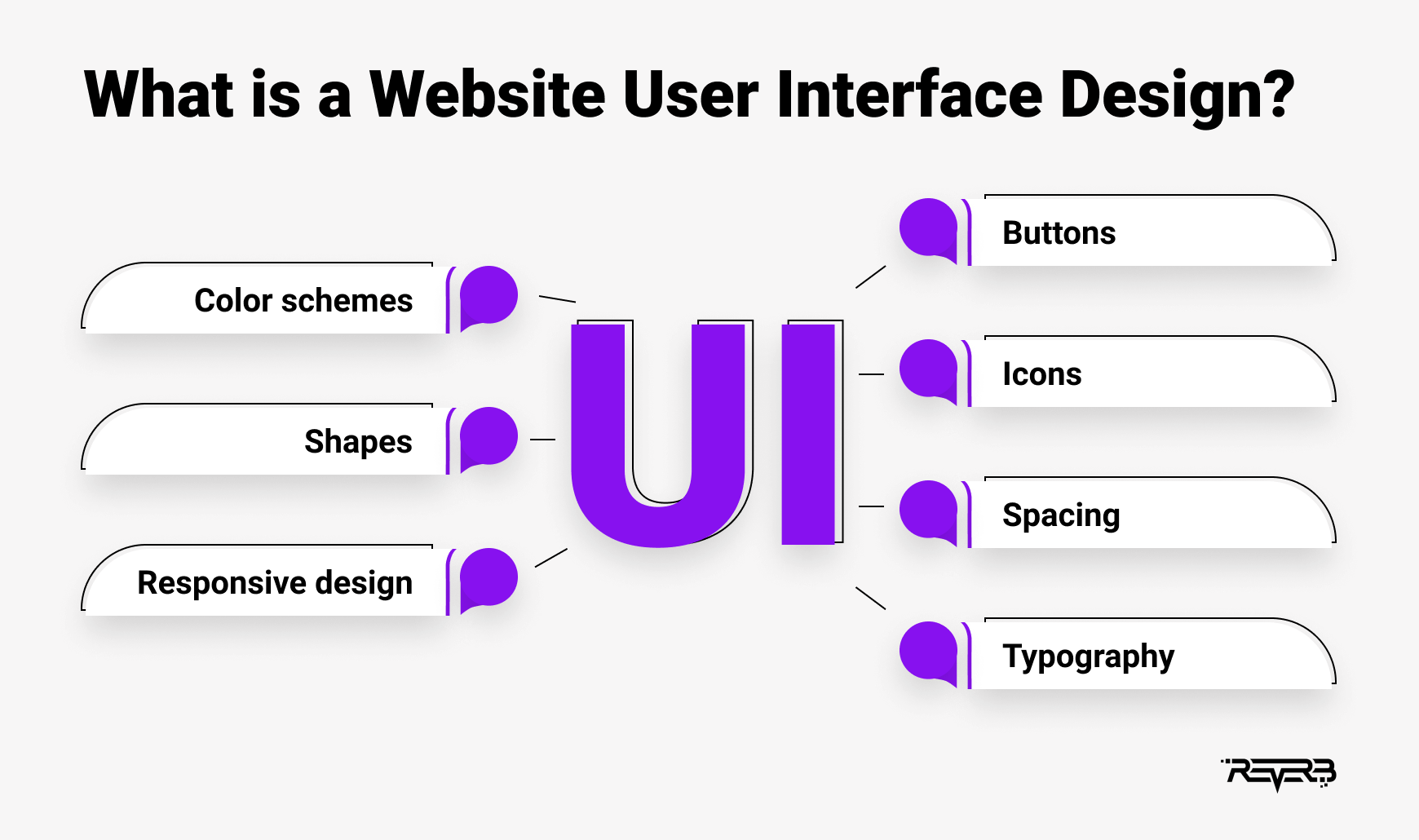
What is a Website User Interface Design?
A website user interface design is a process of creating visual elements and aesthetics to enhance the site’s interactivity and appearance.
In general, UI designers have a set of goals to pursue:
Reveal the brand’s identity by building an interface that corresponds to the company’s tone of voice, personality, views, and values.
Design user interfaces that boost conversions.
Elicit a positive response from users by introducing an aesthetically attractive interface.
Anticipate users’ needs and fulfill them by implementing useful interface elements.
Remember, that for any UI designer, it’s just as important to use the best practices for UI design in order to meet business objectives as well as to make the website look like eye candy. So to enhance the artistic merit of the website and achieve key business goals, consider using the following user interface design tips.
10 Tips for Creating an Amazing Website UI Design
So I’m here with a comprehensive list of user interface ideas that will make your website look exceptional and convert any leads professionally:
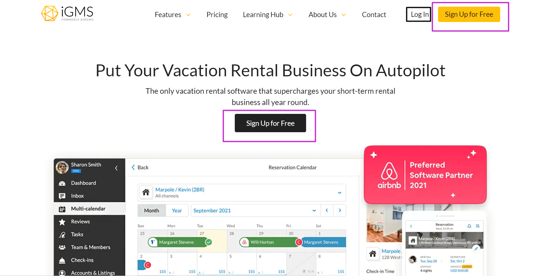
1. Don’t reinvent the wheel
No matter how attractive the idea of implementing some extraordinary design concepts is, reinventing the interface of a website is not the best solution, even for the most experienced designer.
Why? Because users are accustomed to certain things that look familiar and can be found in certain places in the layout.
For instance, take Google Docs and compare its layout to Office Word. They both look very similar (with a number of minor modifications, of course), and thus, are easily interchangeable.
On the opposite side of the spectrum is the MacOS Pages app. Here you see a completely different layout that might confuse Word and Google Docs users.
The main conclusion to draw from these examples is that in terms of UI design, users tend to like design techniques that they understand, and that don’t invoke learning.
So by reinventing the website interface along with its layout, you might stumble upon negative feedback and confuse users, instead of receiving avid appreciation for your outstanding achievement.
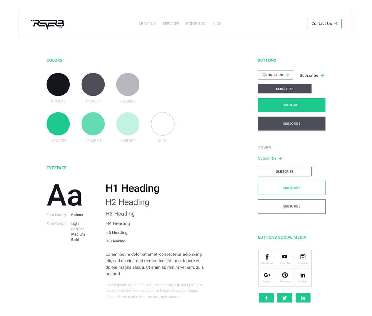
2. First off, come up with a UI style kit
Before starting the project, create a UI style kit (also known as a style guide) that you’ll be sticking to throughout the process of designing your website user interface. Think about the main colors you will use (ideally, no more than four colors), fonts, icon styles, etc.
Not only will this help you keep every detail in check, but it will also save your fellow developers a ton of time.
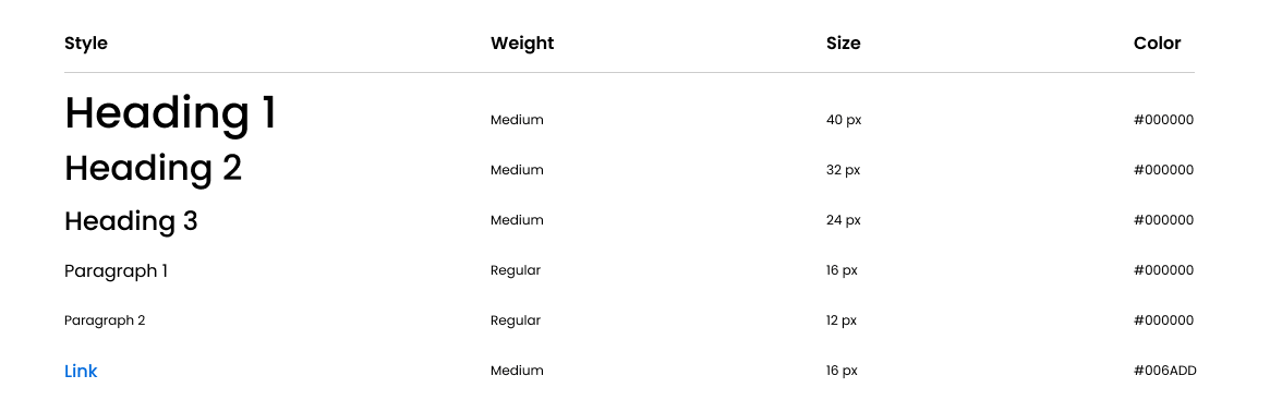
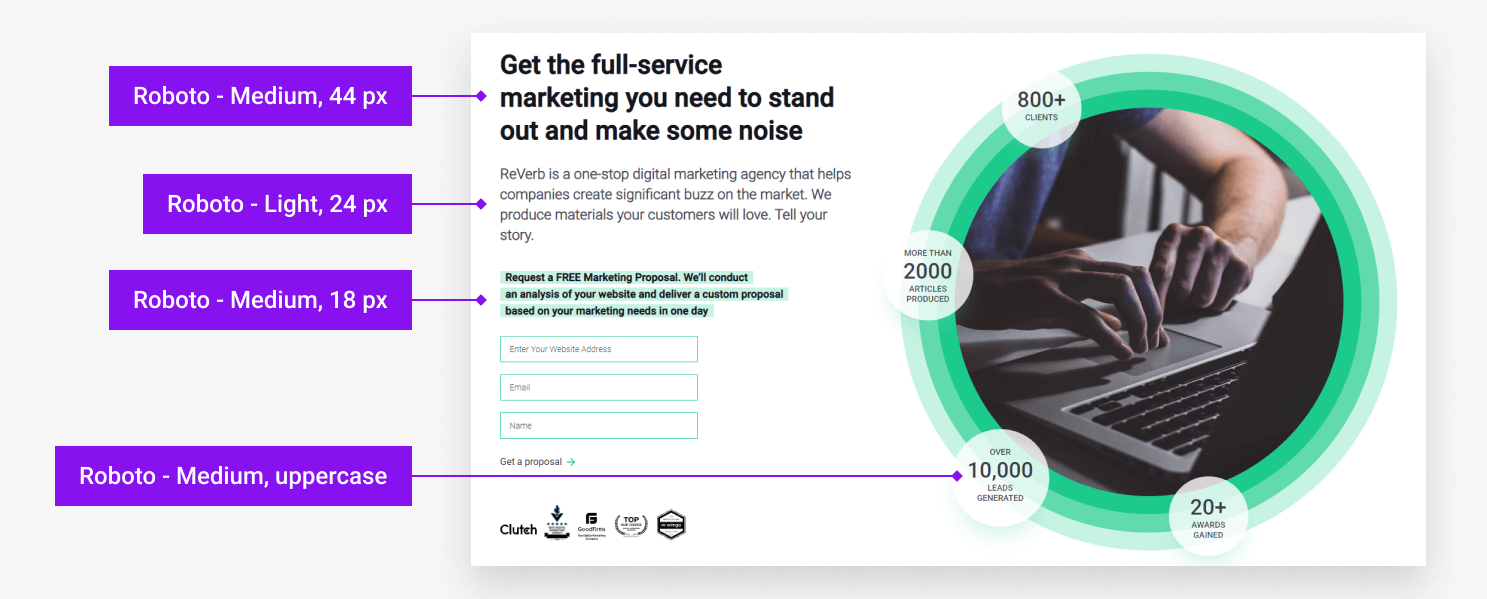
3. Use text hierarchy to focus the reader’s attention
Another important rule of a good UI design includes placing text elements in a strict hierarchy. This will help focus the reader’s attention on the important parts of the text such as the title and contents list.
The order of the text styles goes from the largest to smallest (i.e.: H1>H2>H3, etc.), where you can experiment not only with font size but also with font weight and color.
4. Come up with optimal element size and placement
A fundamental law of human-computer interaction states that the distance to and size of the target directly affect the time to acquire a target.
Simply put, the bigger and closer the icon, the faster and more likely the user will click on it.
With this in mind, follow four simple steps for optimal element placement:
Make sure to place the most important icons and links in parts of the website that are easily accessible and don’t confuse users.
Enlarge the size of these icons (to a reasonable extent), and make them stand out in the layout. At the same time, make sure that navigation tools such as the search bar and interactive elements are placed on the corners of the screen to minimize the possibility of overshooting the target.
Highlight and keep the primary actions in the front and center of the page and push secondary actions deeper in the layout, or lighten their visual weight.
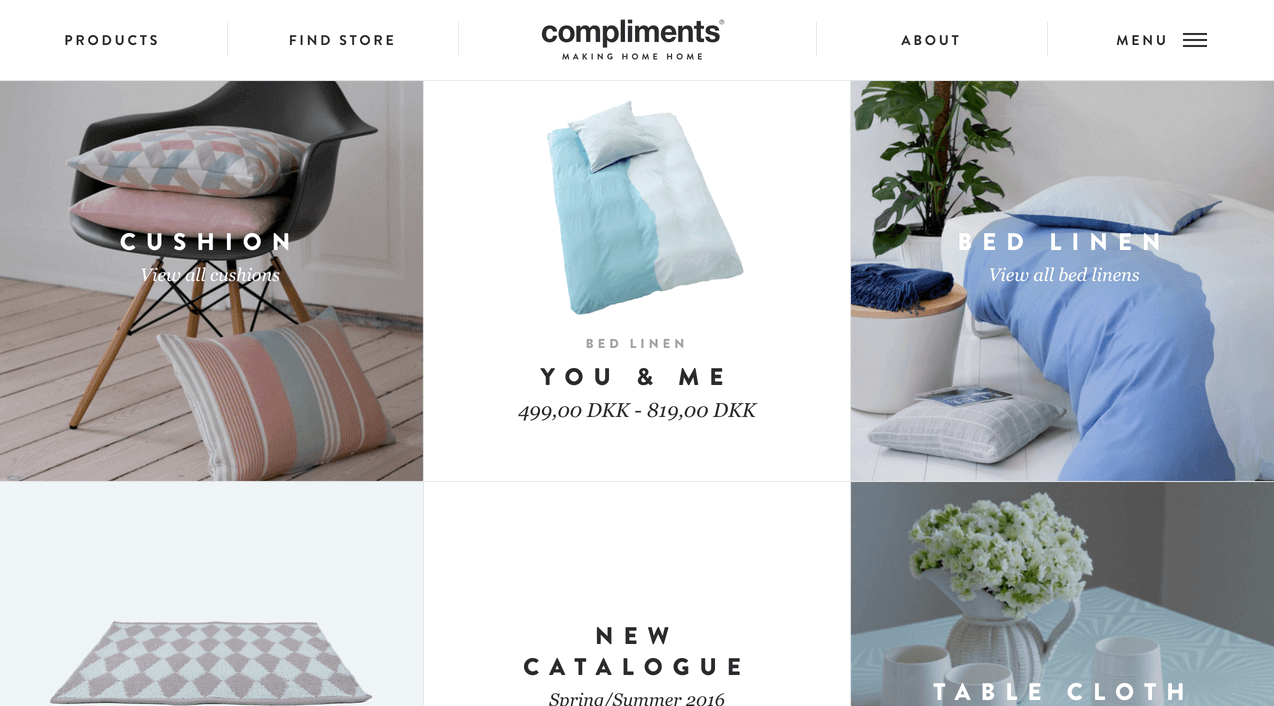
5. Don’t use too many typefaces
Novice designers tend to overuse typefaces in their projects. At times you may see Helvetica, Times New Roman, and Roboto all mashed together in a chaotic font mess. Not to mention “fancier” and “curvier” typefaces like Pacifico or Lobster.
All this creates a “messy” visual effect and distracts users.
Don’t be afraid to use a single typeface in your project. With the help of weight, color, and size, you can create a clear and consistent text sequence using just ONE typeface.
Here’s an example of a good user interface that features a single typeface but does so in different styles.
6. Keep your icons in one style
If your design team doesn’t include an illustrator who creates custom elements and unique graphics for your project, chances are you’re taking the icons from the internet. There’s absolutely nothing wrong with that, as long as you choose icons that share the same style.
If you see that some of them differ in size or color, modify them to a single style.
After all, consistency is key to a successful and efficient UI website.
7. Keep your design clean and neat
As you might have noticed, most of the UI design principles listed above are aimed at “unloading” the user’s mind. In many ways, these techniques make the user’s life simpler and their experience with a website more efficient.
To maximize the effect of the cognitive unload, follow a minimalist approach when creating your UI design. When incorporating visual elements, make sure to sharpen images and maintain the clean, professional aesthetic that users expect.
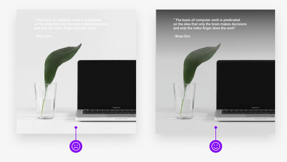
Images and illustrations help make your website more lively and appealing. However, you should be careful when working with graphics.
For instance, your text can get easily lost if you put it directly on the image, no matter what color of the text you use. To reduce this effect, use image overlay. You can either opt for an entire image overlay or a subtle gradient over the spot where you intend to place your text.
Here are two user interface examples that clearly show that overlaying your image will help sharpen the text and improve its visibility.
9. Don’t overuse centered text
While PowerPoint presentations in the 8th grade might have taught you that placing the text in the center of the slide is cool and looks super symmetrical, this rule doesn’t really apply to a good website design.
Sometimes centered text can be quite practical, (when used for headlines and small passages). However, in order to improve readability, keep your text left-aligned in the majority of cases.
10. Make your website universally accessible
A well-designed website needs to account for any accessibility issues that may be possible. And while colors may be an adequate means of delivering a message, don’t only rely on them in your design.
According to the statistics, 1 in 12 men (8%) and 1 in 200 women (0.5%) are color blind. Therefore, try to use weights and sizes to emphasize the information, instead of simply displaying it in a different color.
Conclusion
UI design is a complicated discipline that in many ways uses many psychological tricks and hacks to influence a user’s emotions and attitude towards your brand.
Luckily, you don’t have to have a Psychology and Graphic Design Degree in order to implement these easy website UI tips in your project.
Still feel unconfident and want to trust this critical mission to professional designers? Contact us. We’ll be happy to create an amazing user interface design for your website that will be both attractive and high-converting!